Business Card
RESEARCH
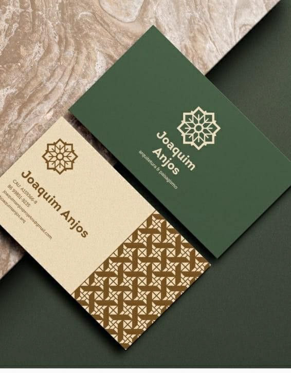
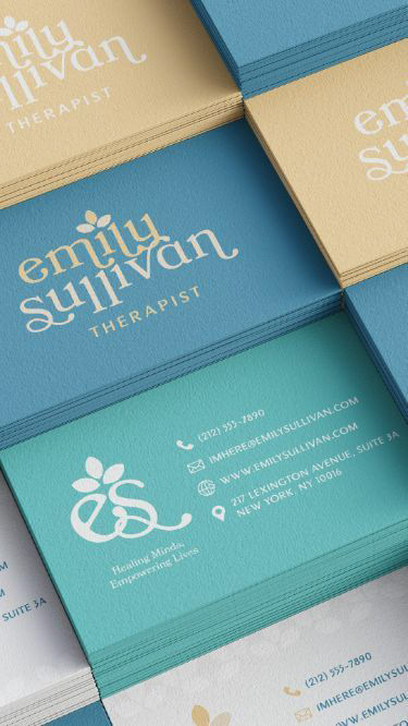
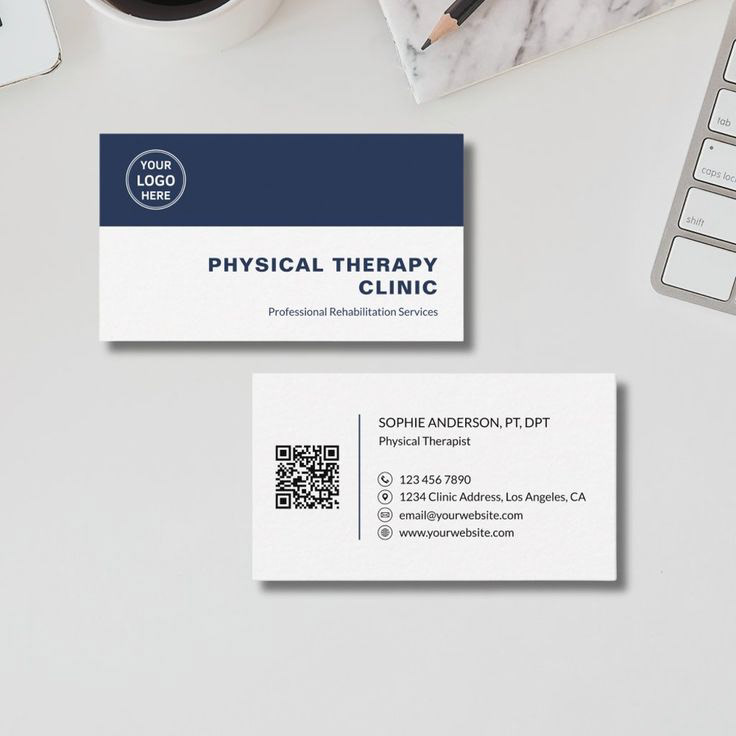
I started the projected collecting inspiration for the car. I looked mostly at business cards in the medical field and wellness. The key qualities I took were the color as well as the use of pattern.
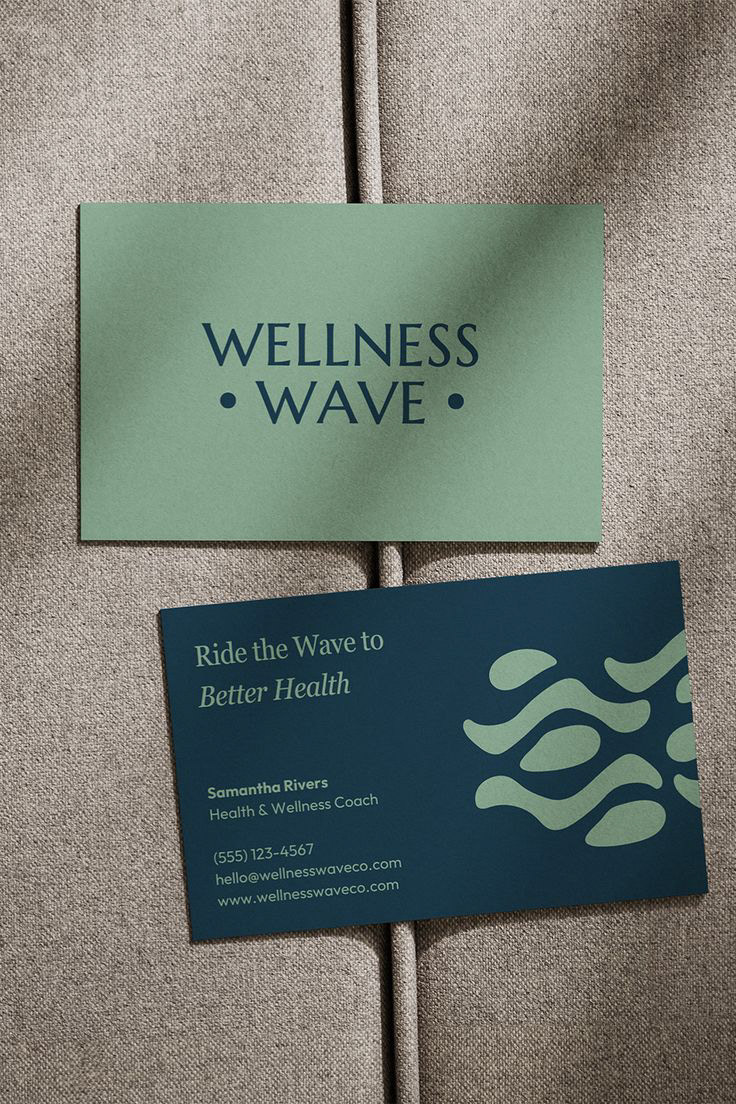
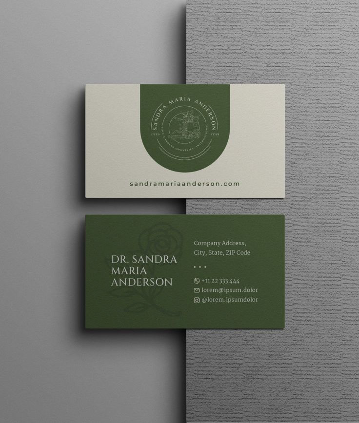
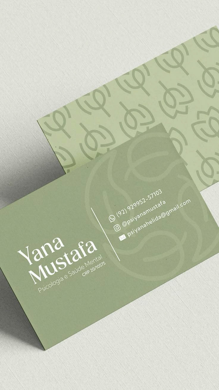
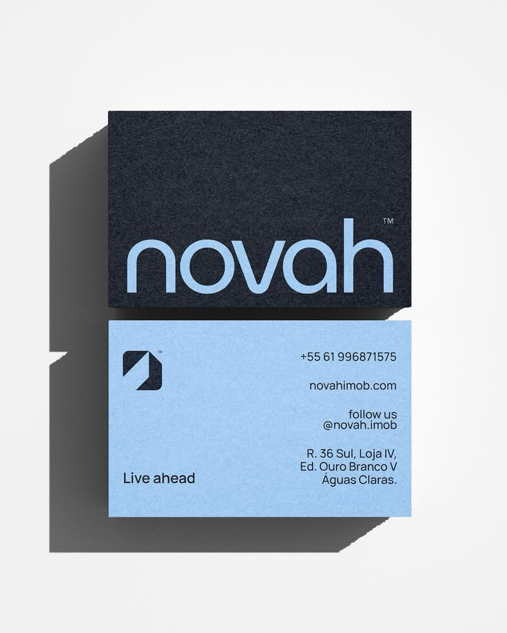
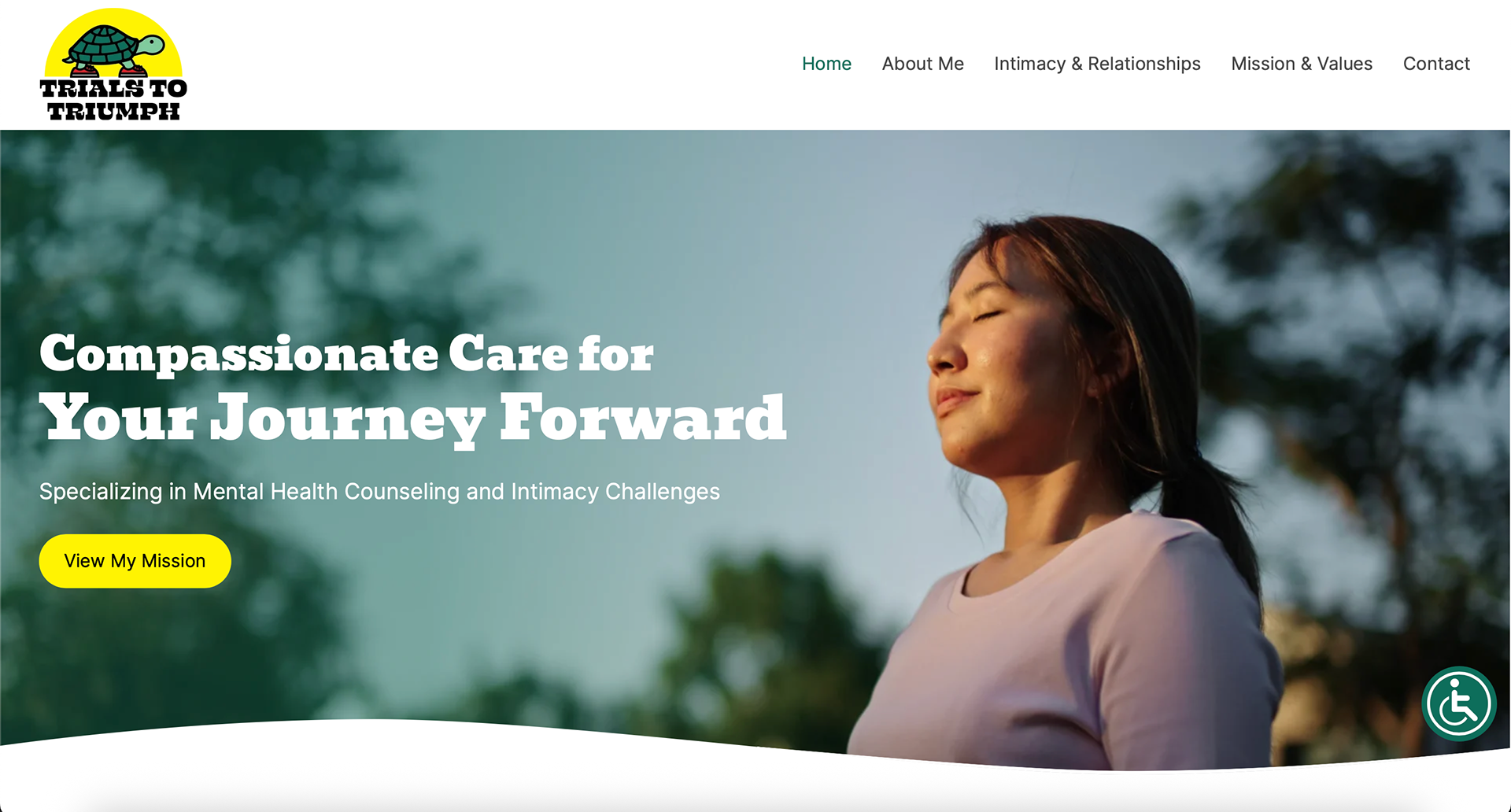
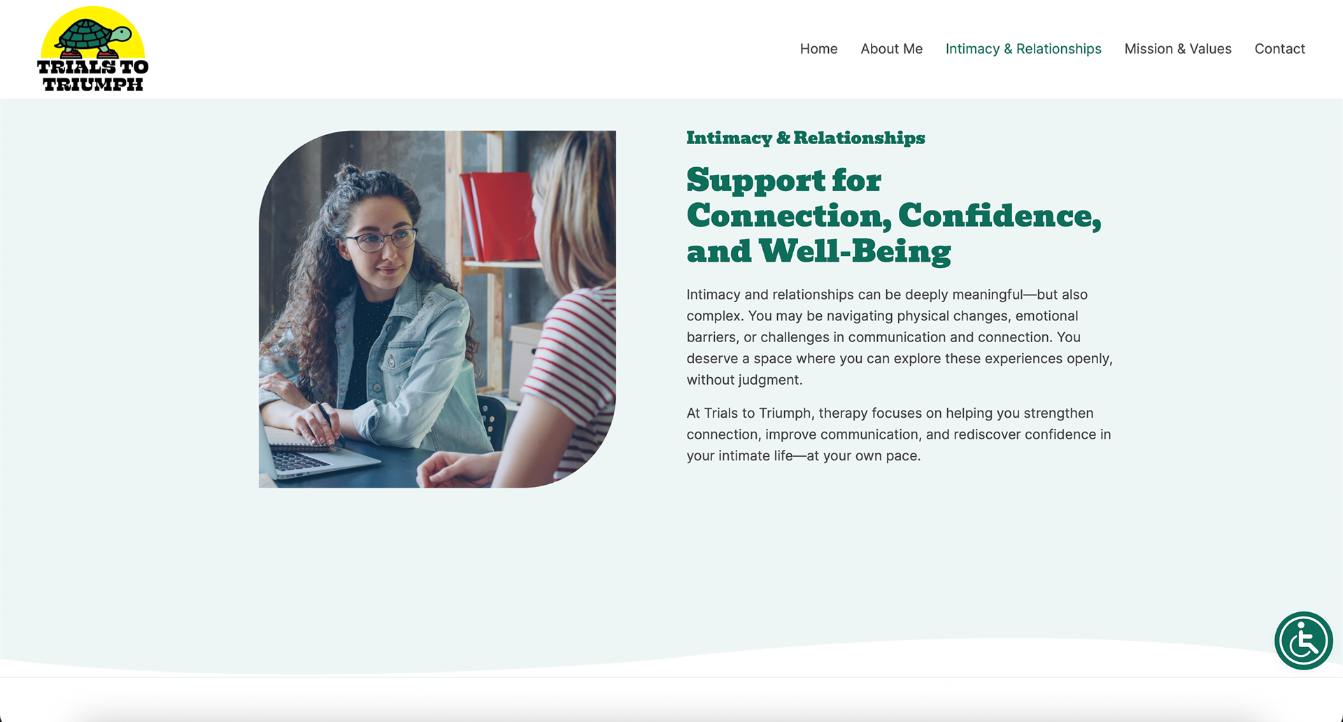
Since the cilent didn't have a brand guide or any thing other than a logo, one place I took inspiration from was their website to extract inspiration.
Sketching
With the sketching, I really tried to experiment. I swapped between conventional and more out-there ideas.
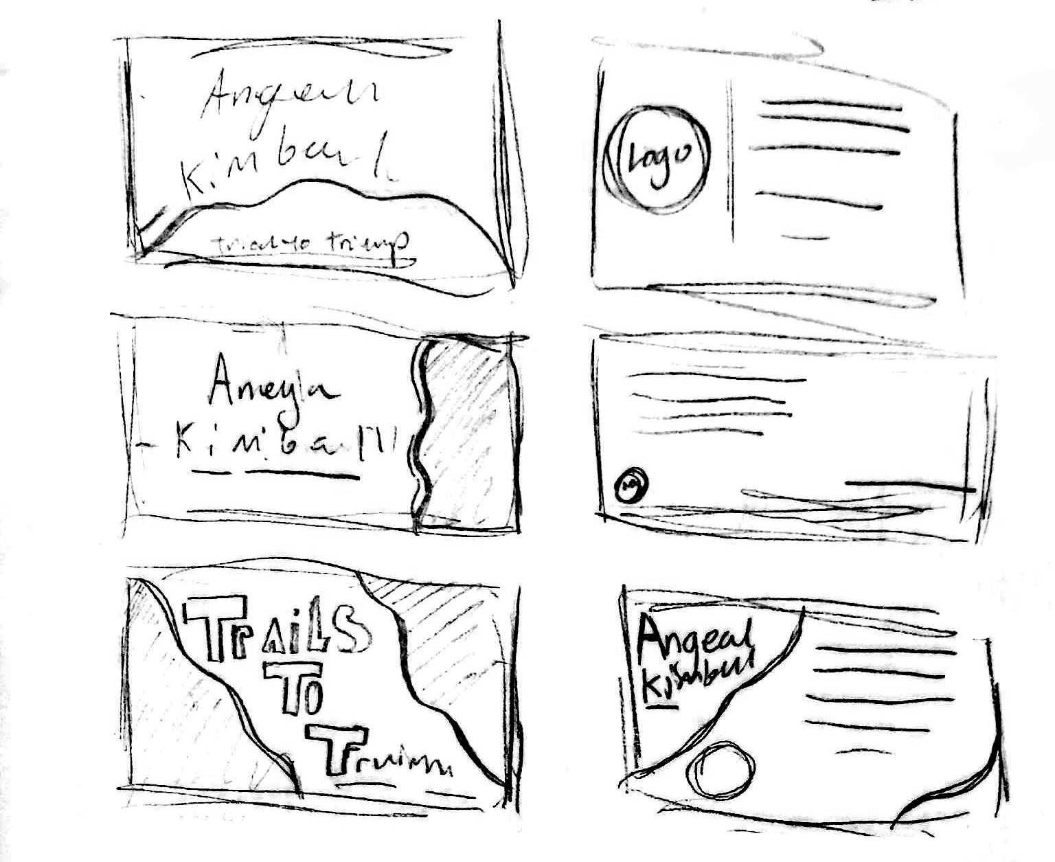
I focused on organic shapes and circles because those were the most common elements I found in designs of this ilk.
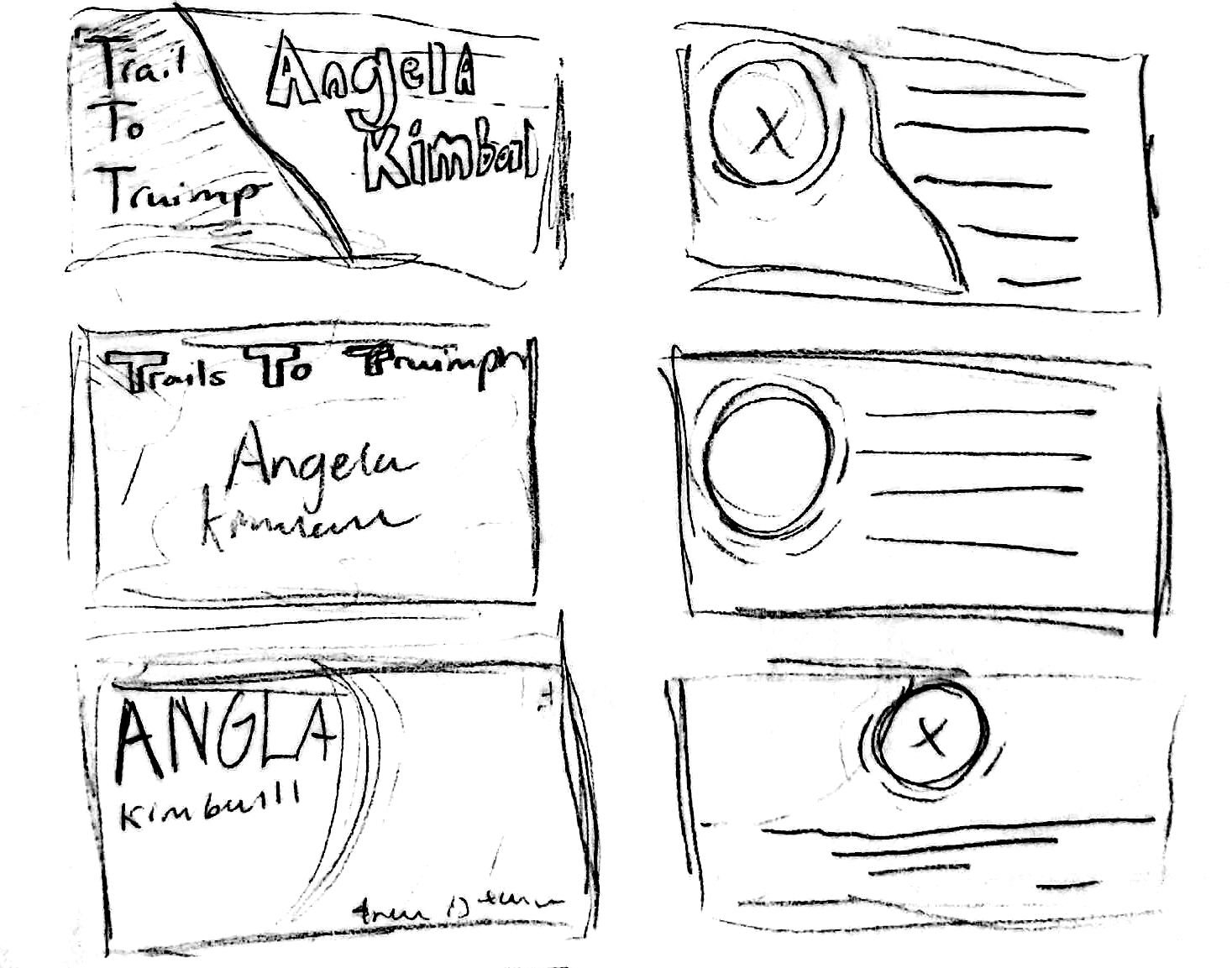
Initial Interations
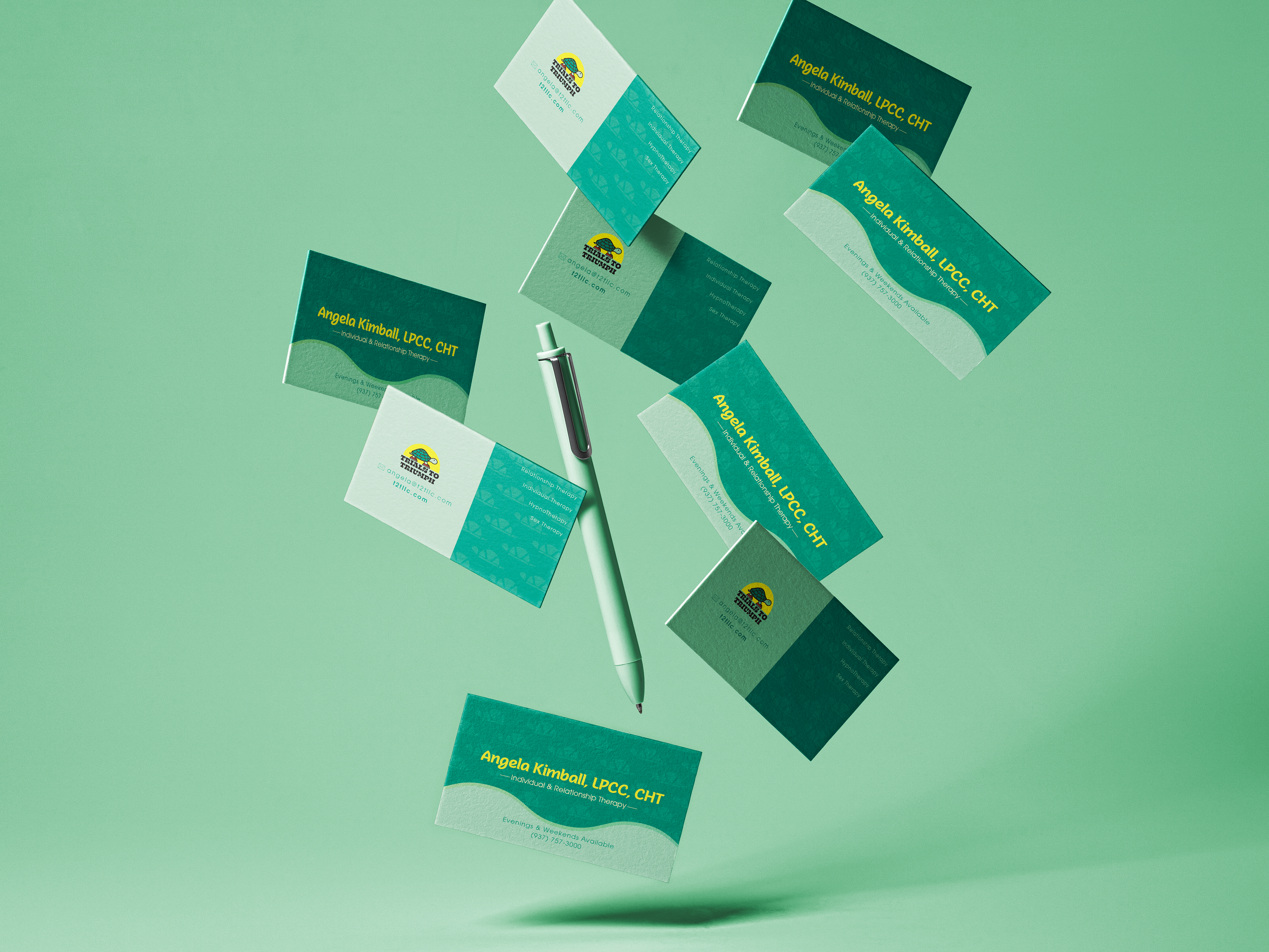
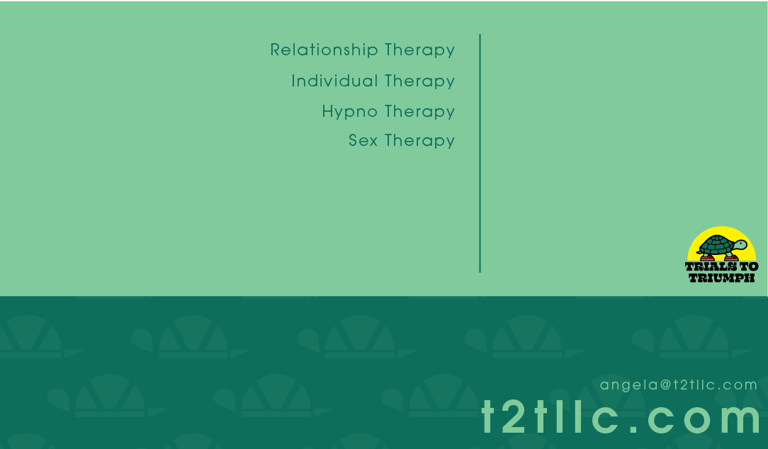
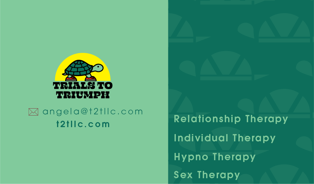
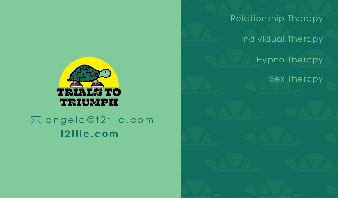
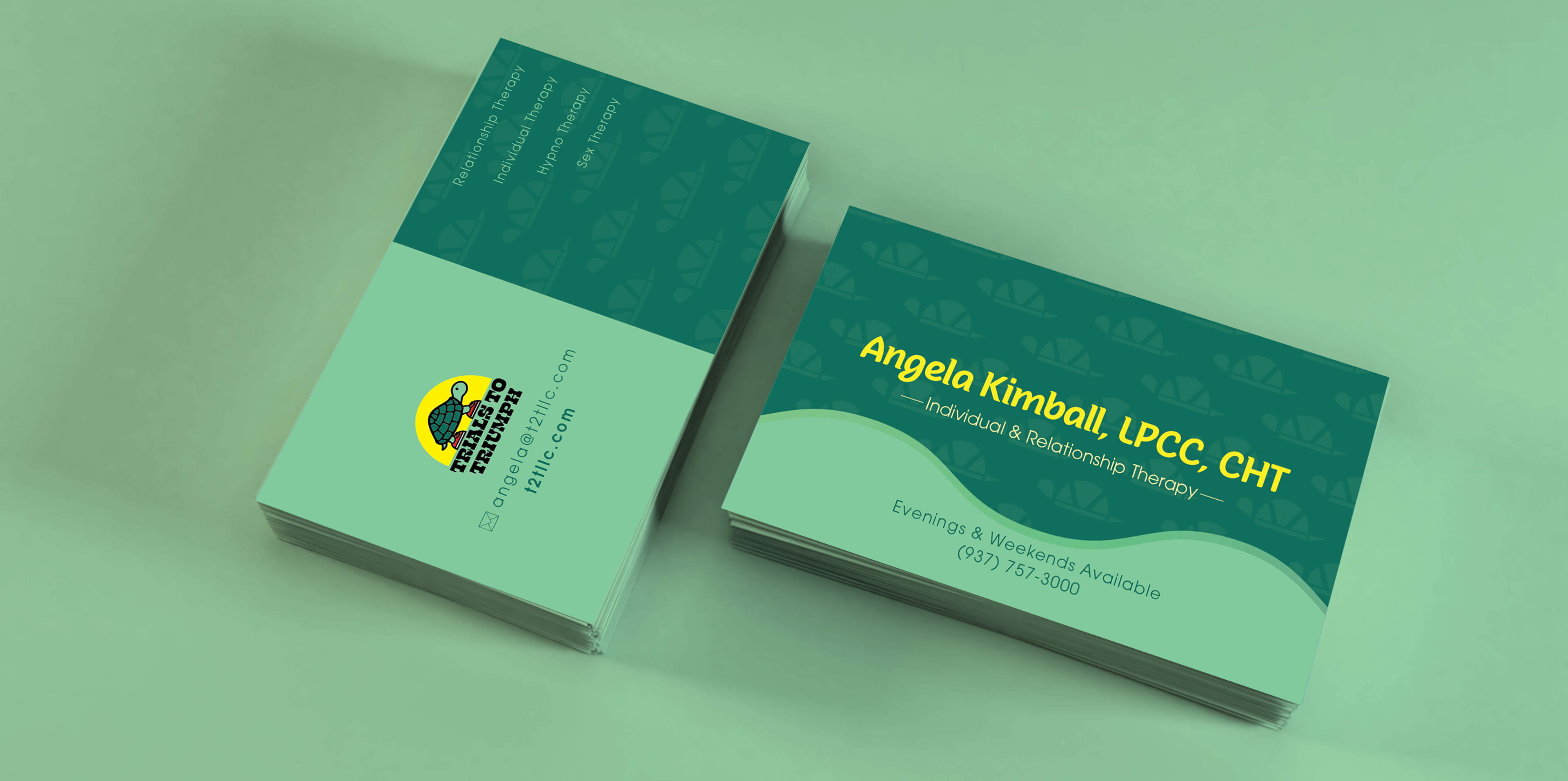
Coming into digital, I chose the colors based on the logo and then choose to focus on the green because of the color's associations with health and calmness.
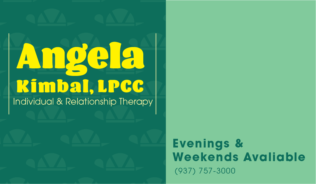




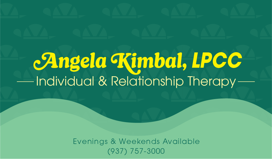
I also created a pattern based on the logo for the background to create a bit more interest.


Refinement
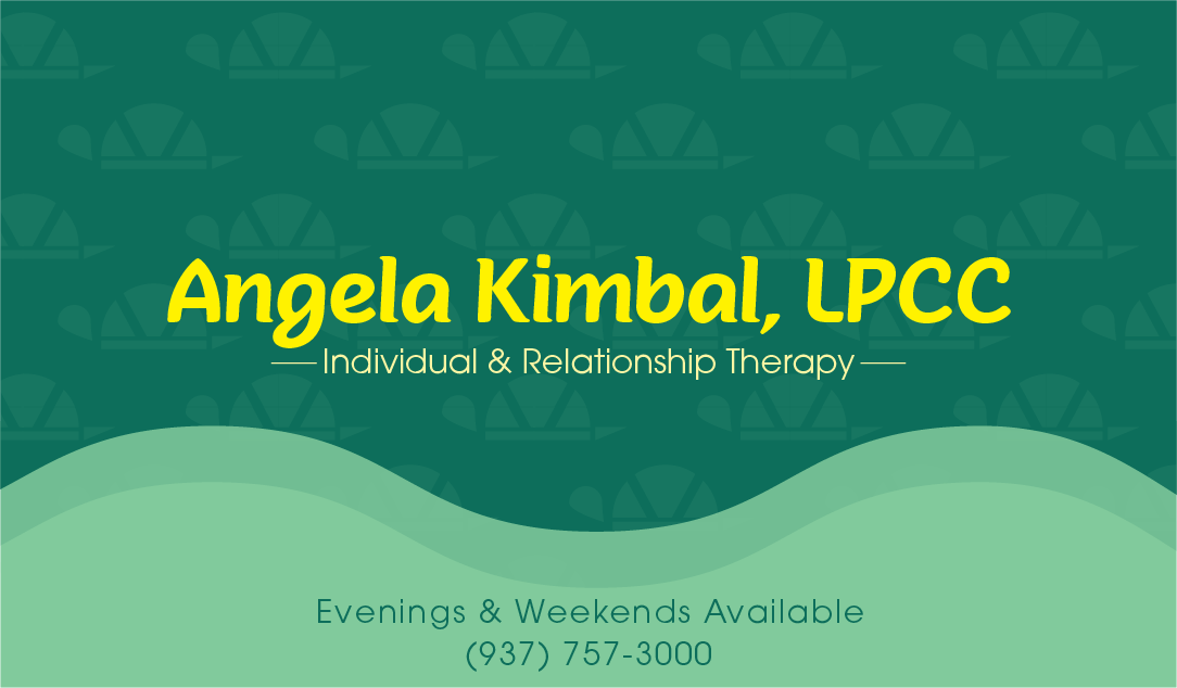
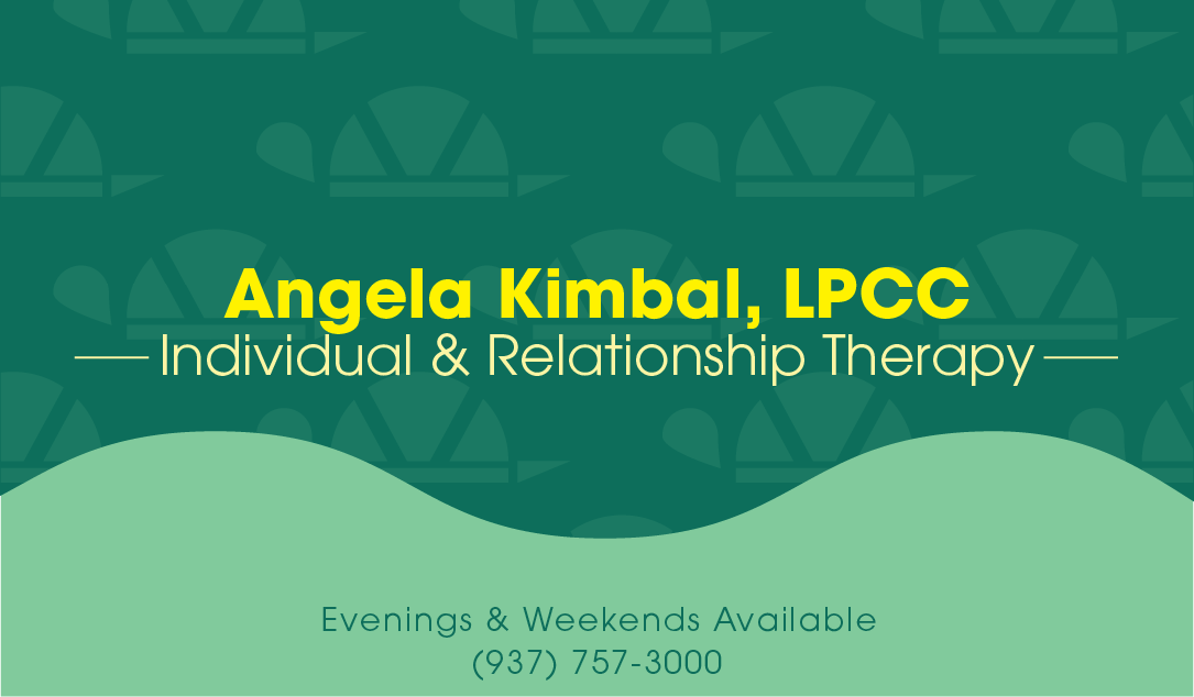
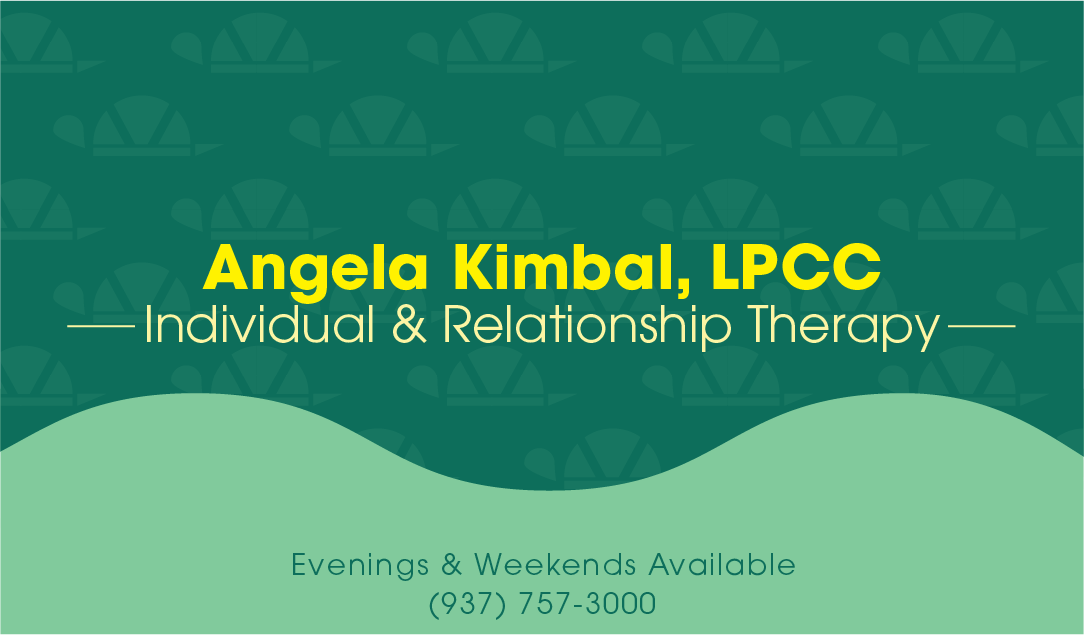
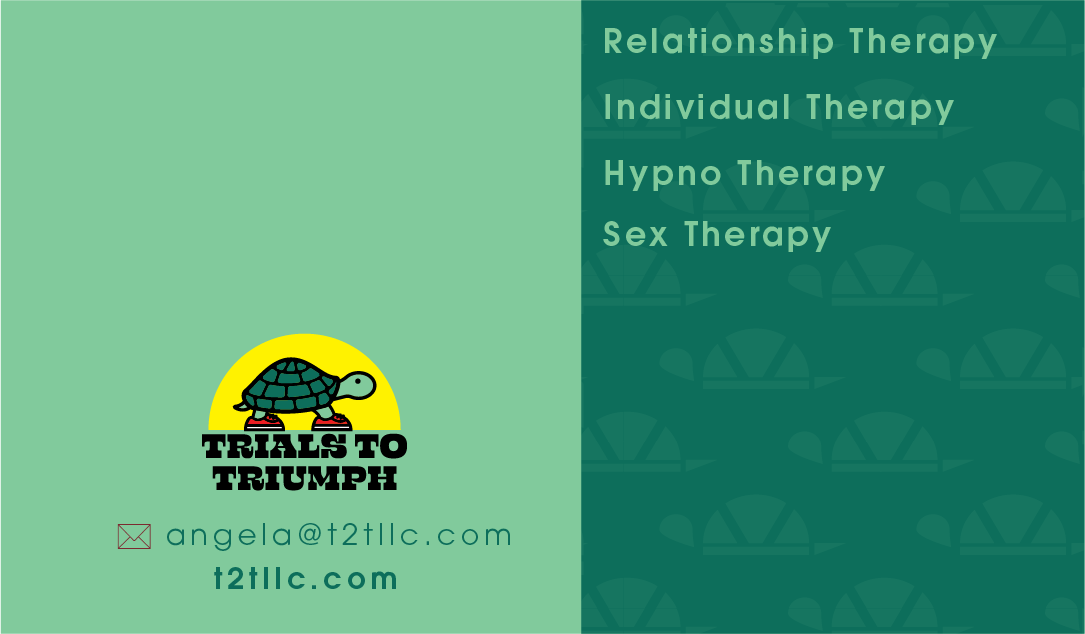
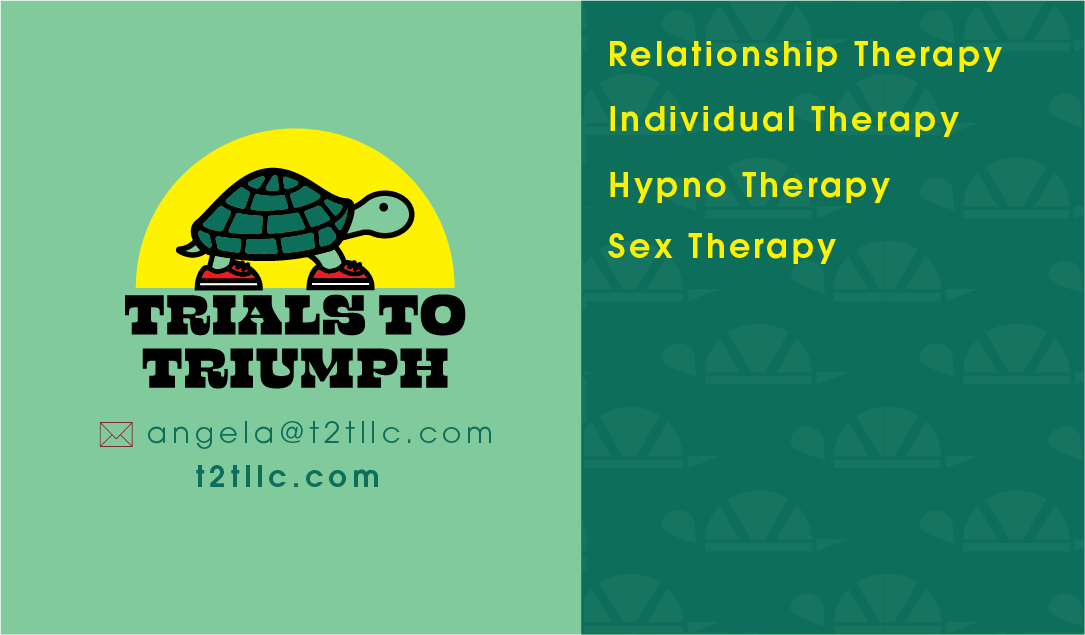
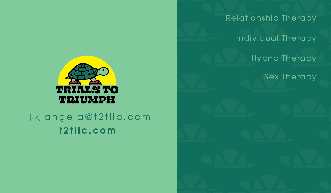
Leading into the refinement, I played around with the pattern's color and size and balanced the design across the elements.
Final

Social Media
Sketches
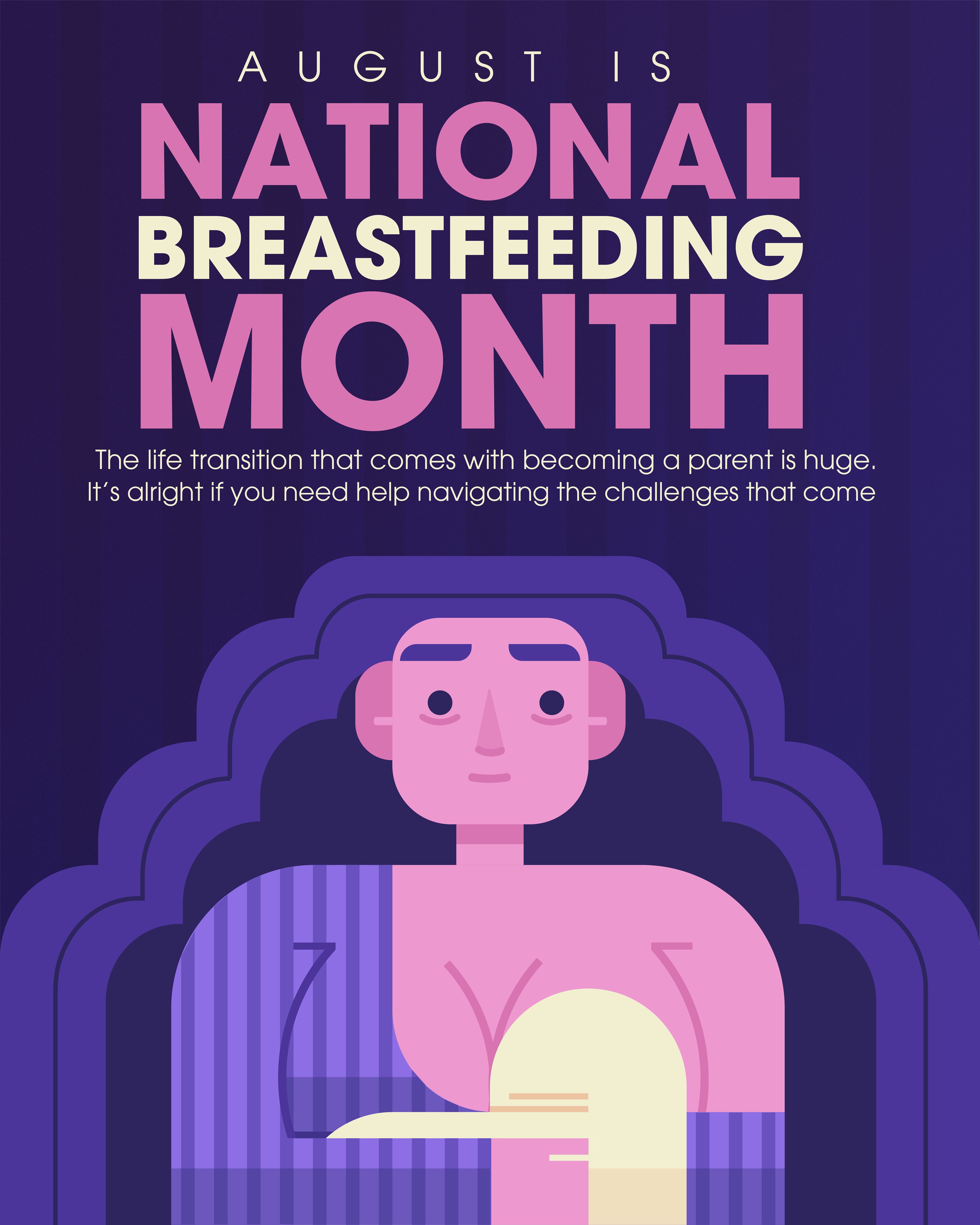
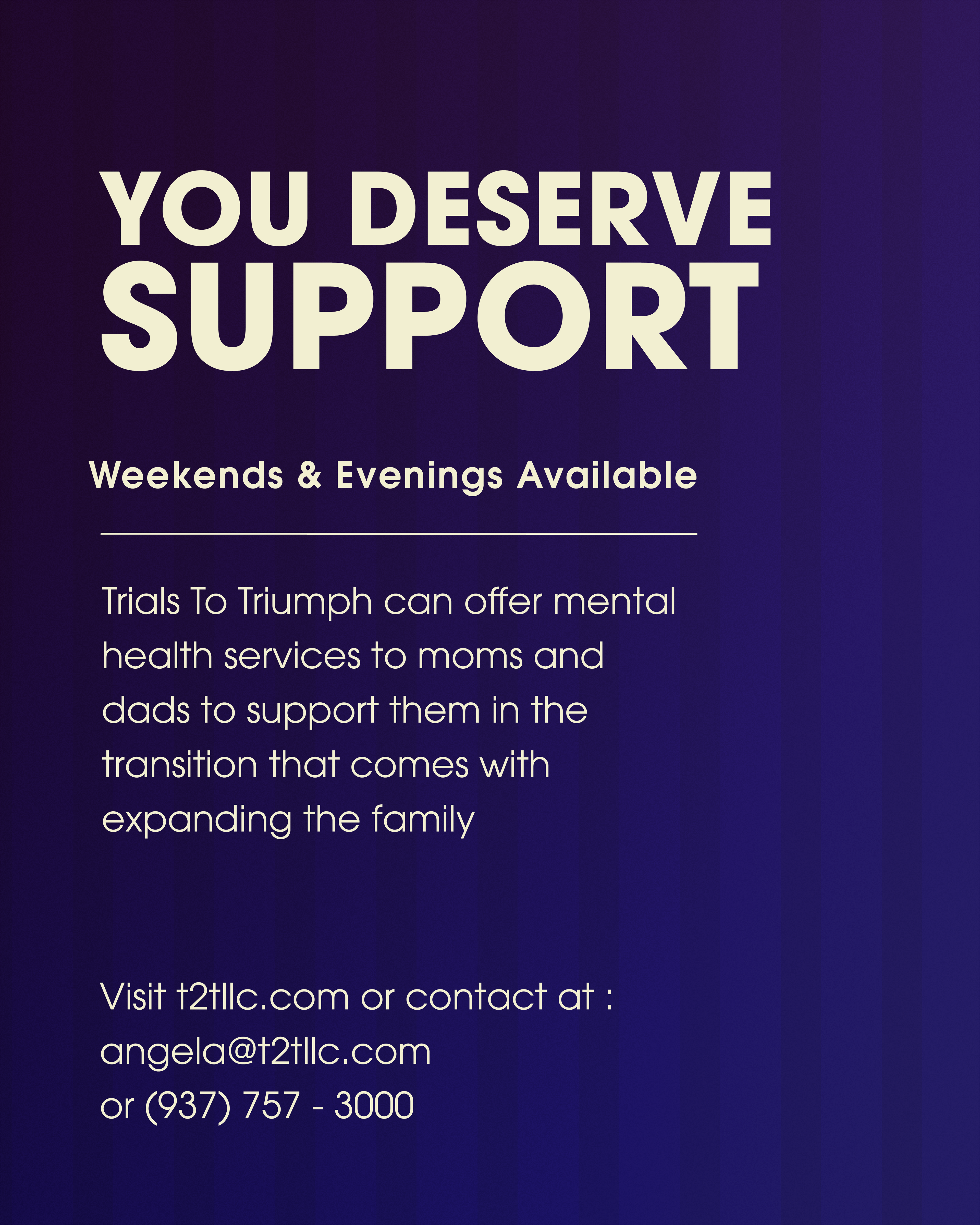
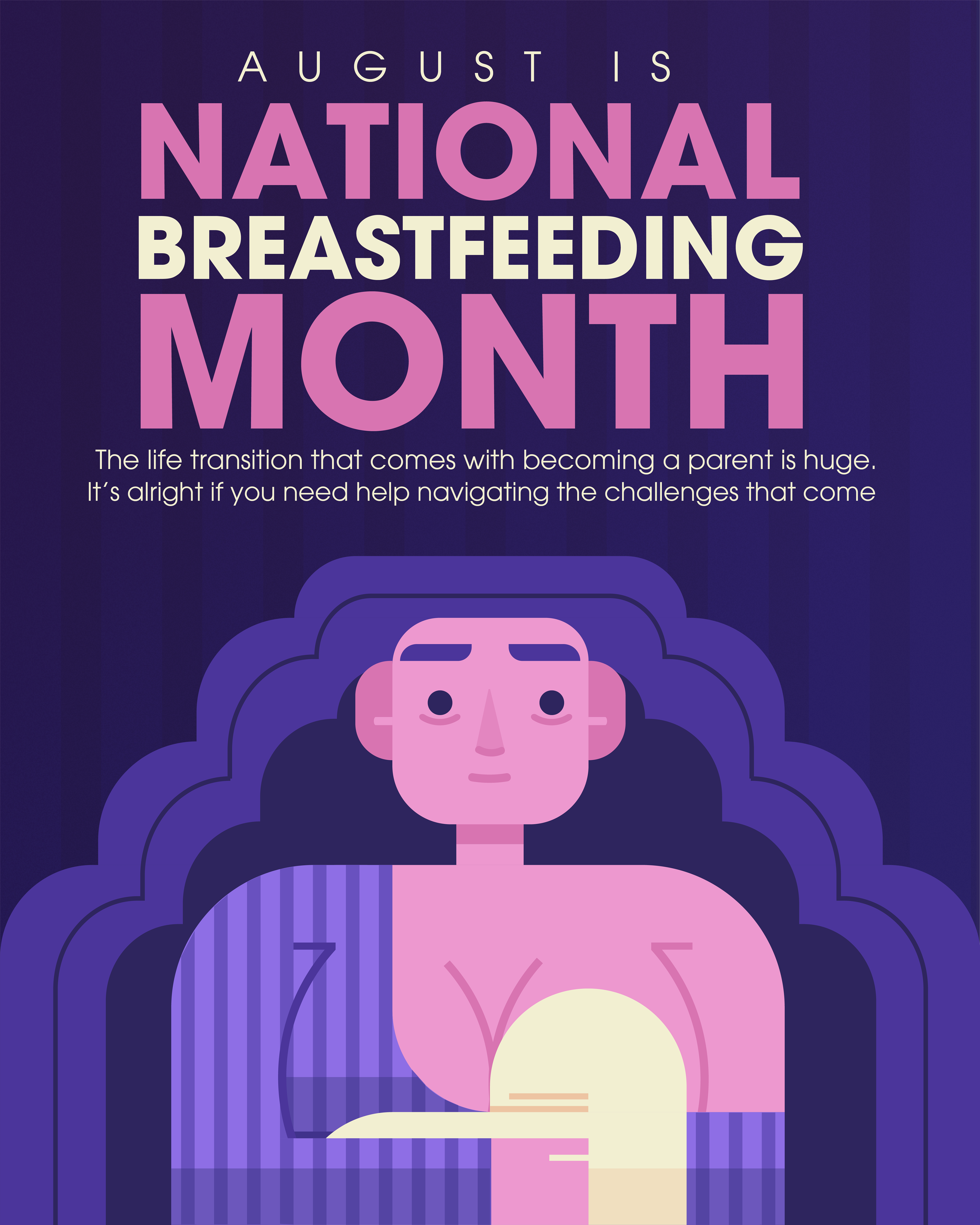
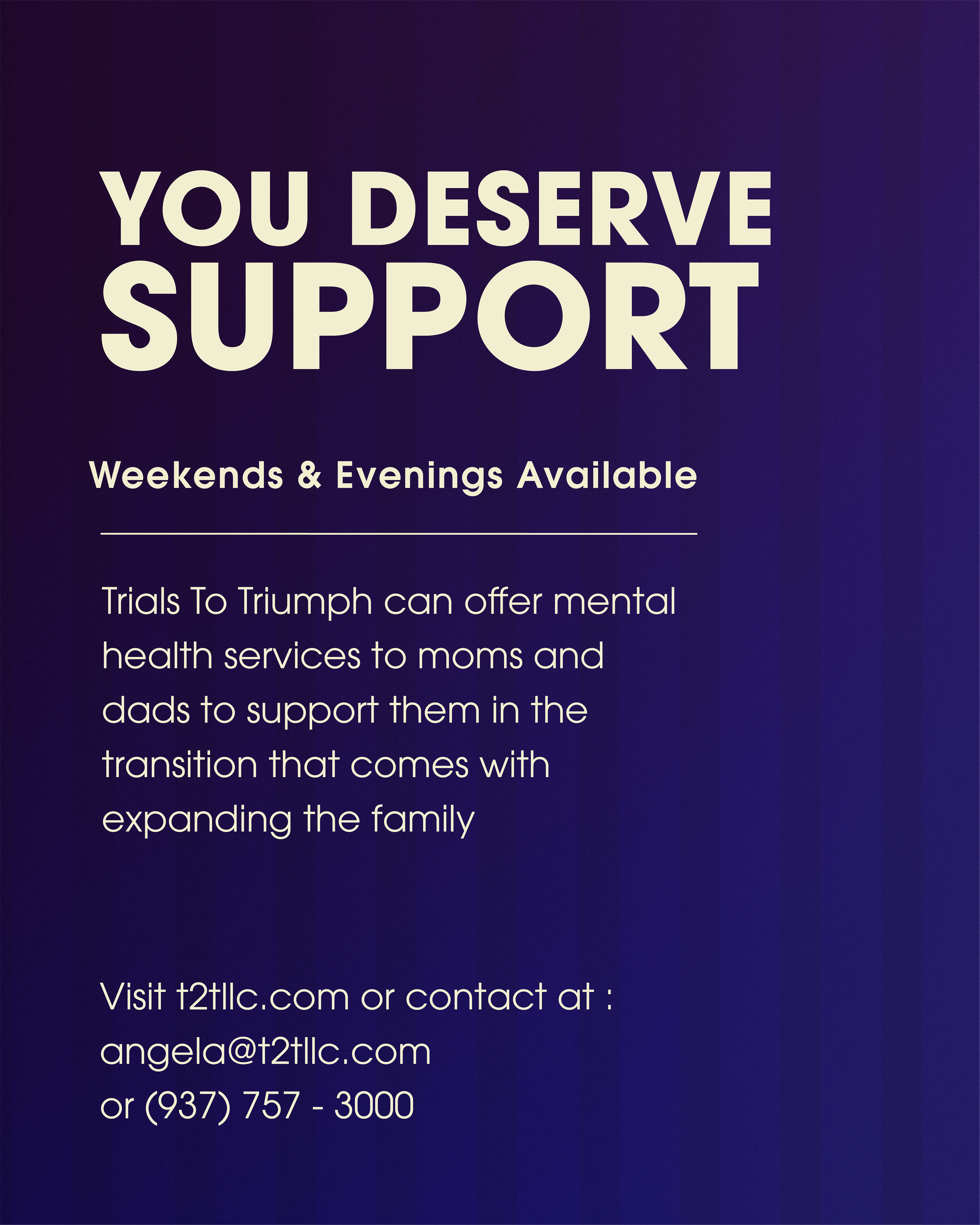
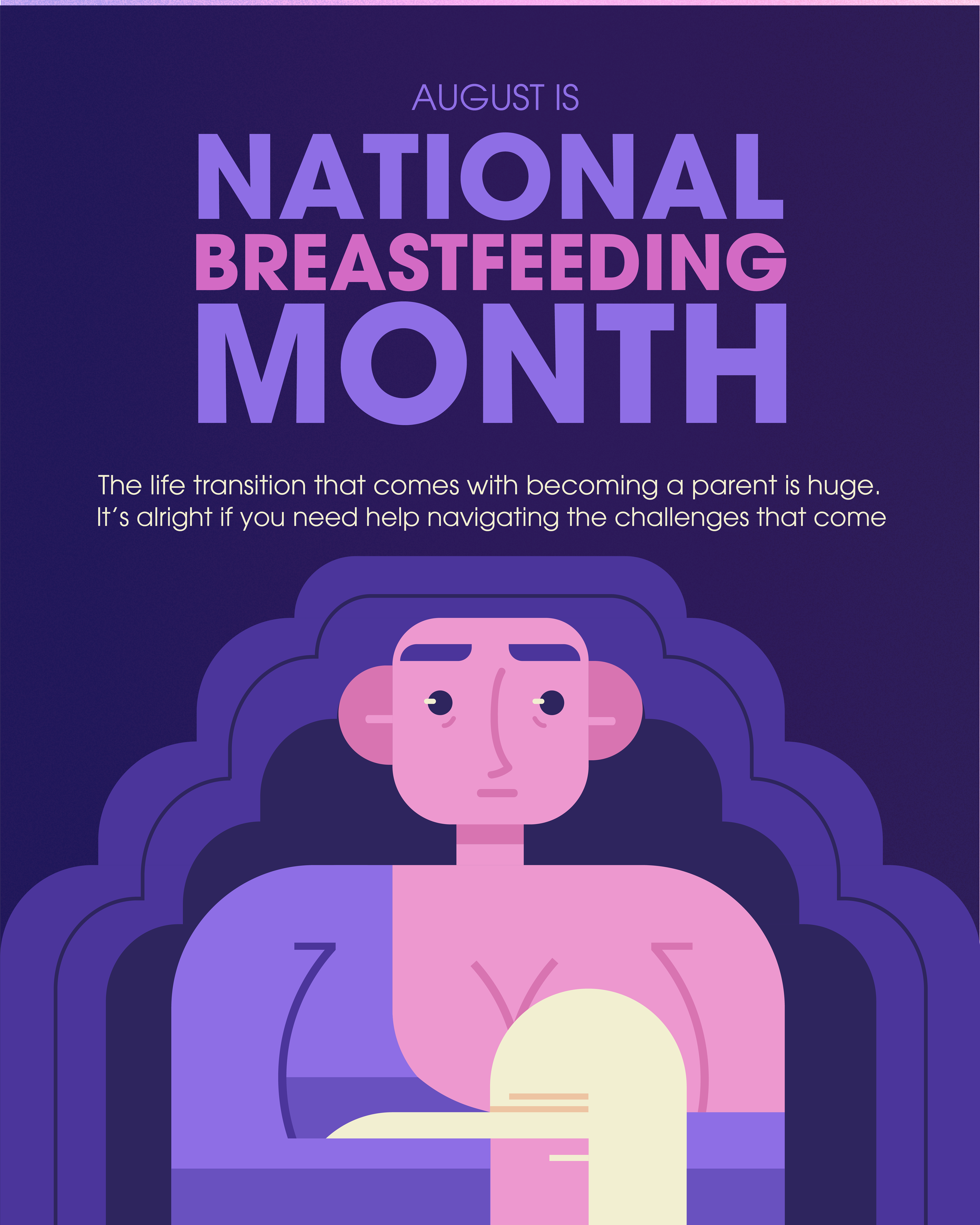
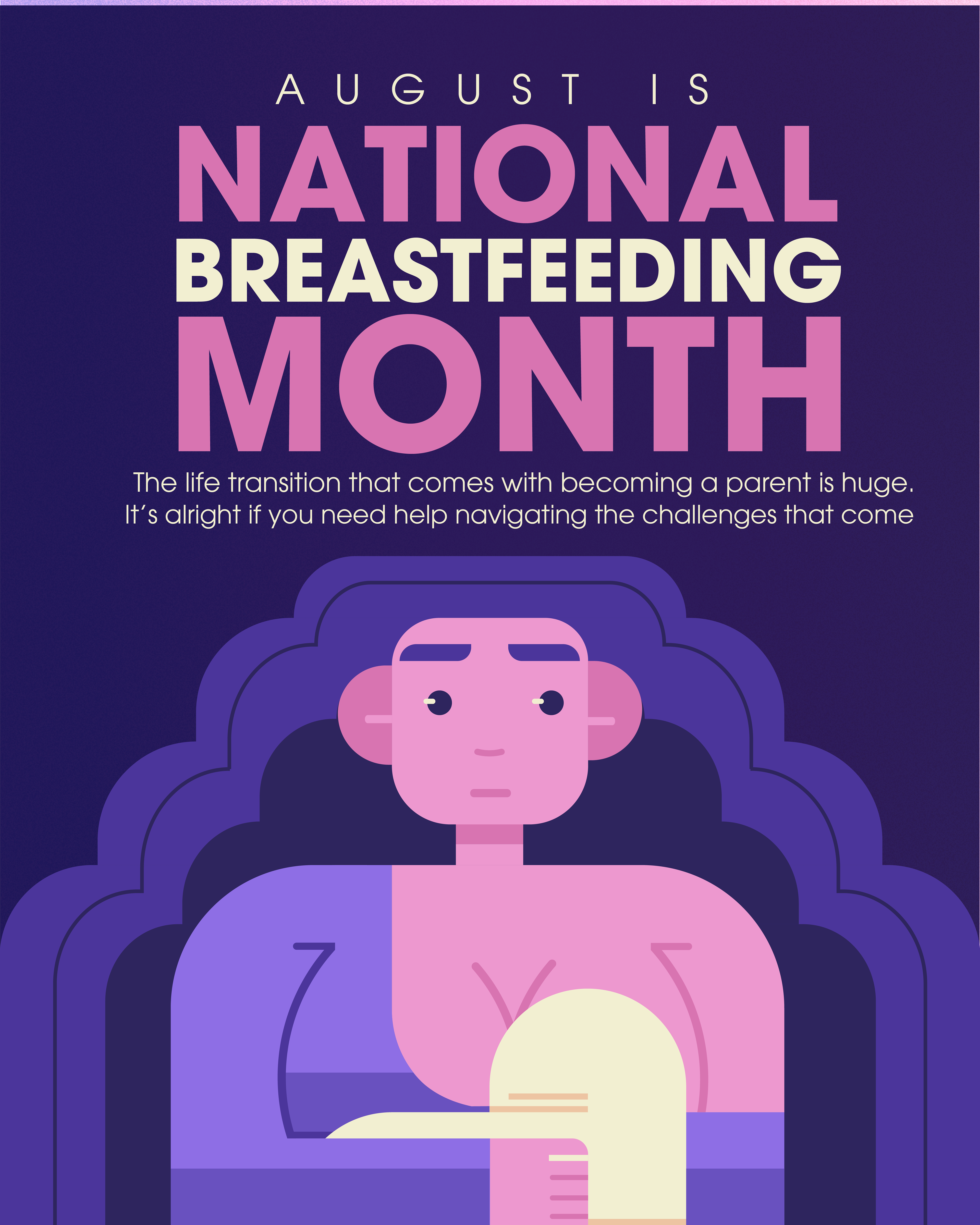
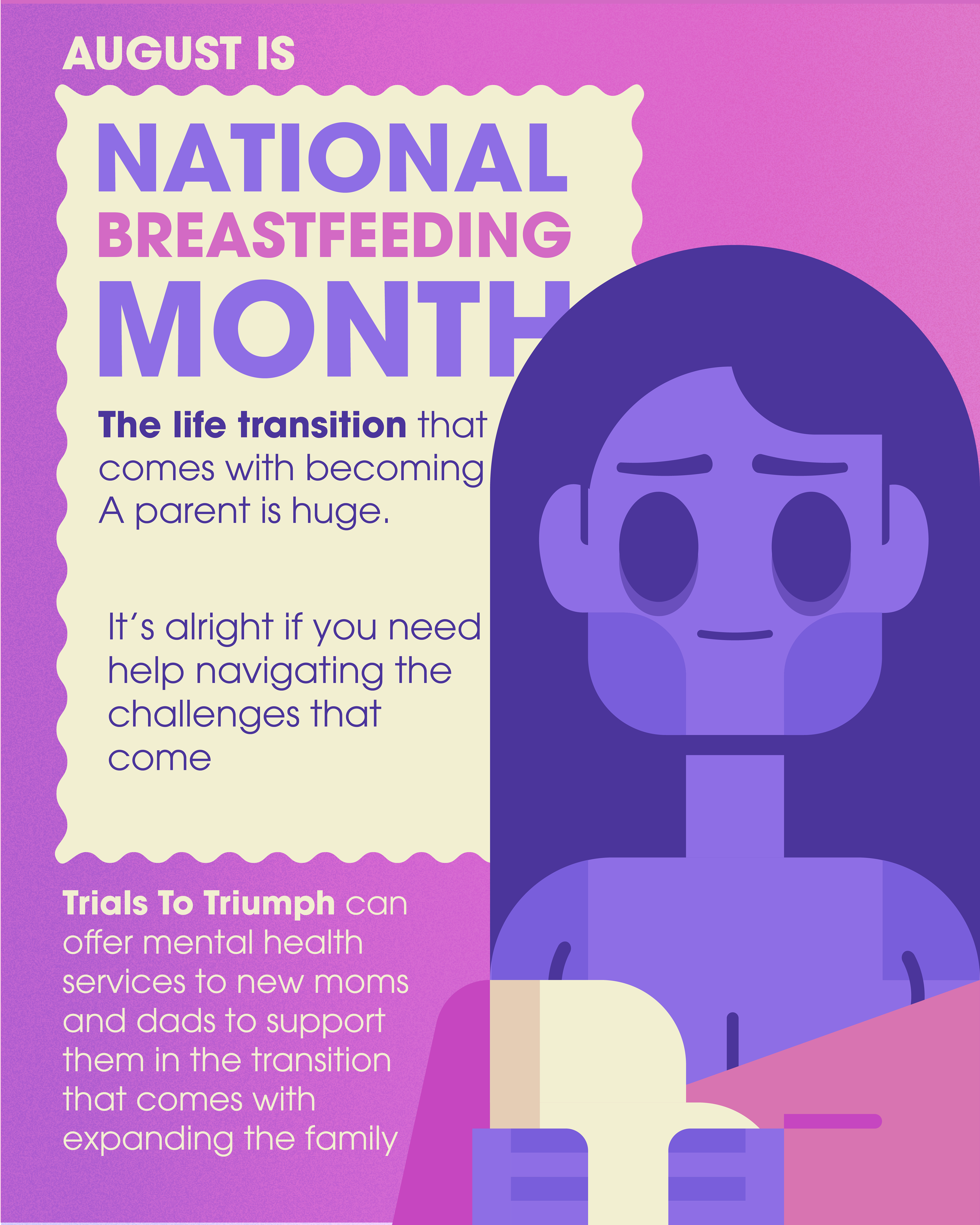
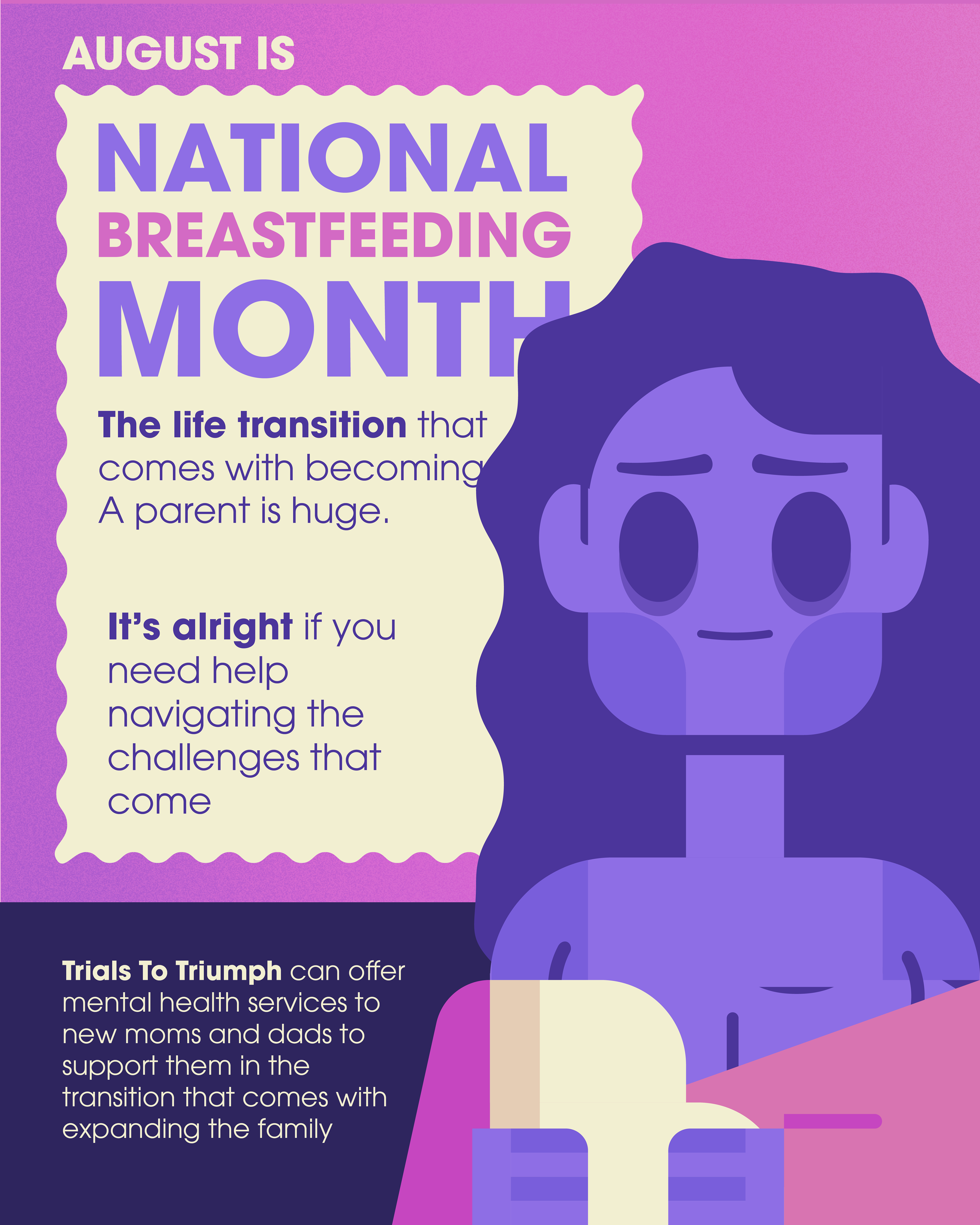
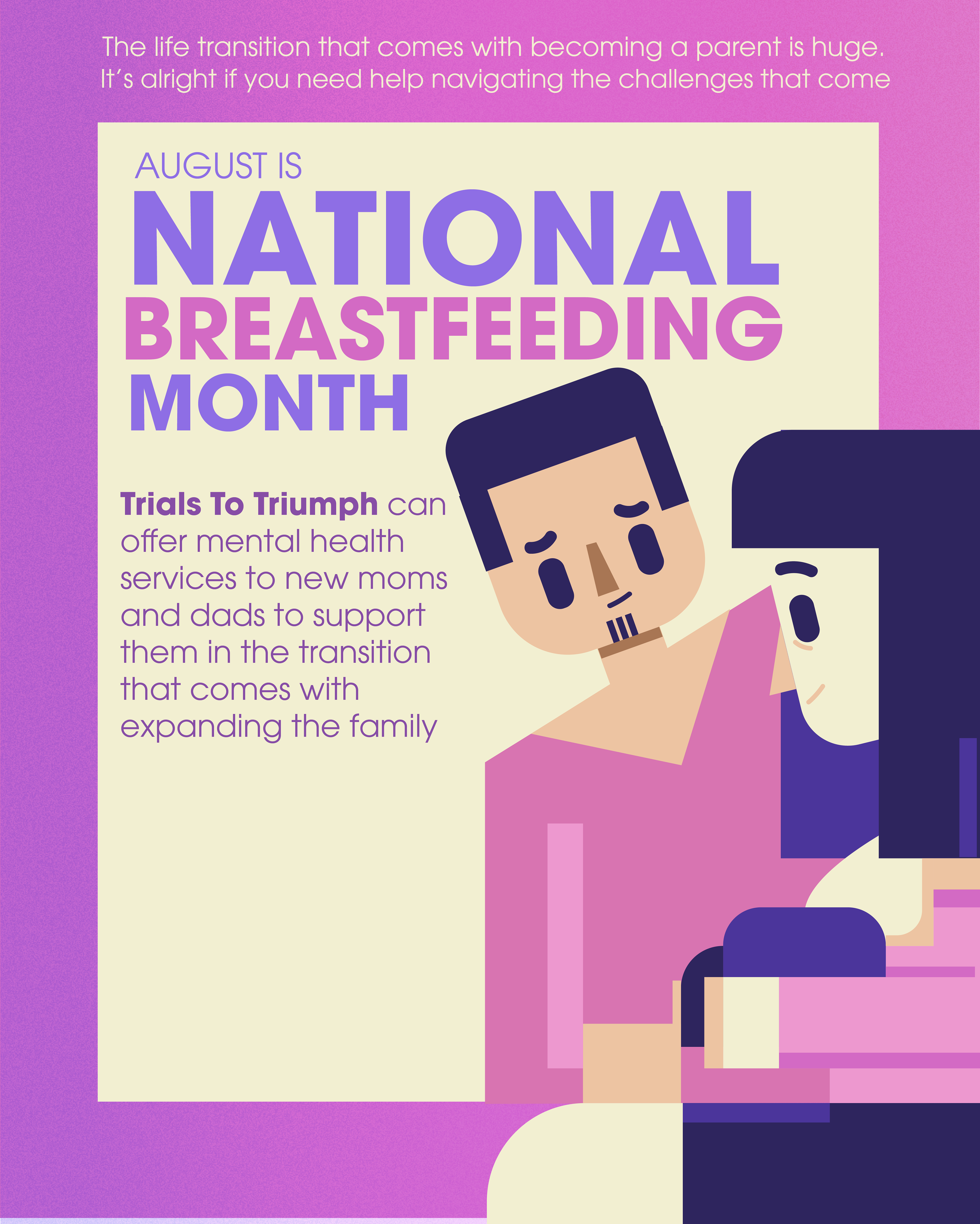
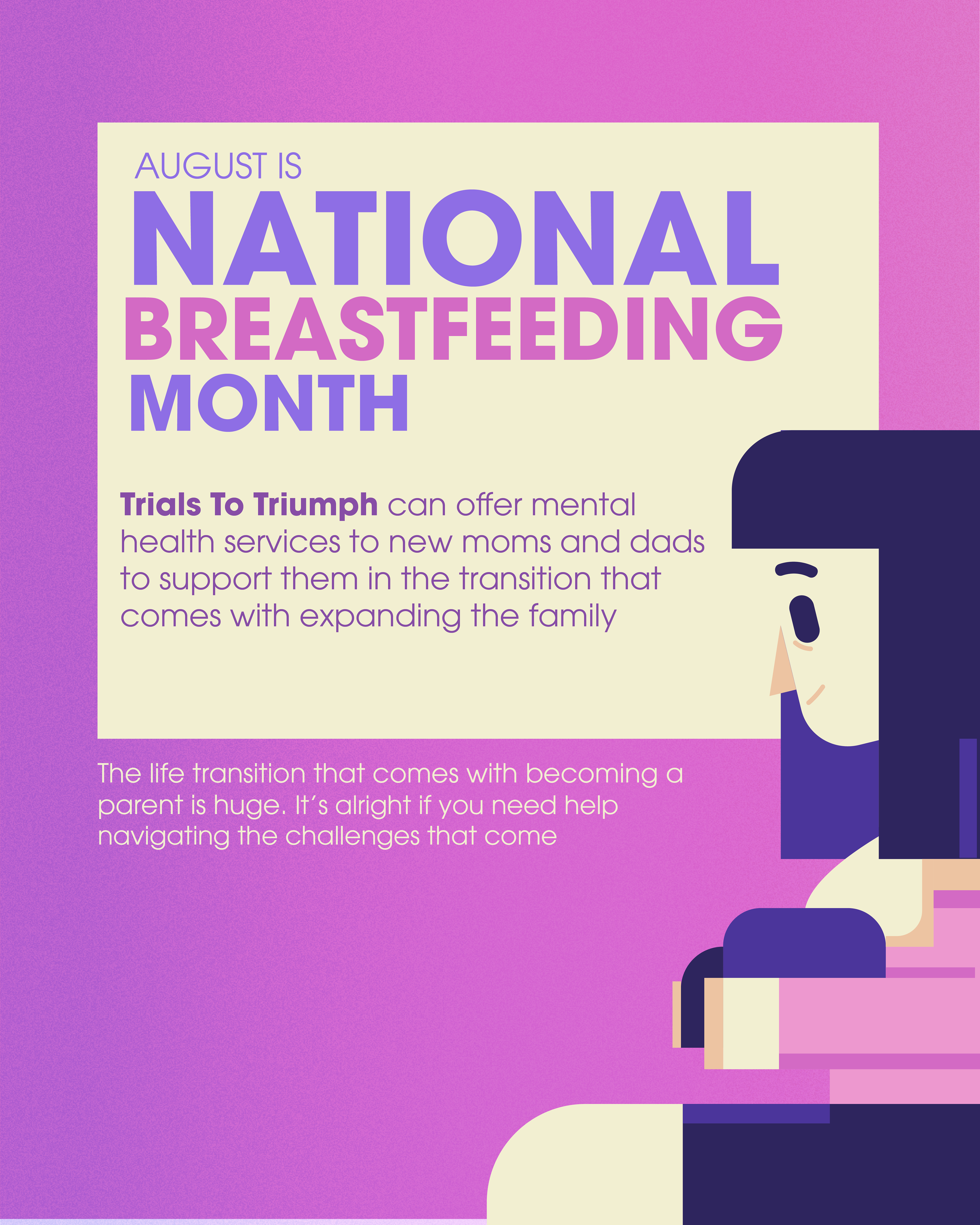
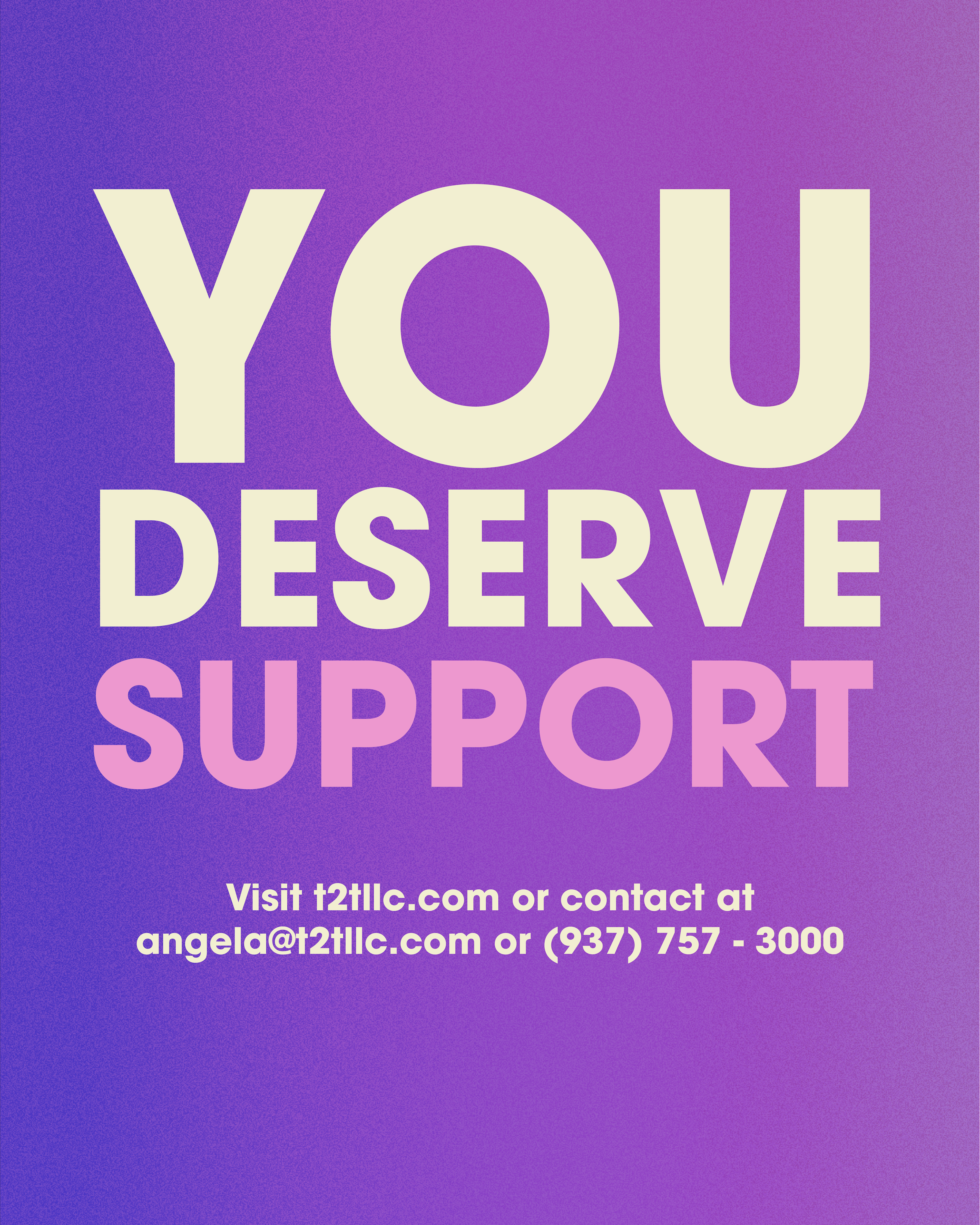
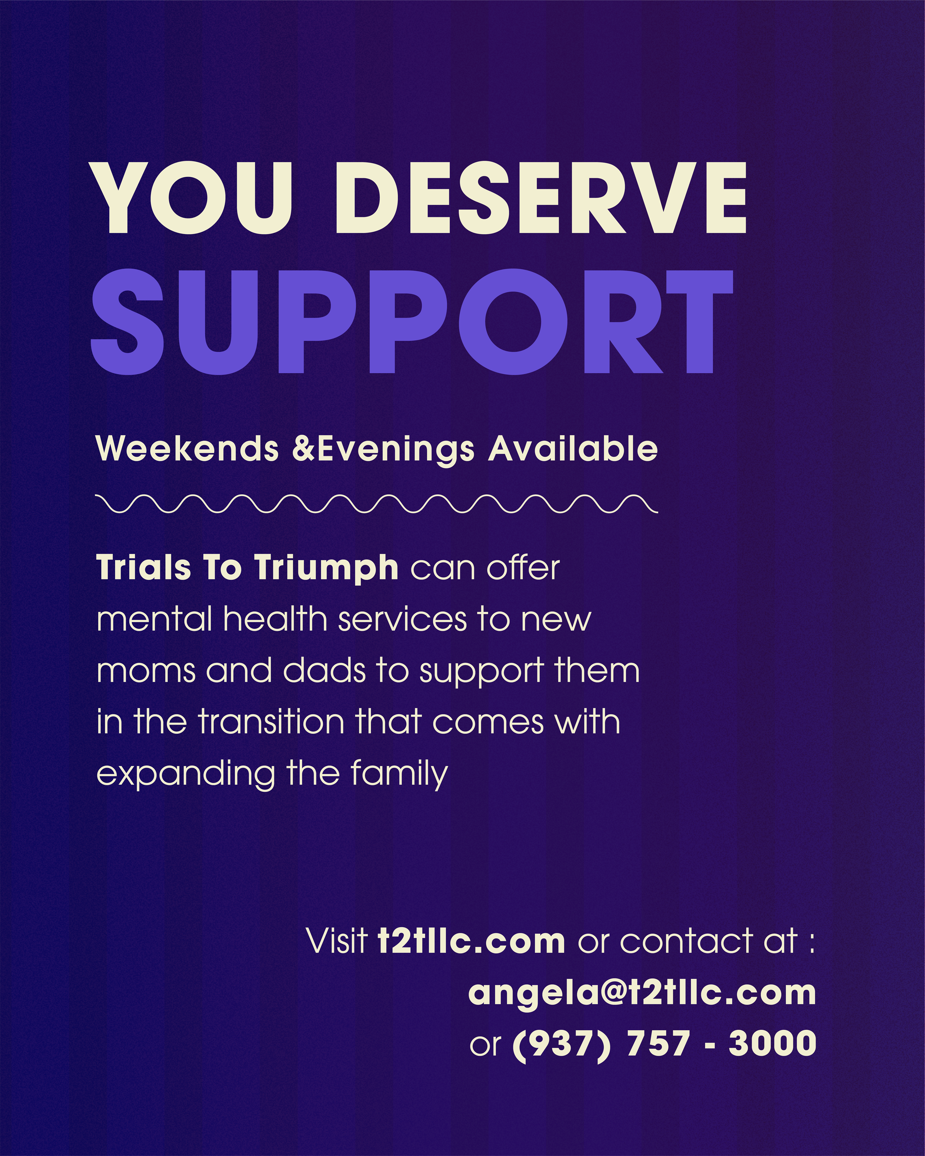
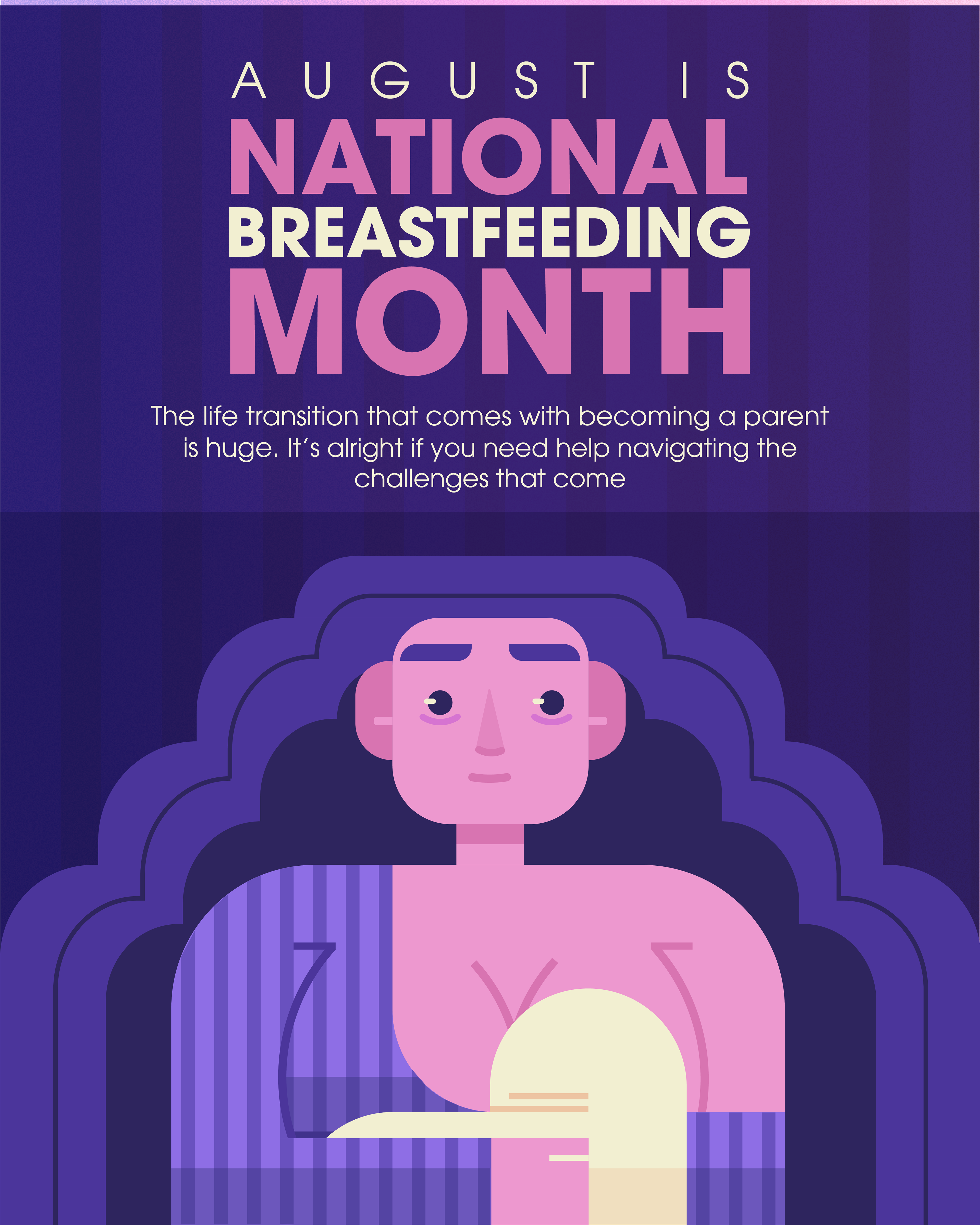
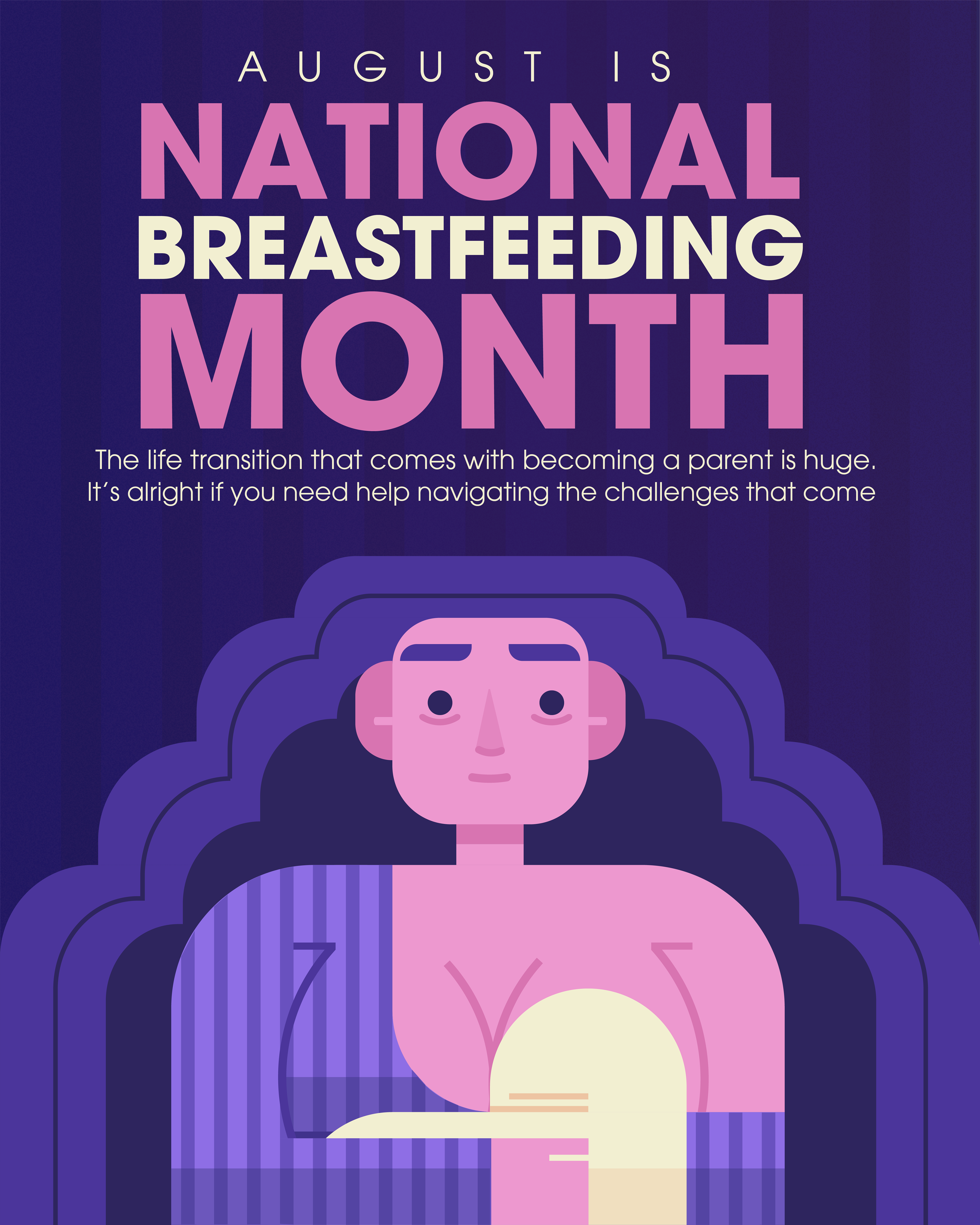
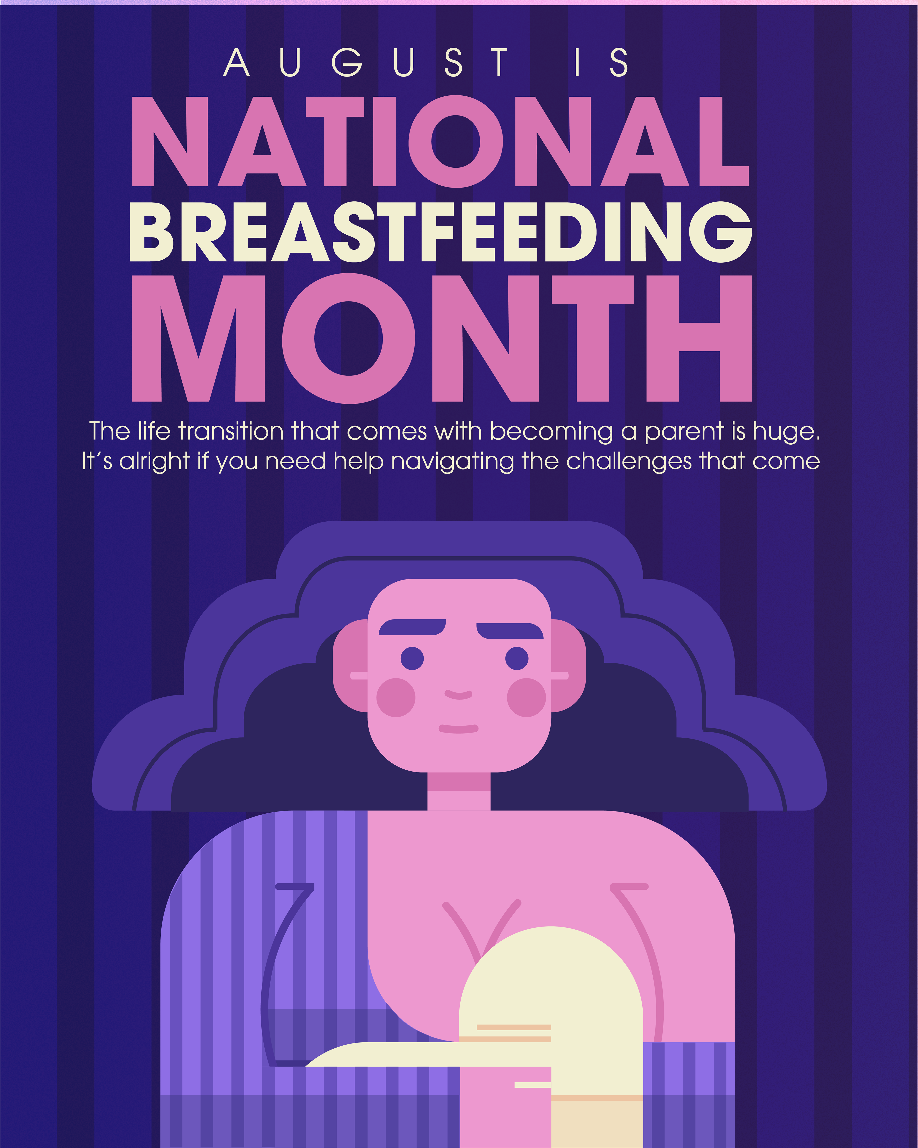
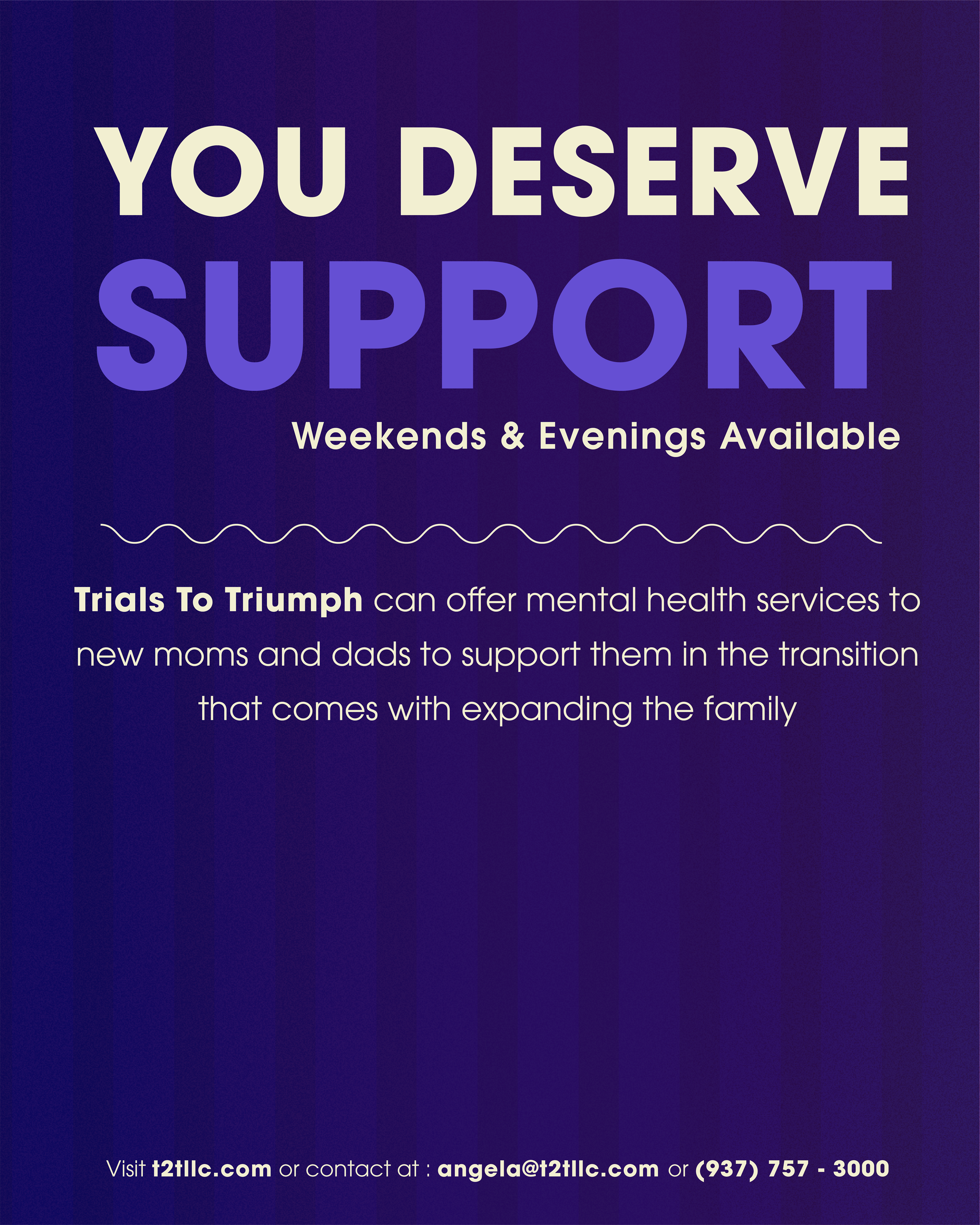
My client asked me to make a post for National Breastfeeding Month that emphasized that they provide mental health services to new parents.
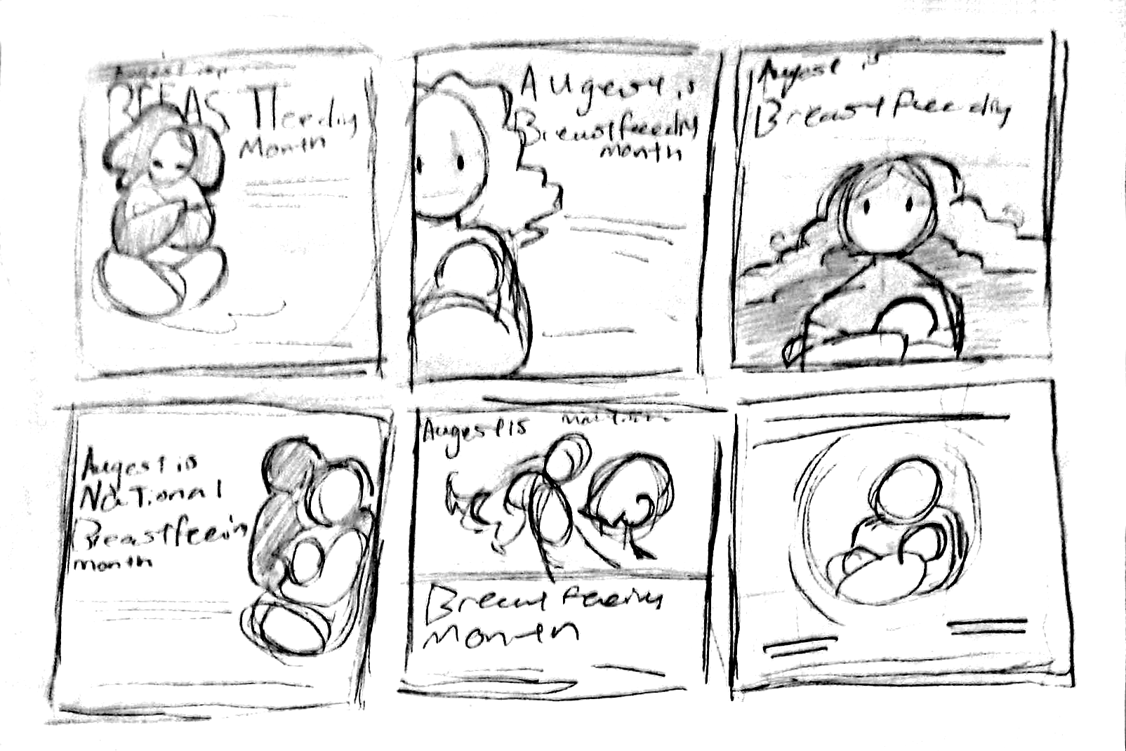
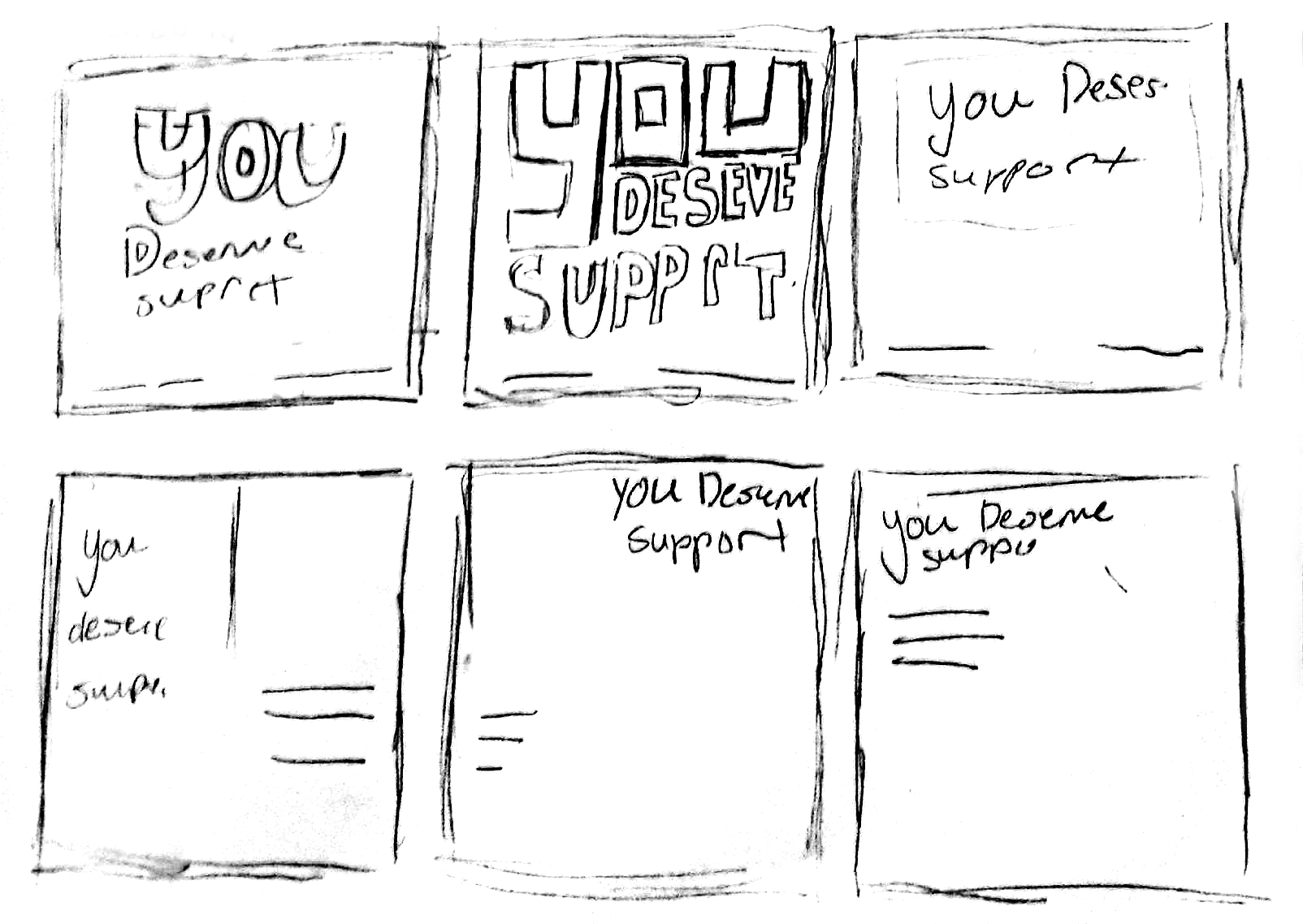
Because it was National Breastfeeding Month, I decided to put the focus on the person breastfeeding. The big things I wanted to stand out were the illustration and "You deserve support".
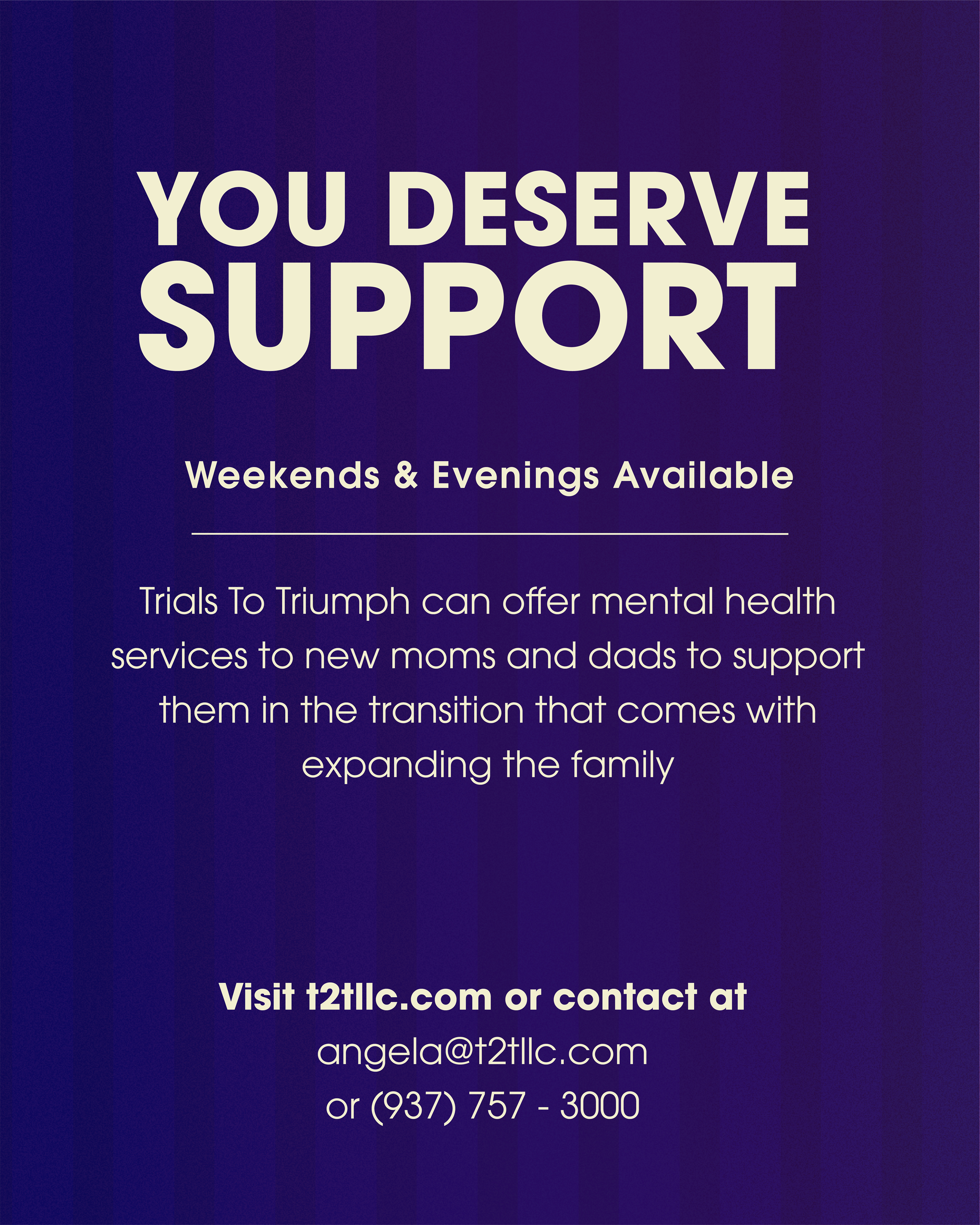
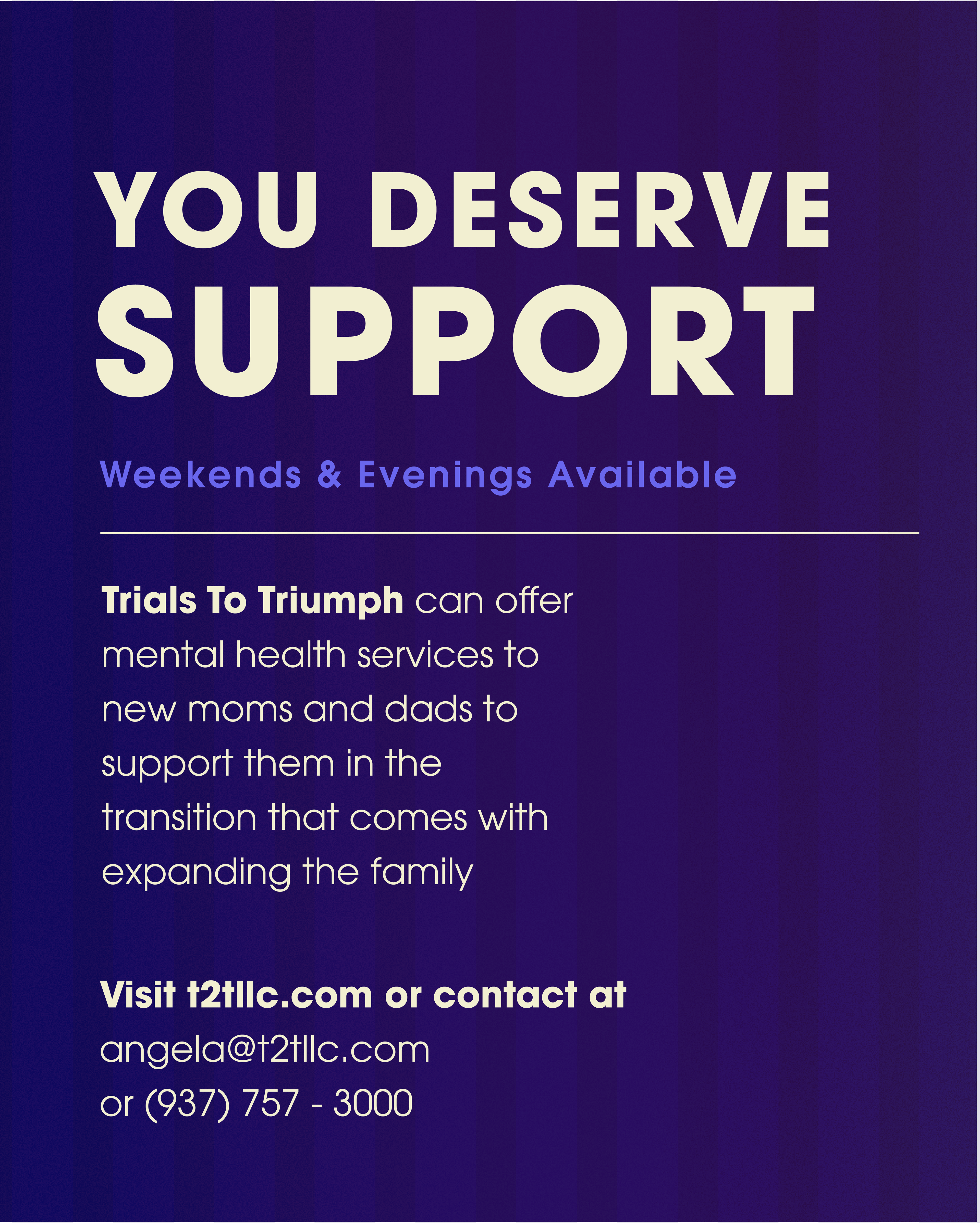
Inital Interations
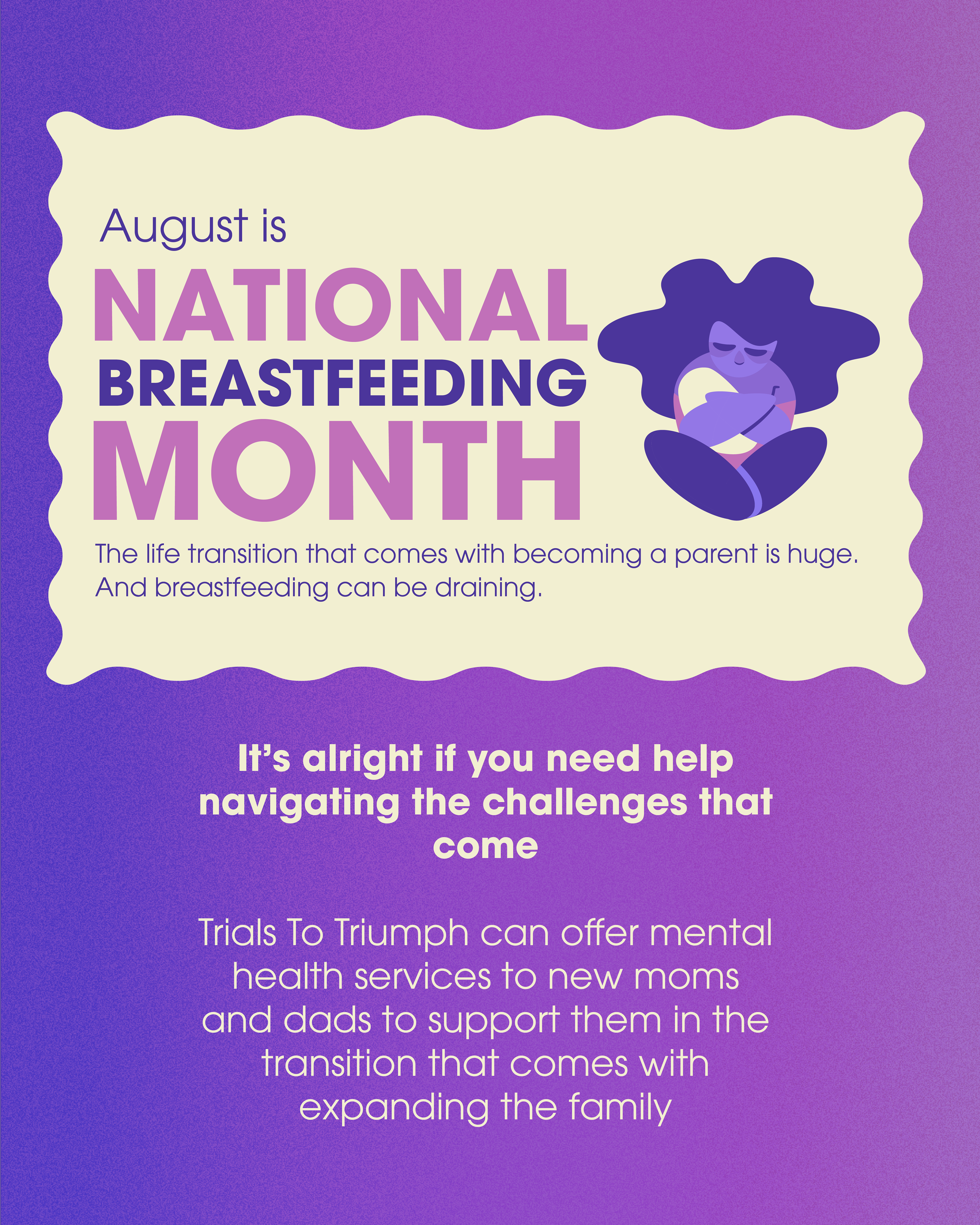
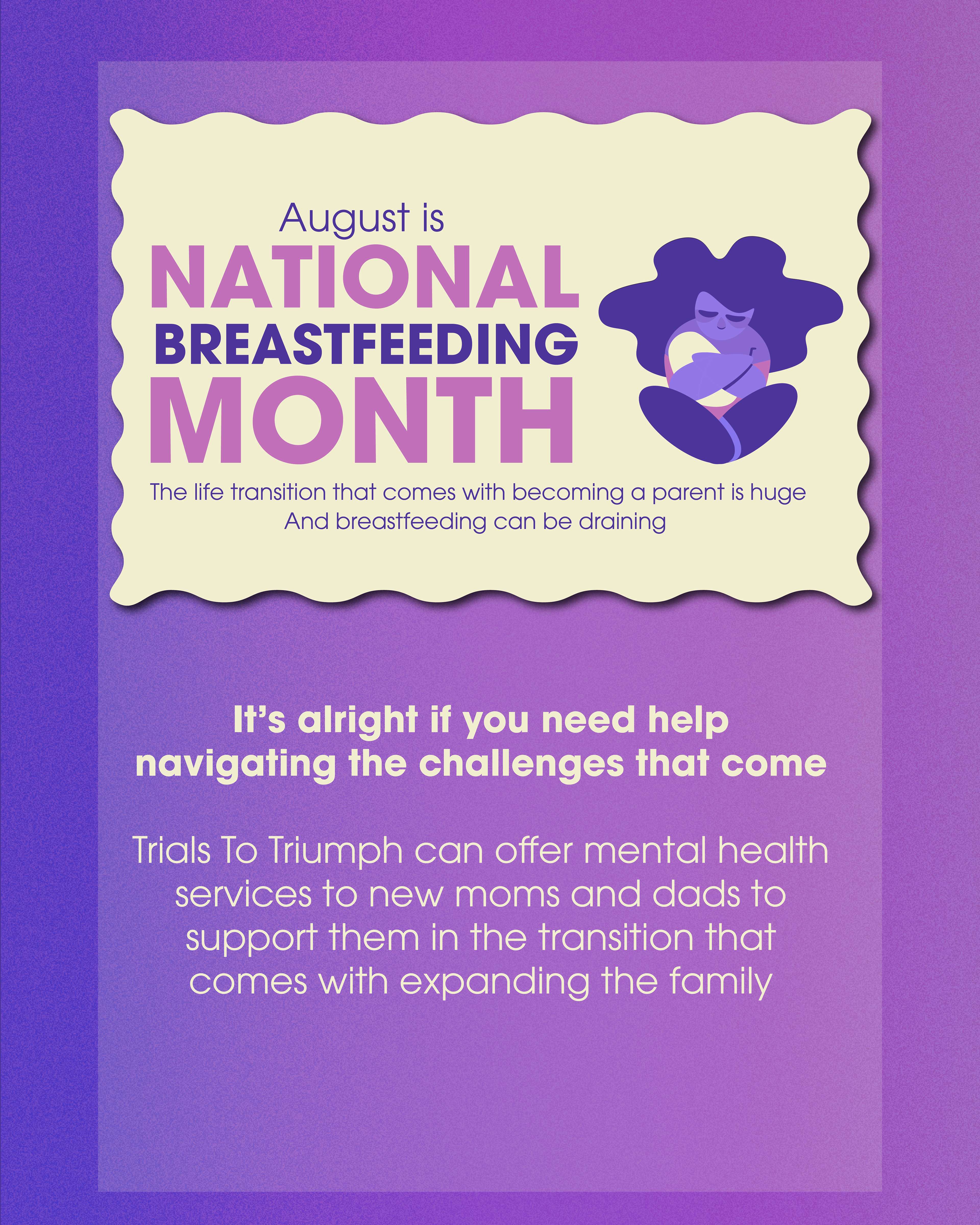
When I transferred it to digital, I took inspiration from the colors for National Breastfeeding Month, along with wanting softer, more traditionally feminine colors for it.
Refinement
Much like the previous slides, I played around with sizing and spacing; I also shifted the image around, trying to find a good spot for it.
FINAL