REference
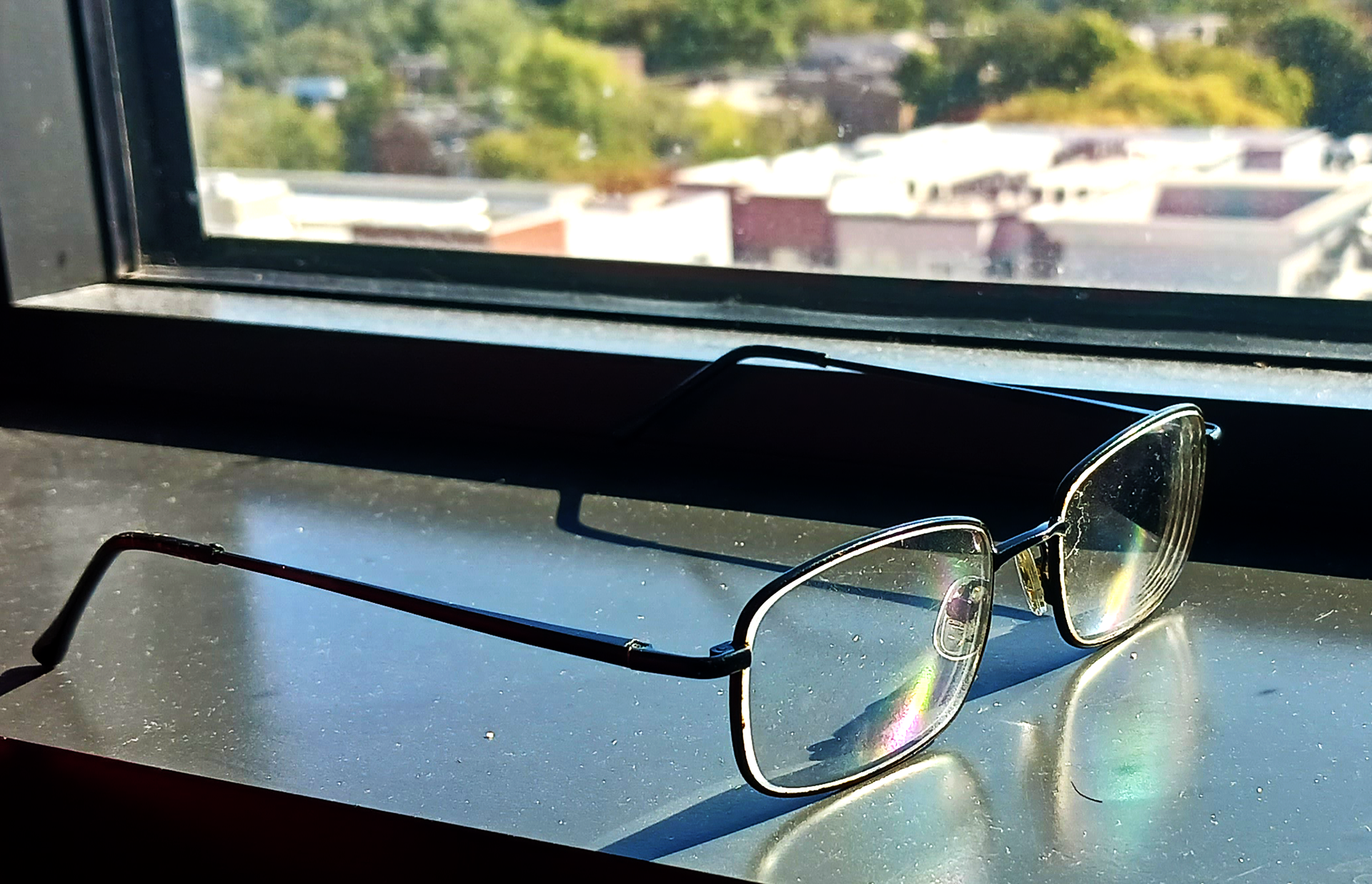
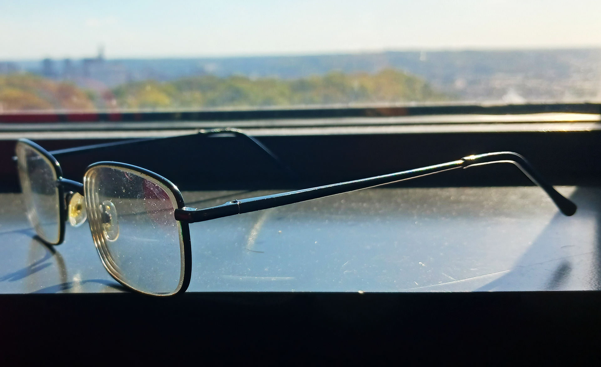
For this project, we had to pick an object and take it through several different stages, with it eventually leading to making an icon and then a logo.
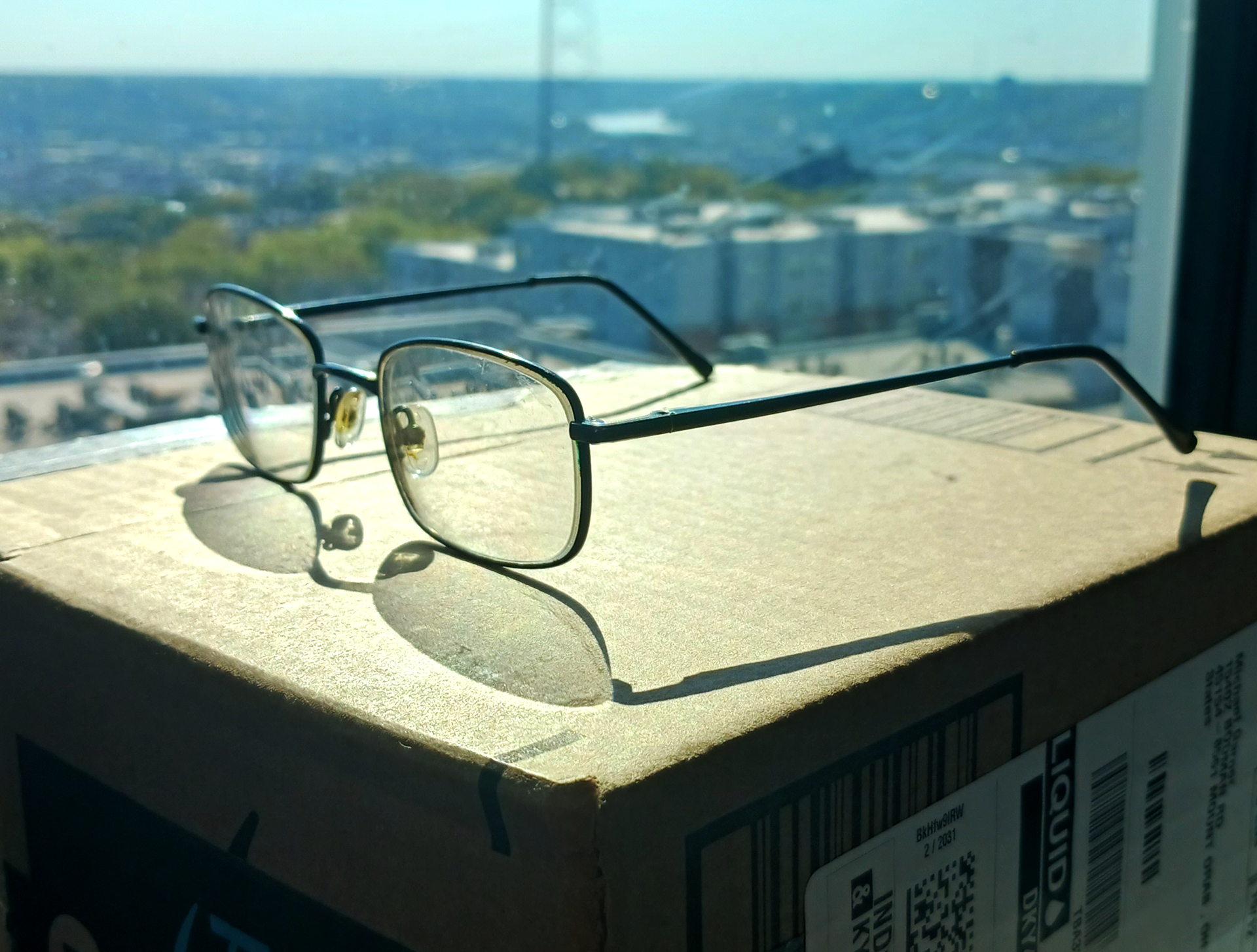
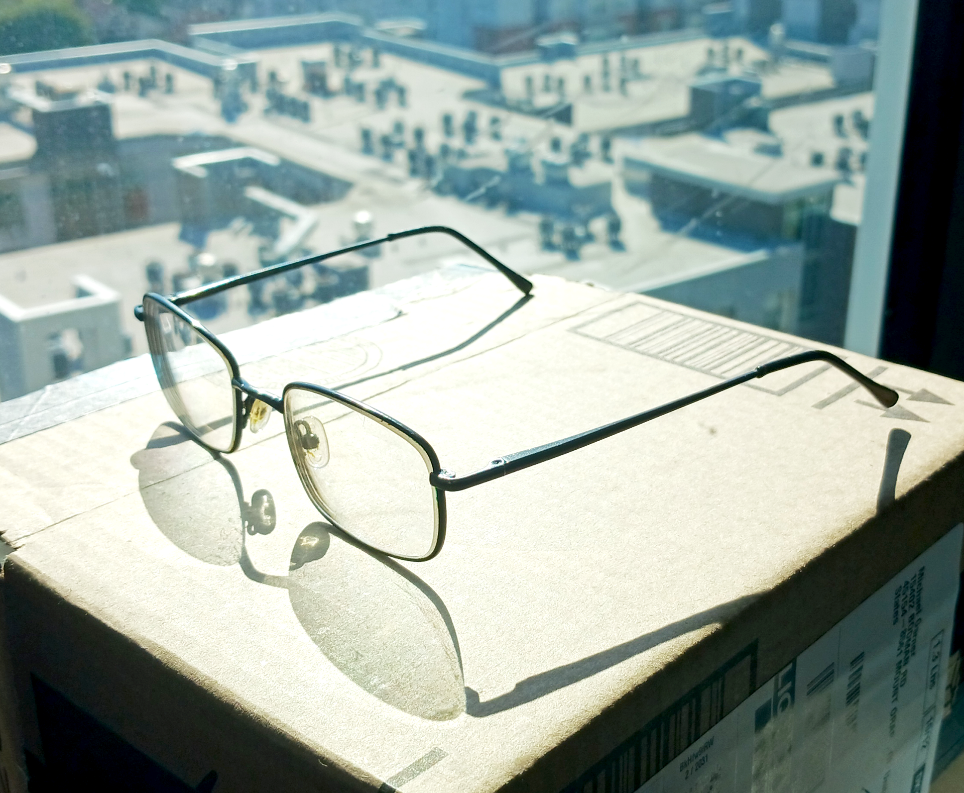
Sketches
We started on sketches of the object, focusing more on the lines, no shading or coloring.
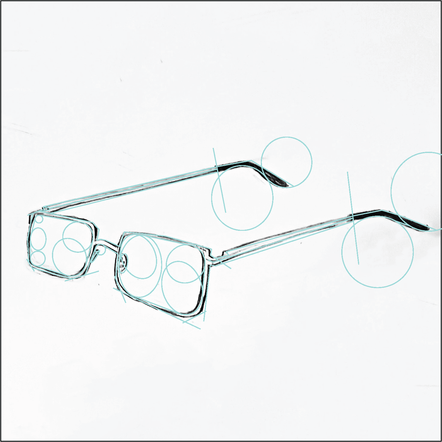
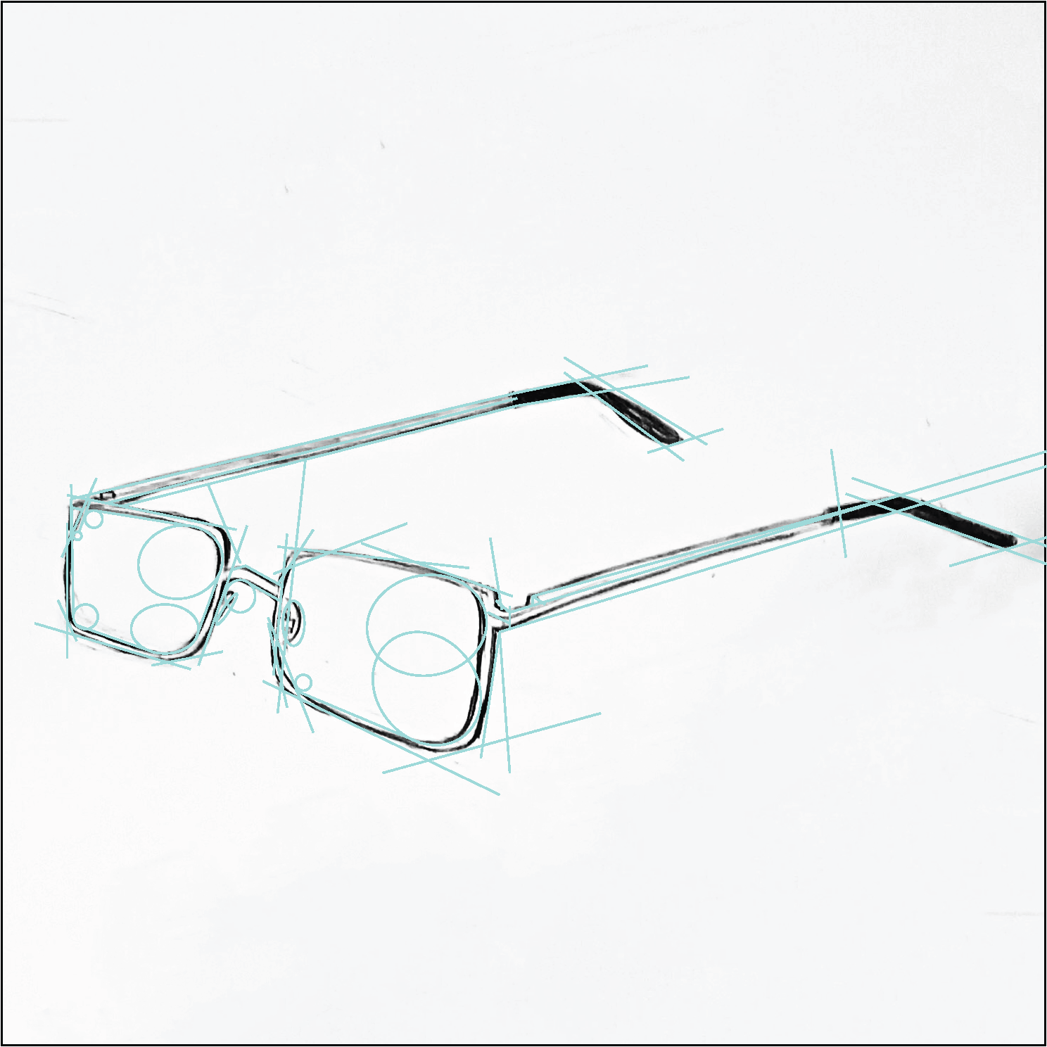
After that, we mapped out the straight lines and the curves in the objects.
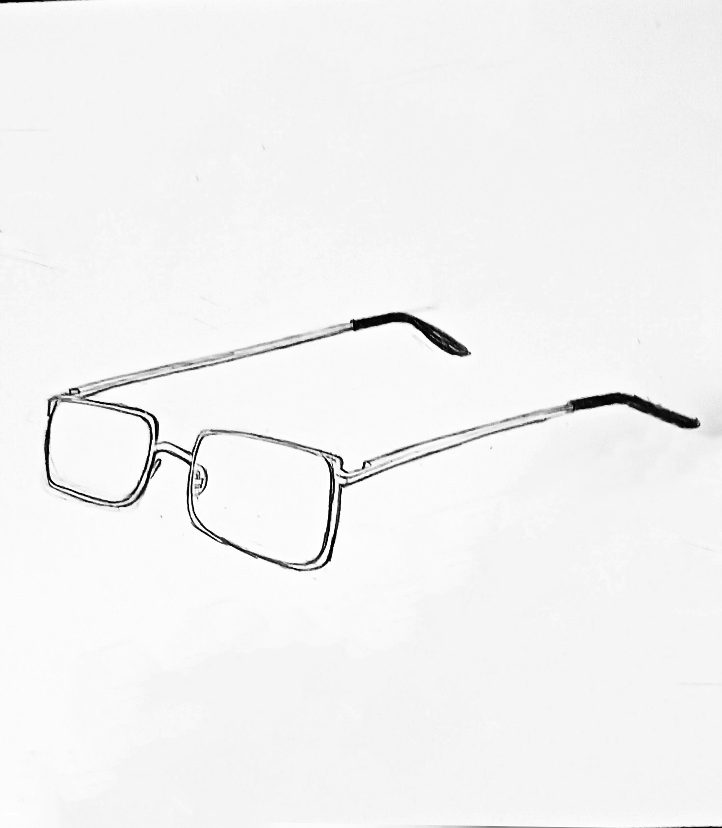
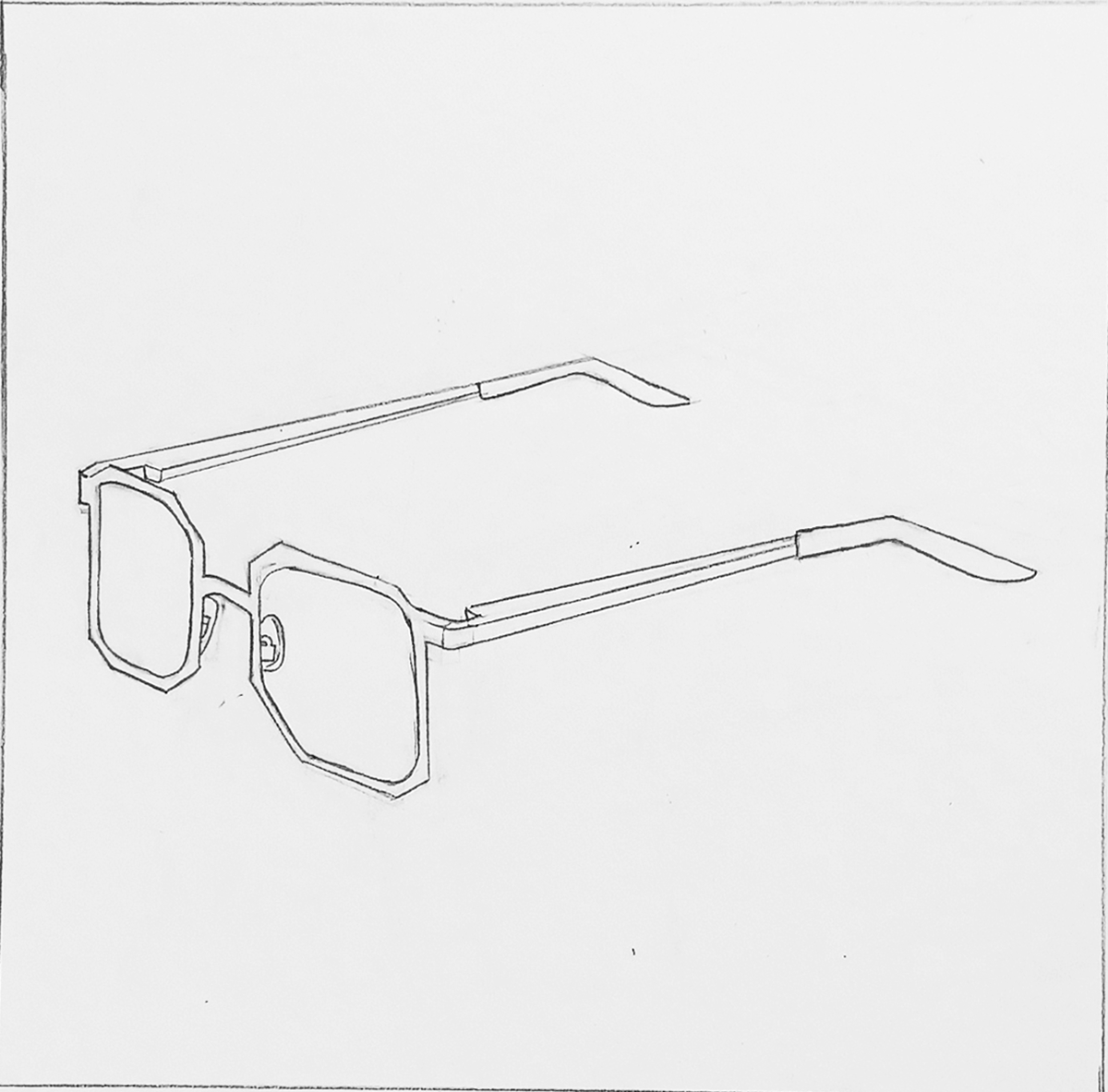
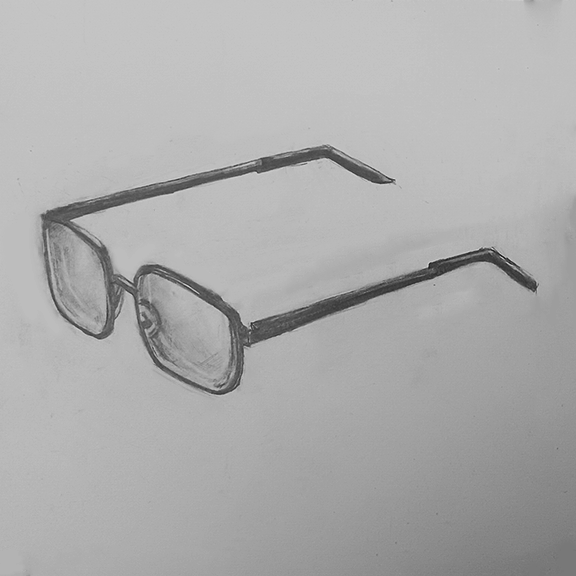
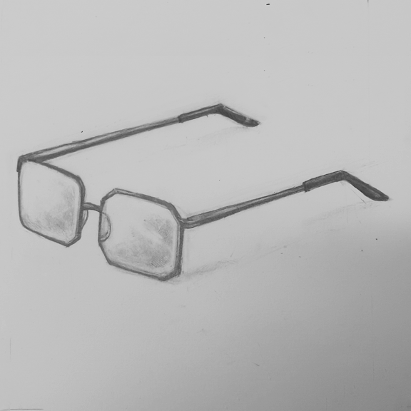
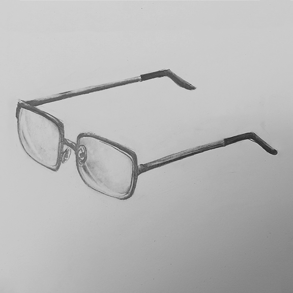
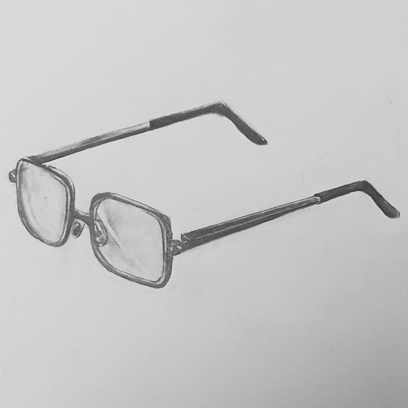
After that, we started drawing to map the shadow and light. What I had a particular focus on was the lenses and how light and shadow interacted.
Digital Translation
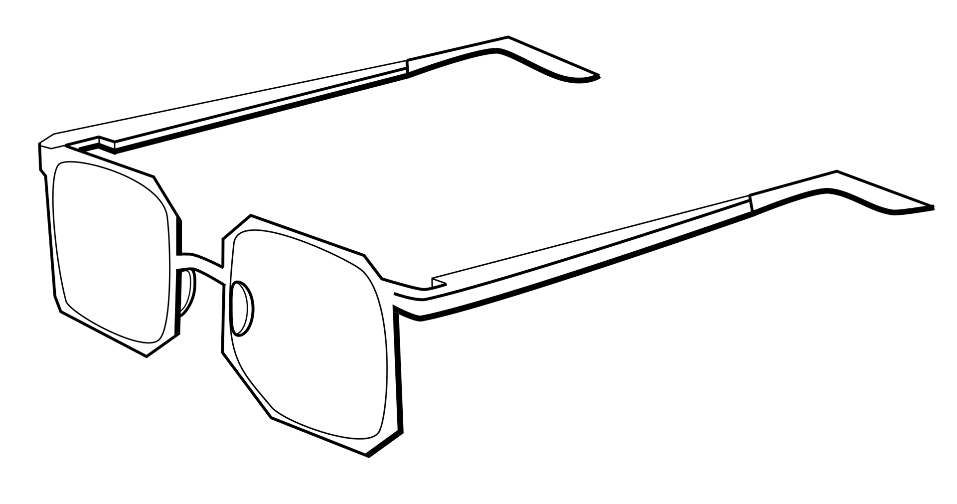
Taking the object into digital, the first thing we were set to do was lines. We had to pay special attention to line weight, using it to convey where the shadows are.
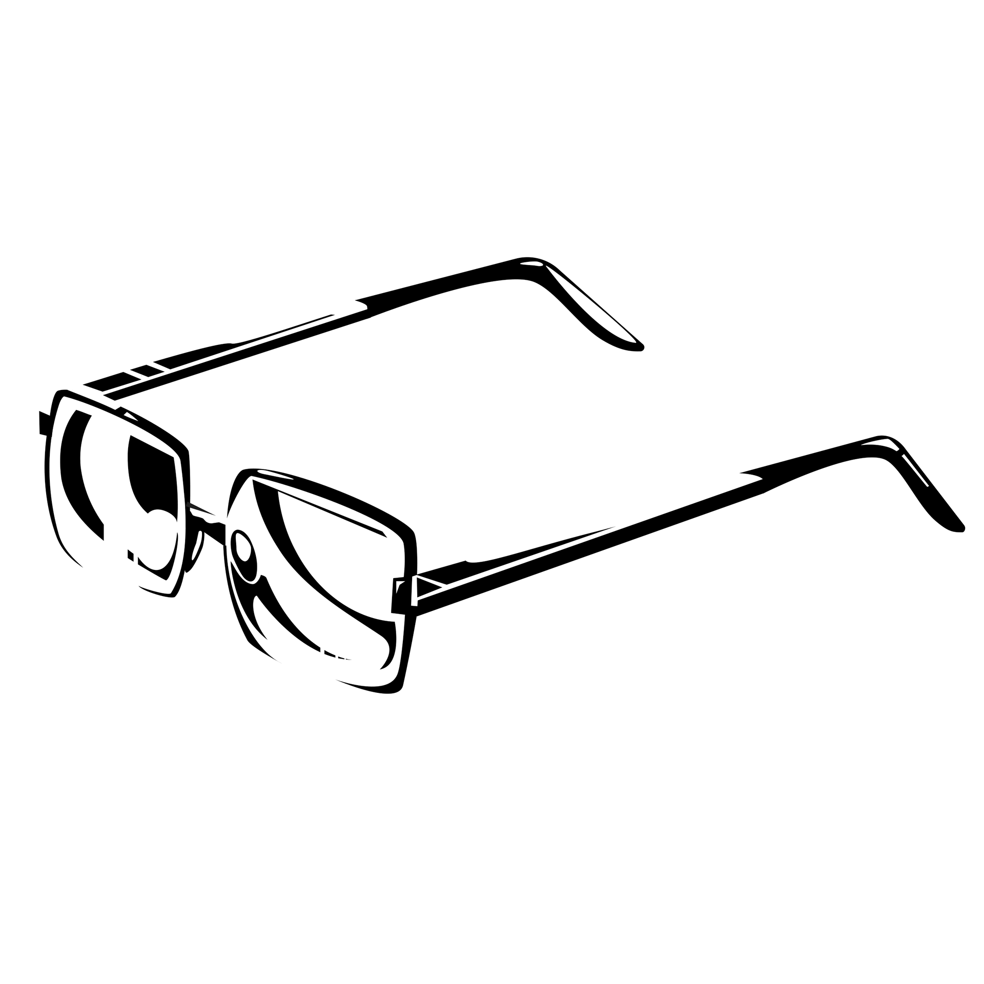
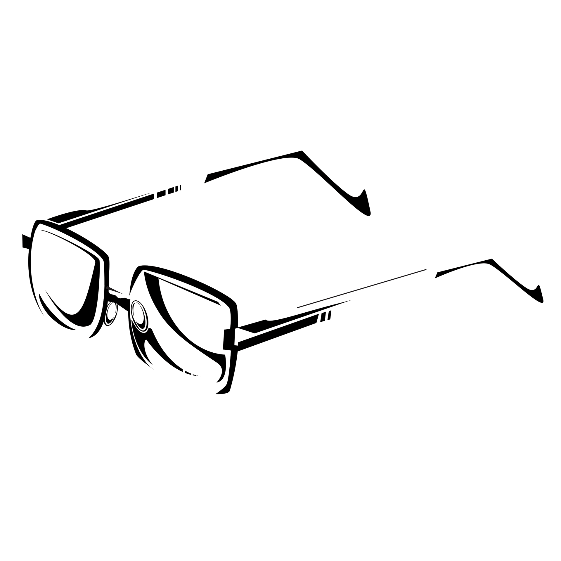
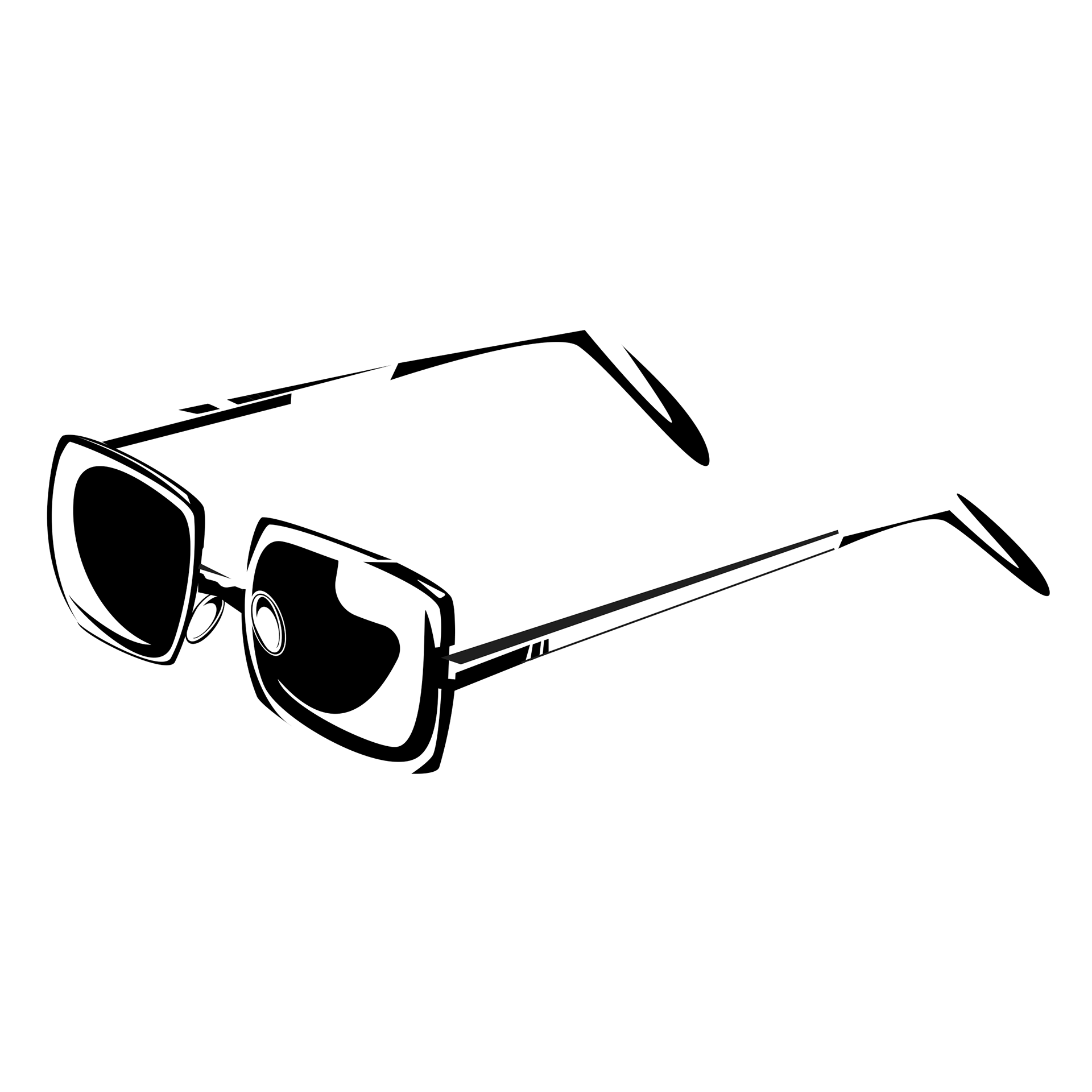
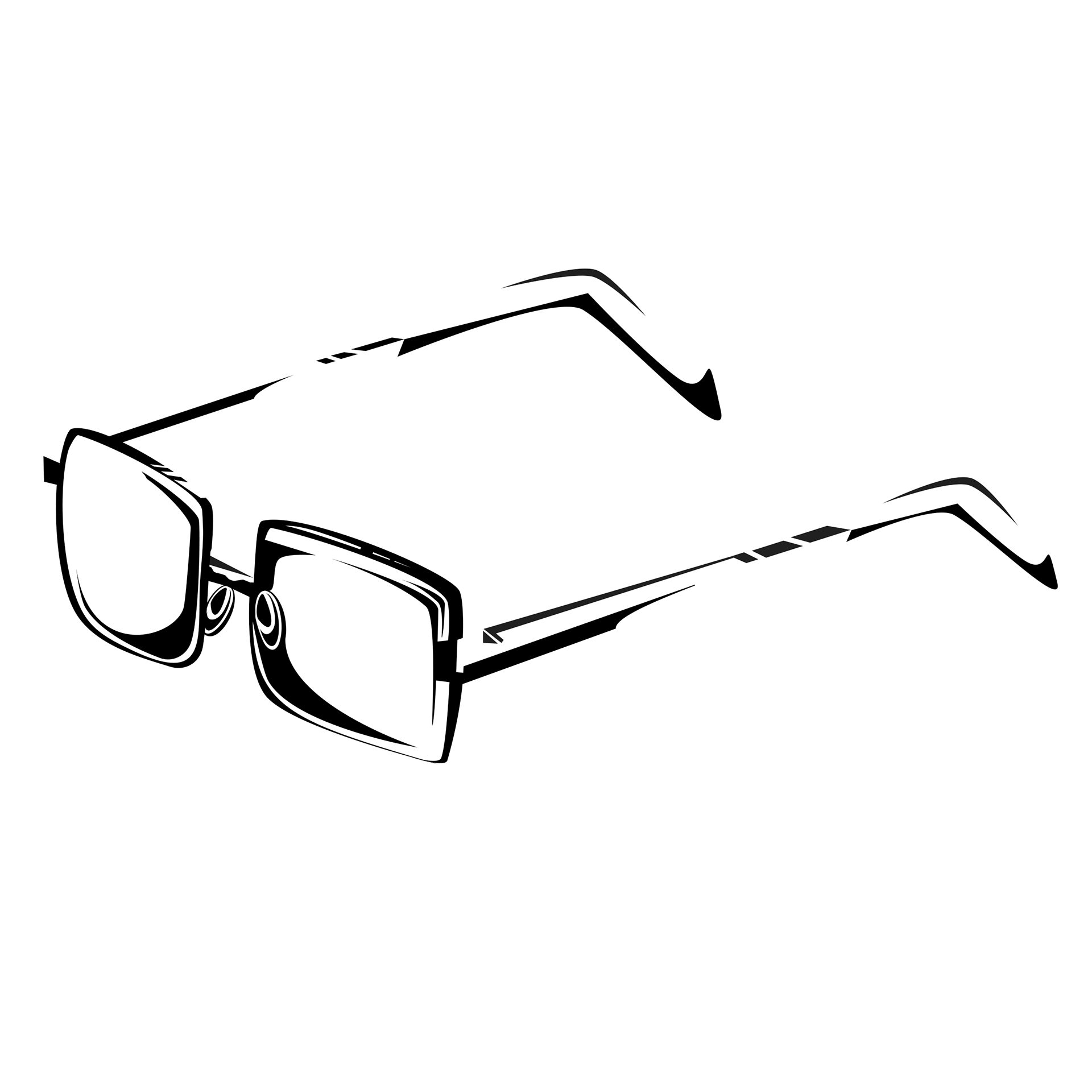
Moving forward with the graphic translation, we started trying to build the objects using the shadows. Once again, one of my biggest focuses was how I wanted to show the lenses interacting with light.
Icon
Iterations
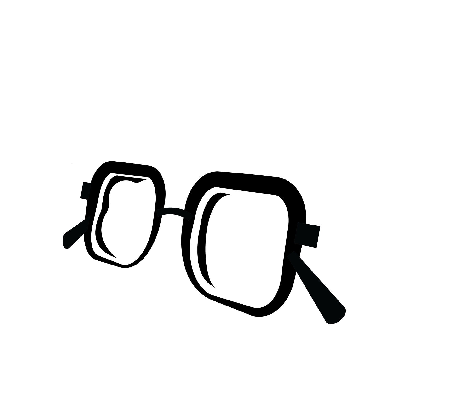
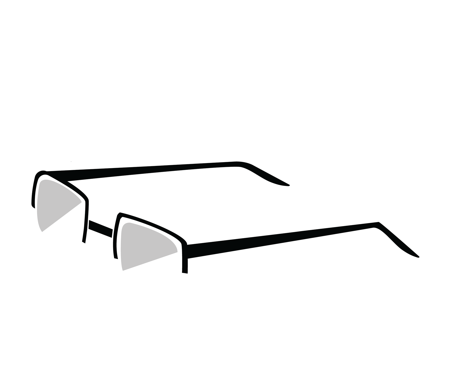
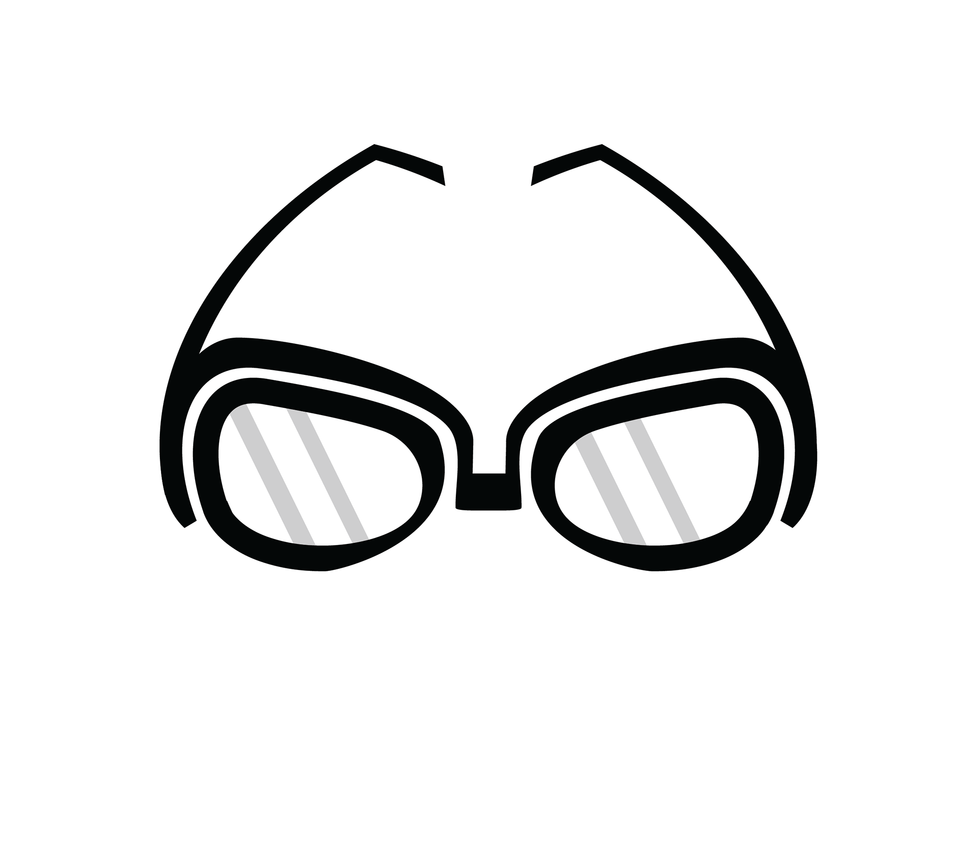
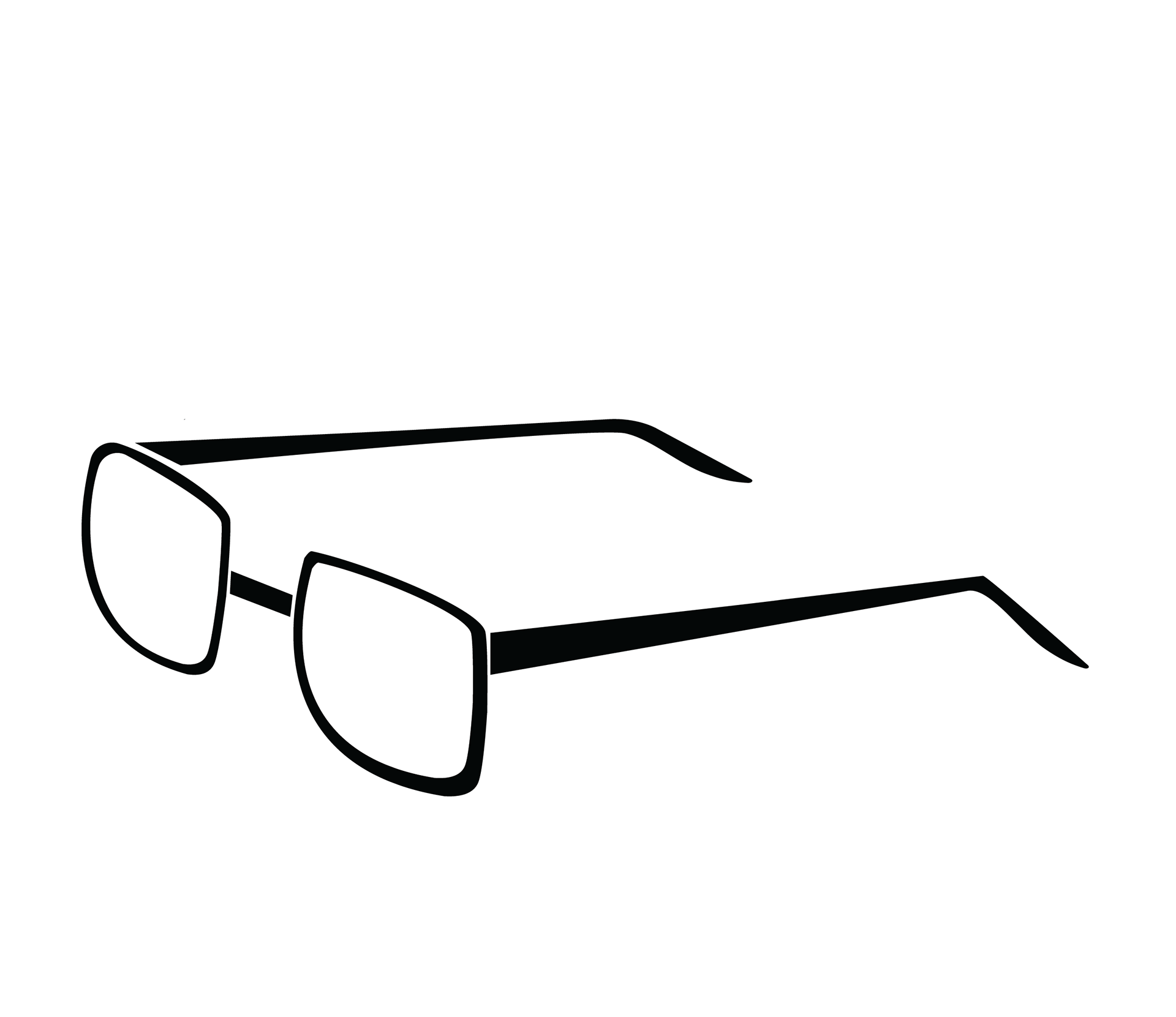
With the icon, I was experimenting with a more exaggerated approach and a simplified, more true-to-form one.
Final
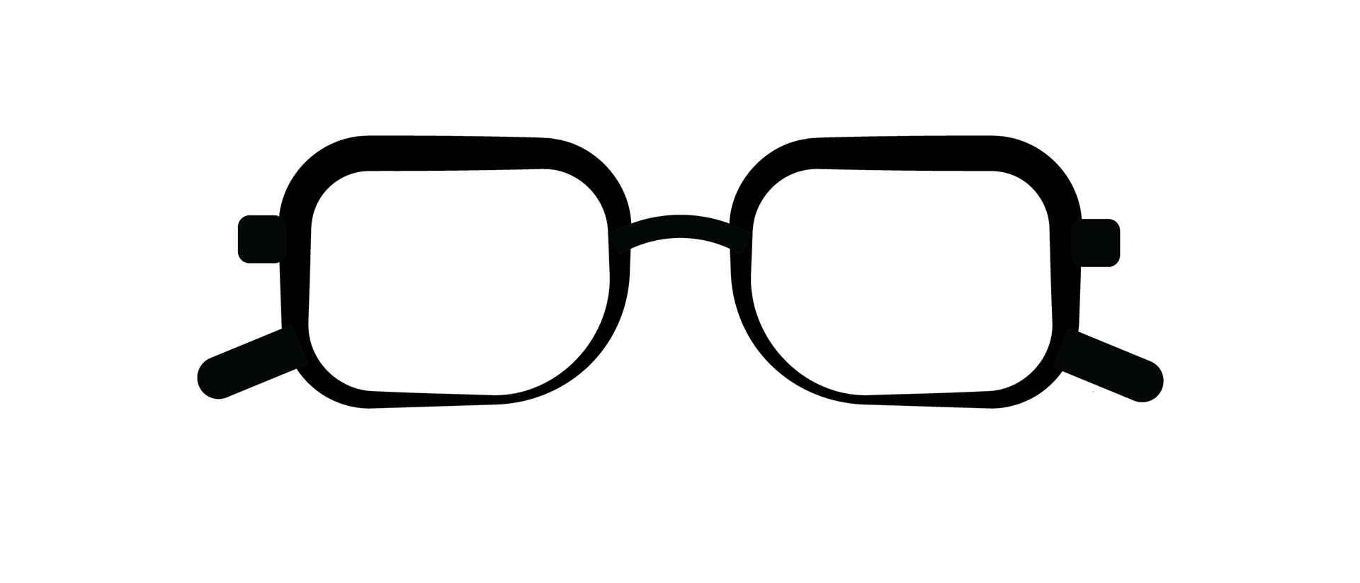
In the end, I chose one that felt like a combined version of the two.
Logo
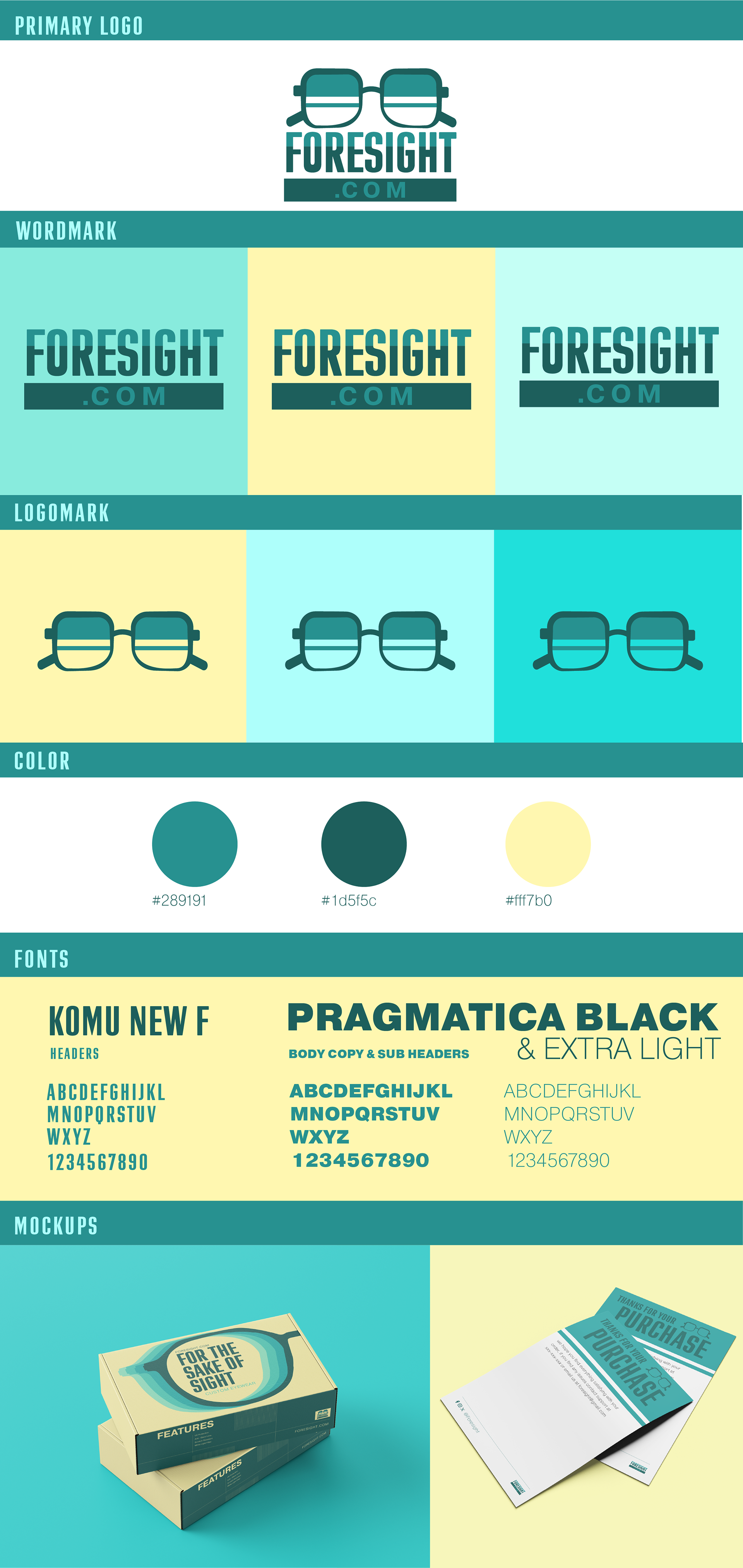
Witht the logo, we also brought in some of the icons that we made during our iteration process. With the decisions, I gravitated toward more vibrant colors to give the feeling of excitement.





Final
In the end, I chose a blue scheme for the logo because blue conveys a sense of security, which foresight.com would want to project when shipping people's glasses.
Overall Final