RESEARCH
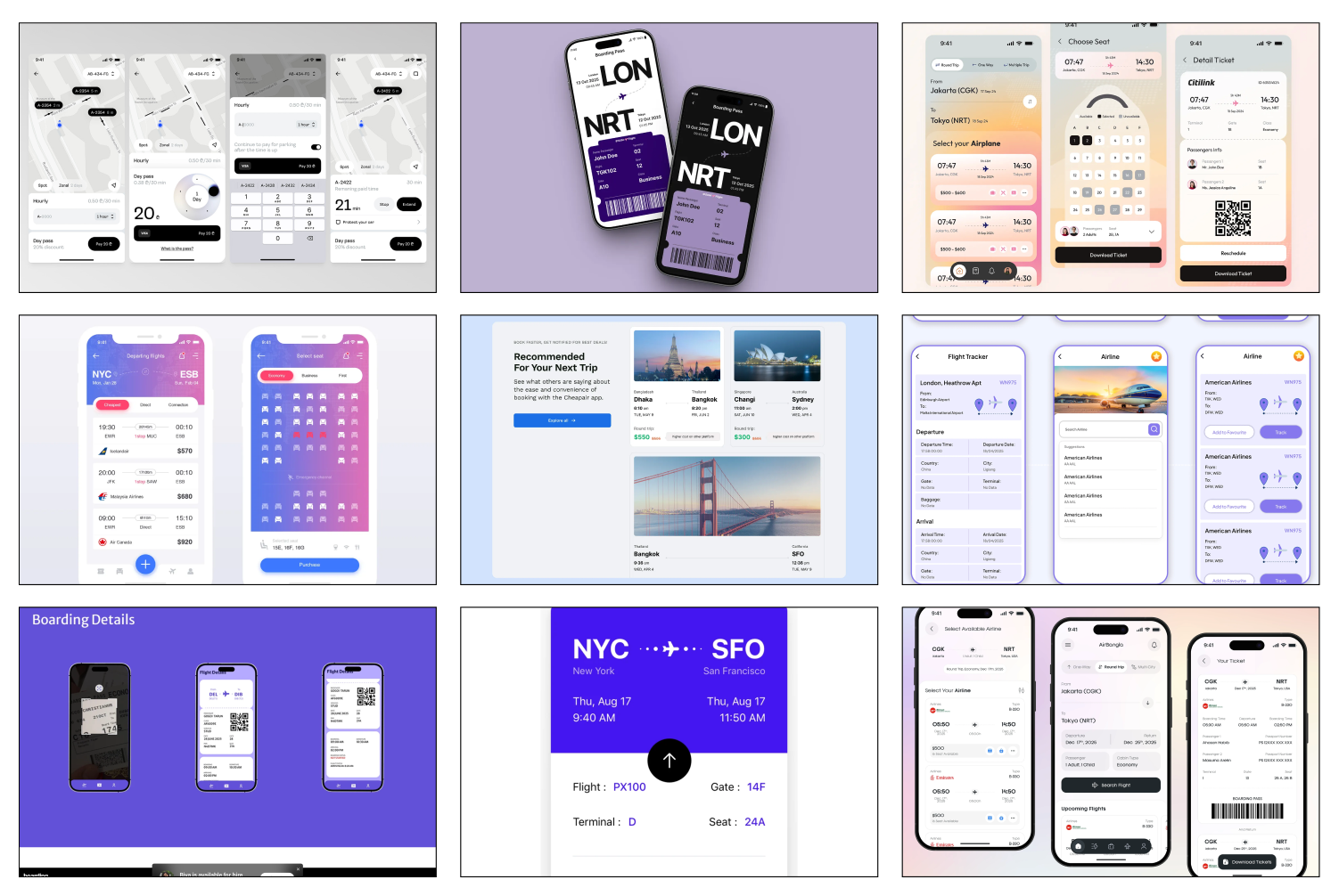
I began this project by selecting different images I would take inspiration from. I wanted to try a lot of different things, and because of this, my images are pretty diverse, but some things I took from them were their color palette choice and the way they arranged information.
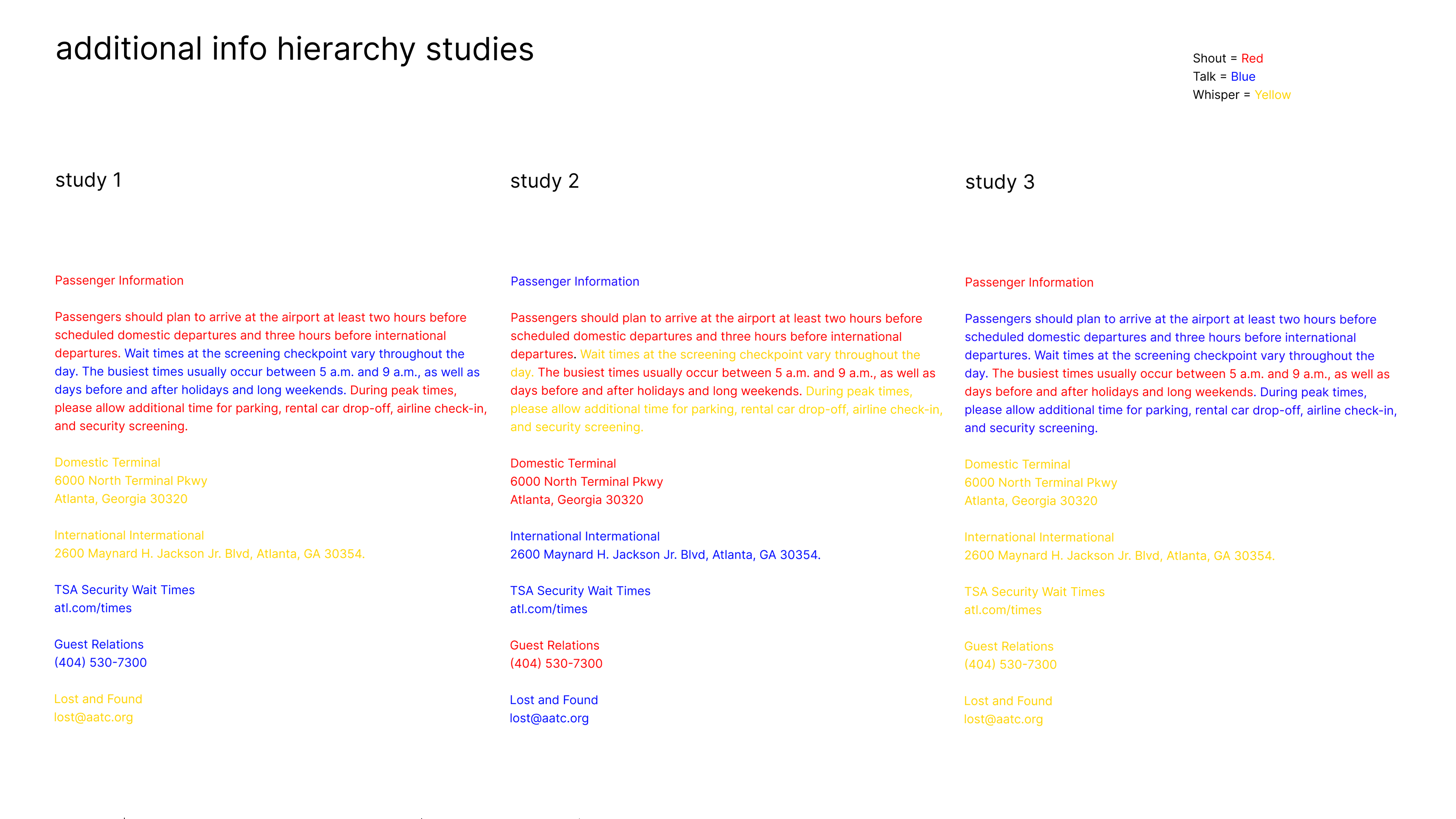
I then experiment with hierarchy, trying out different combinations.
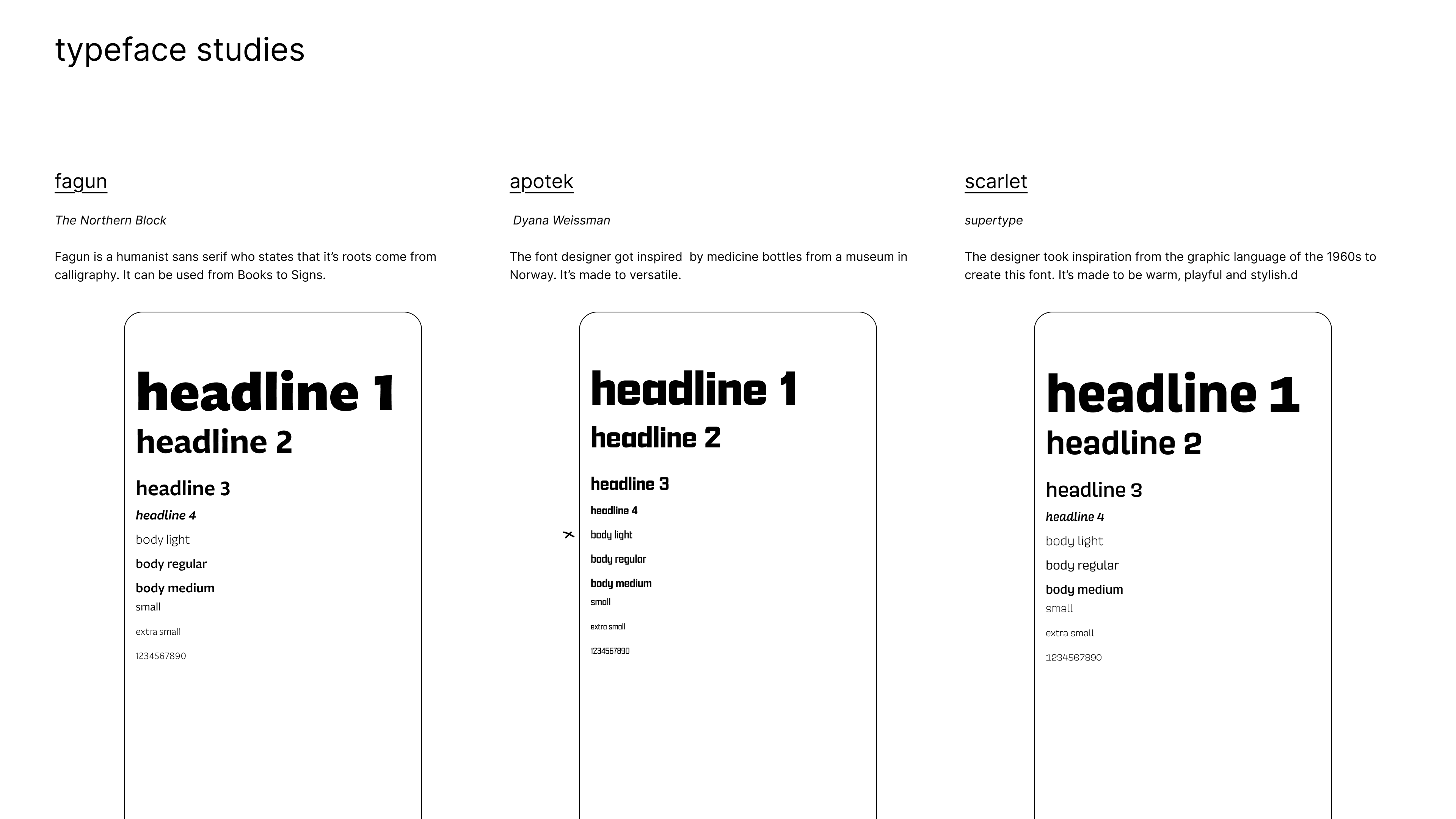
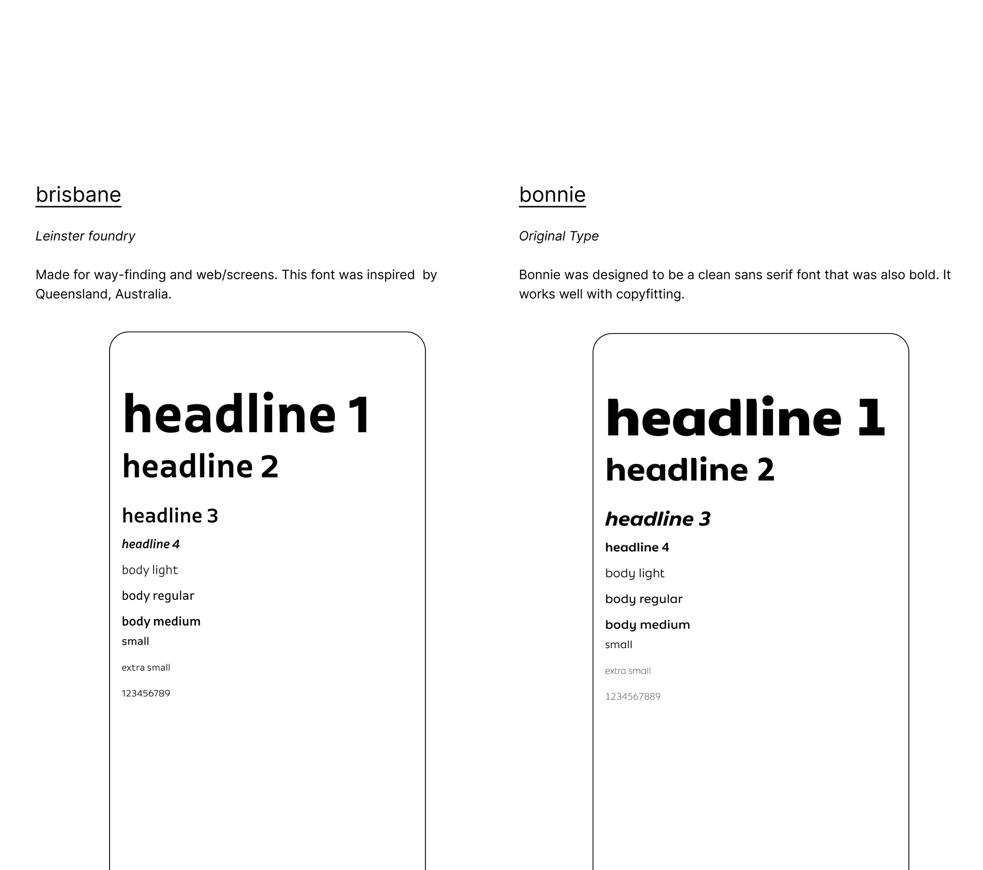
Then I tried out different fonts to see which on matched what I was going for.
Sketches
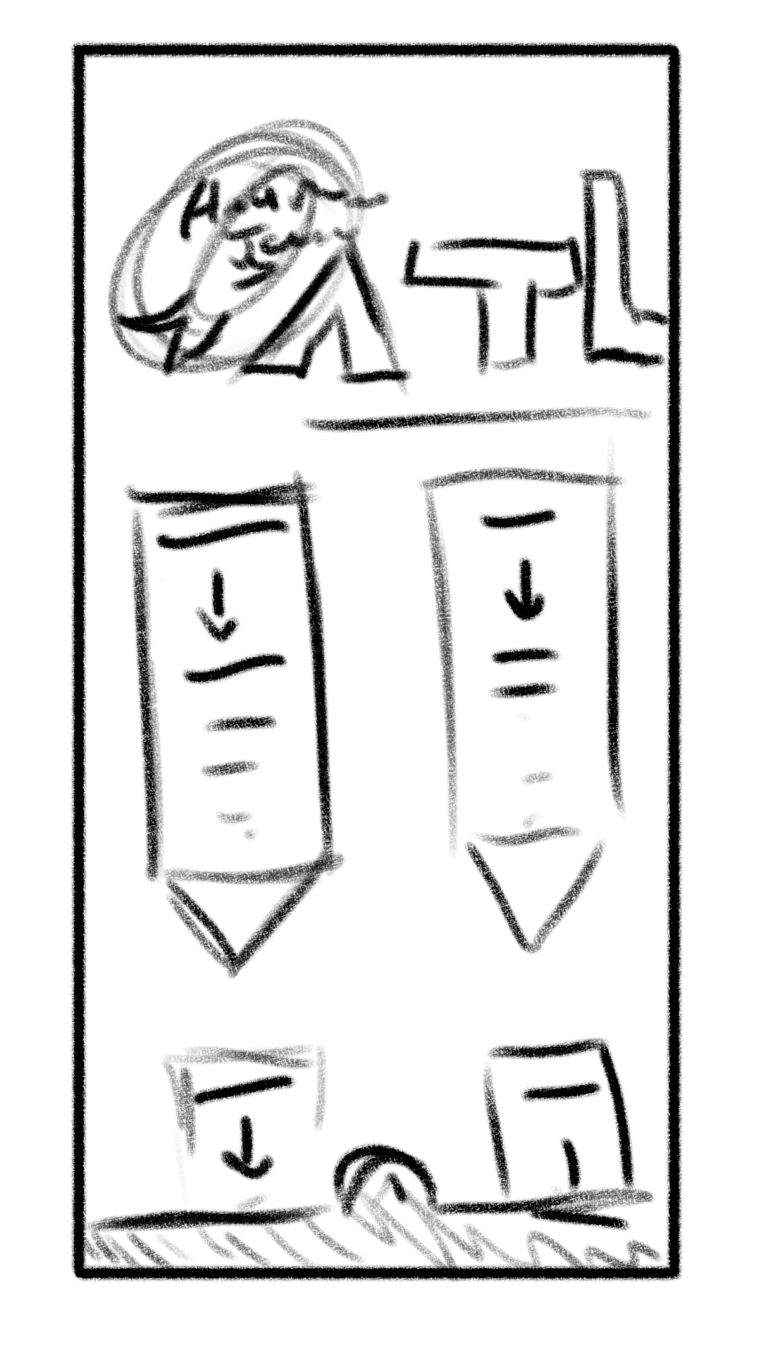
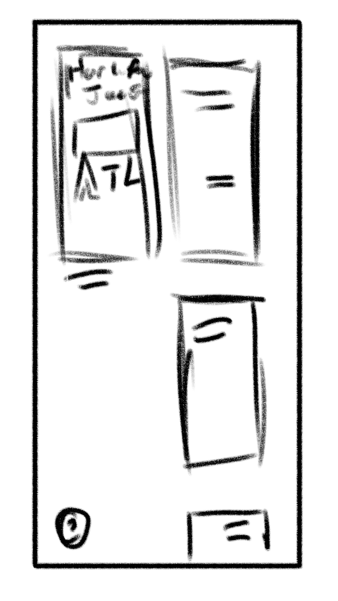
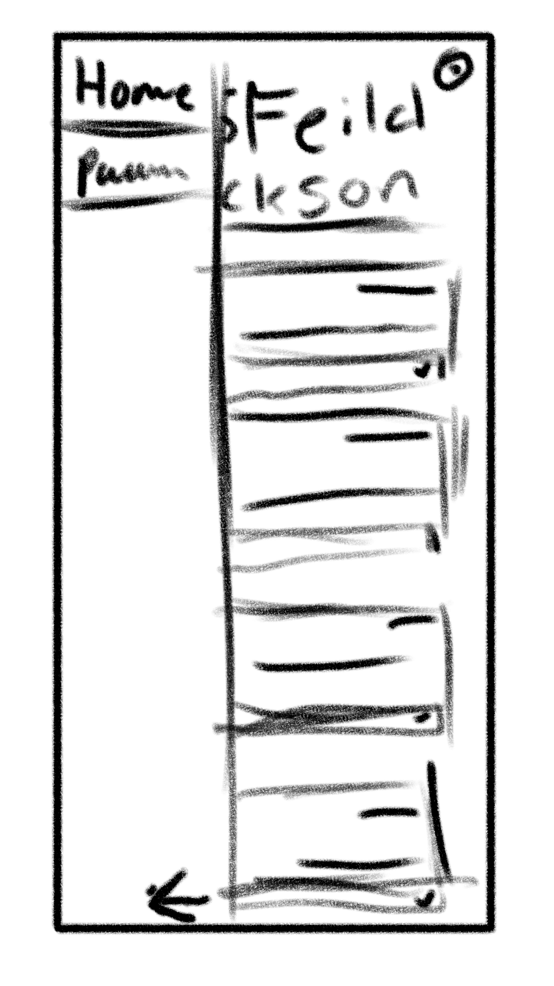
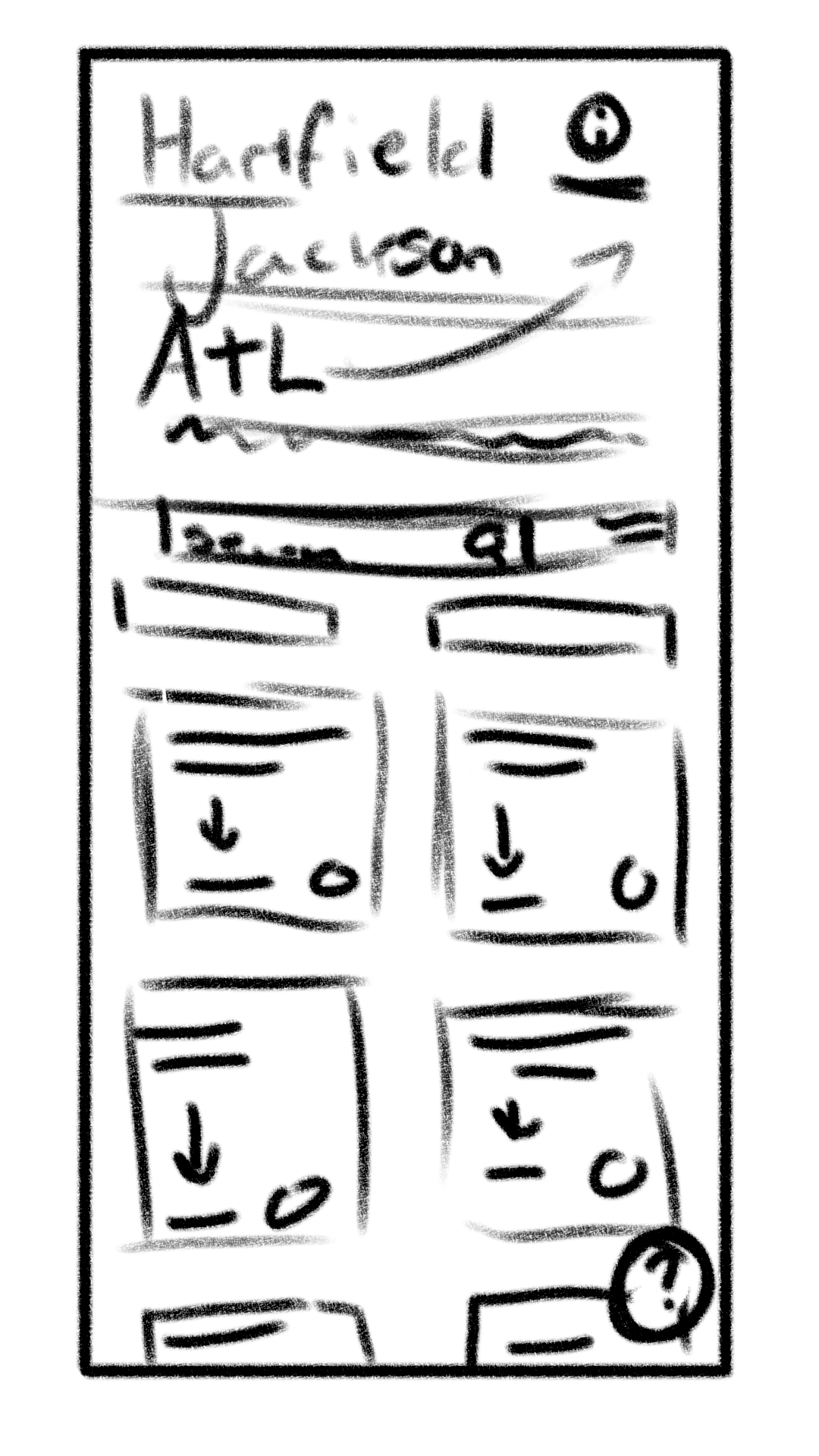
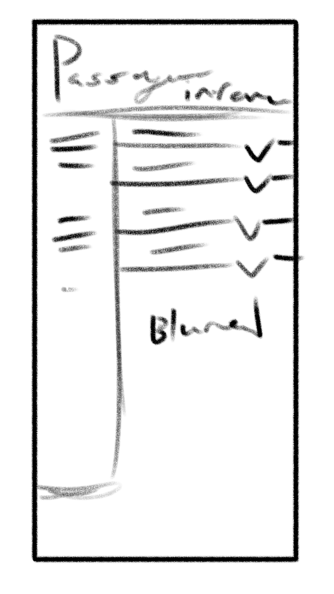
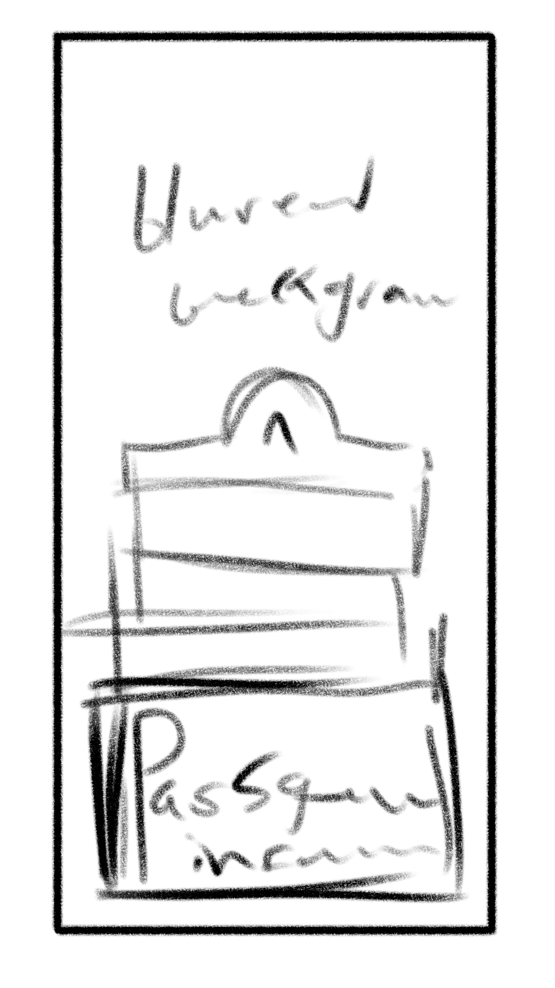
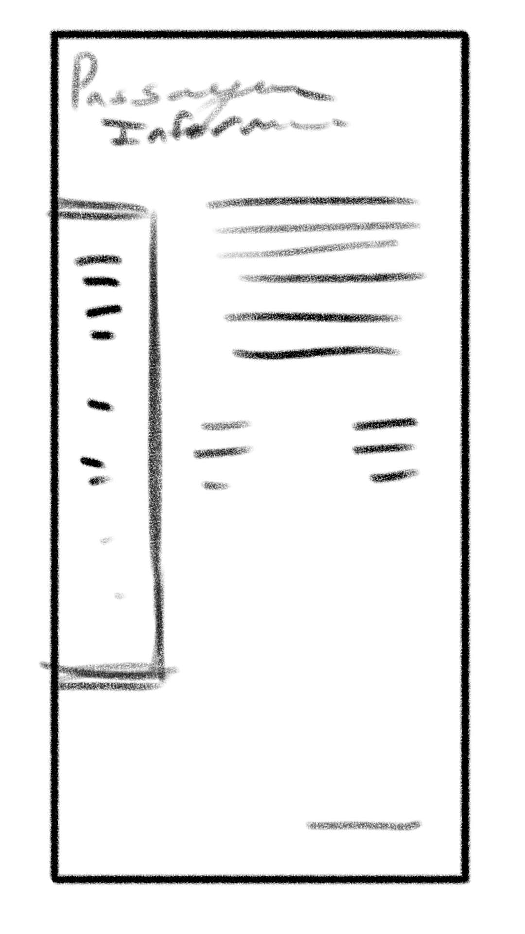
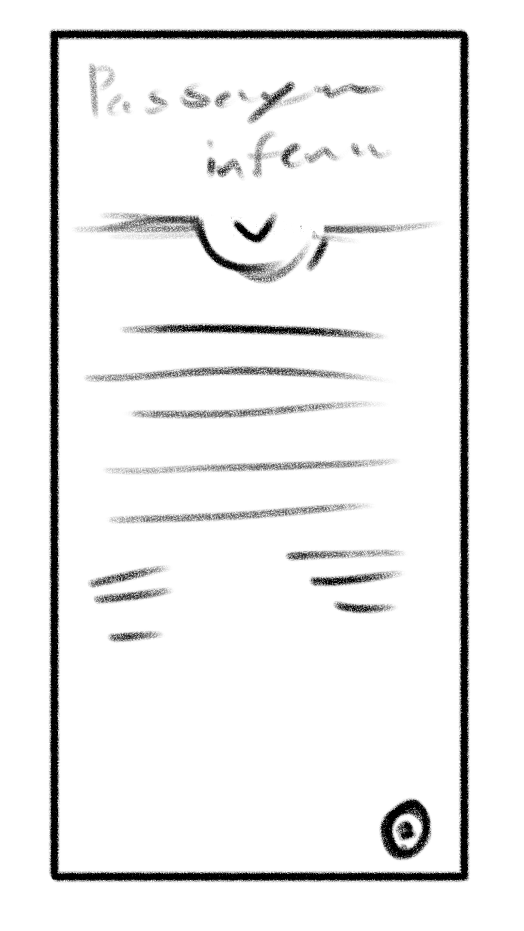
With the sketches, I wanted to be more experimental with different layouts.
Initial Iterations
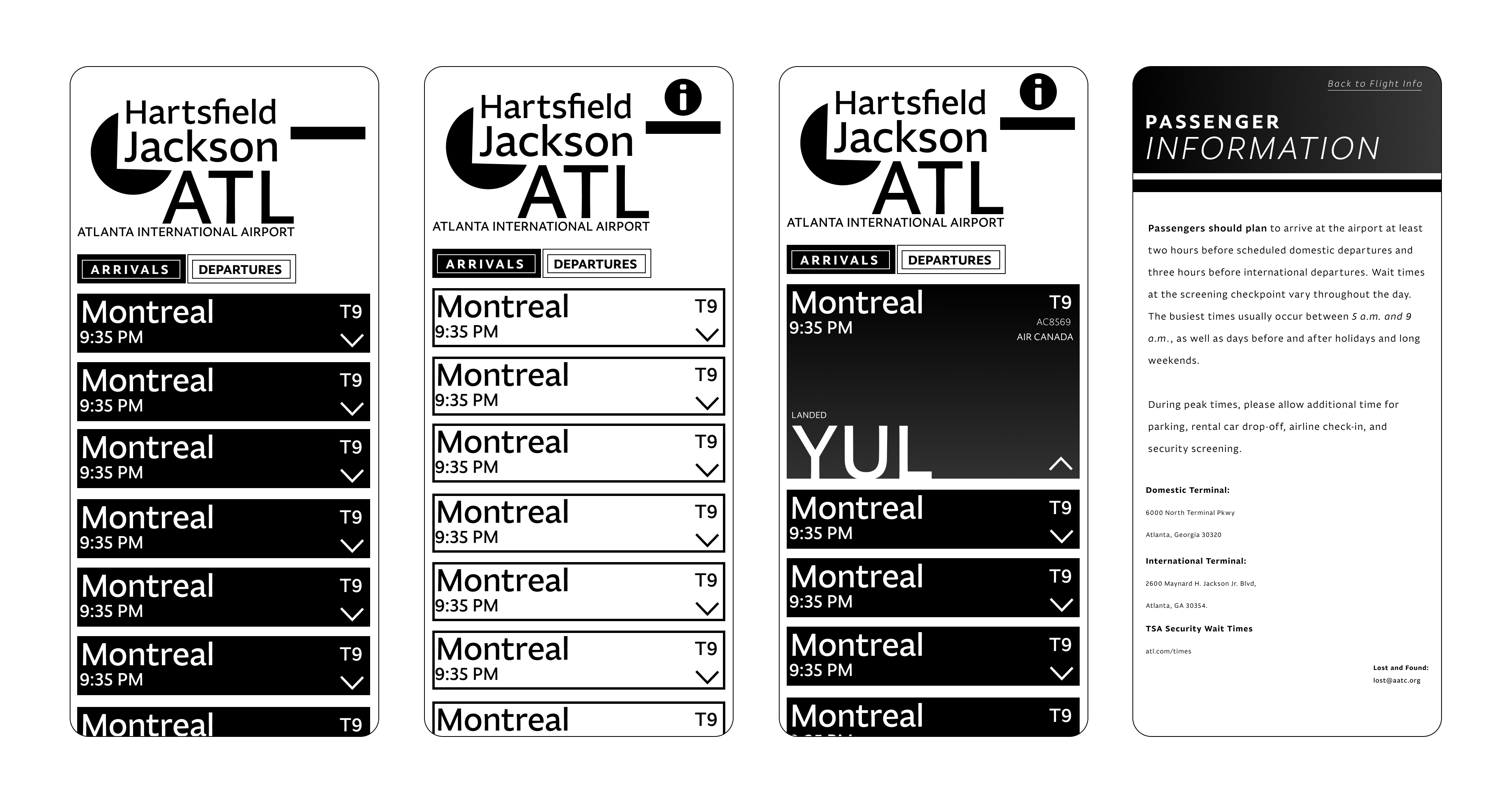
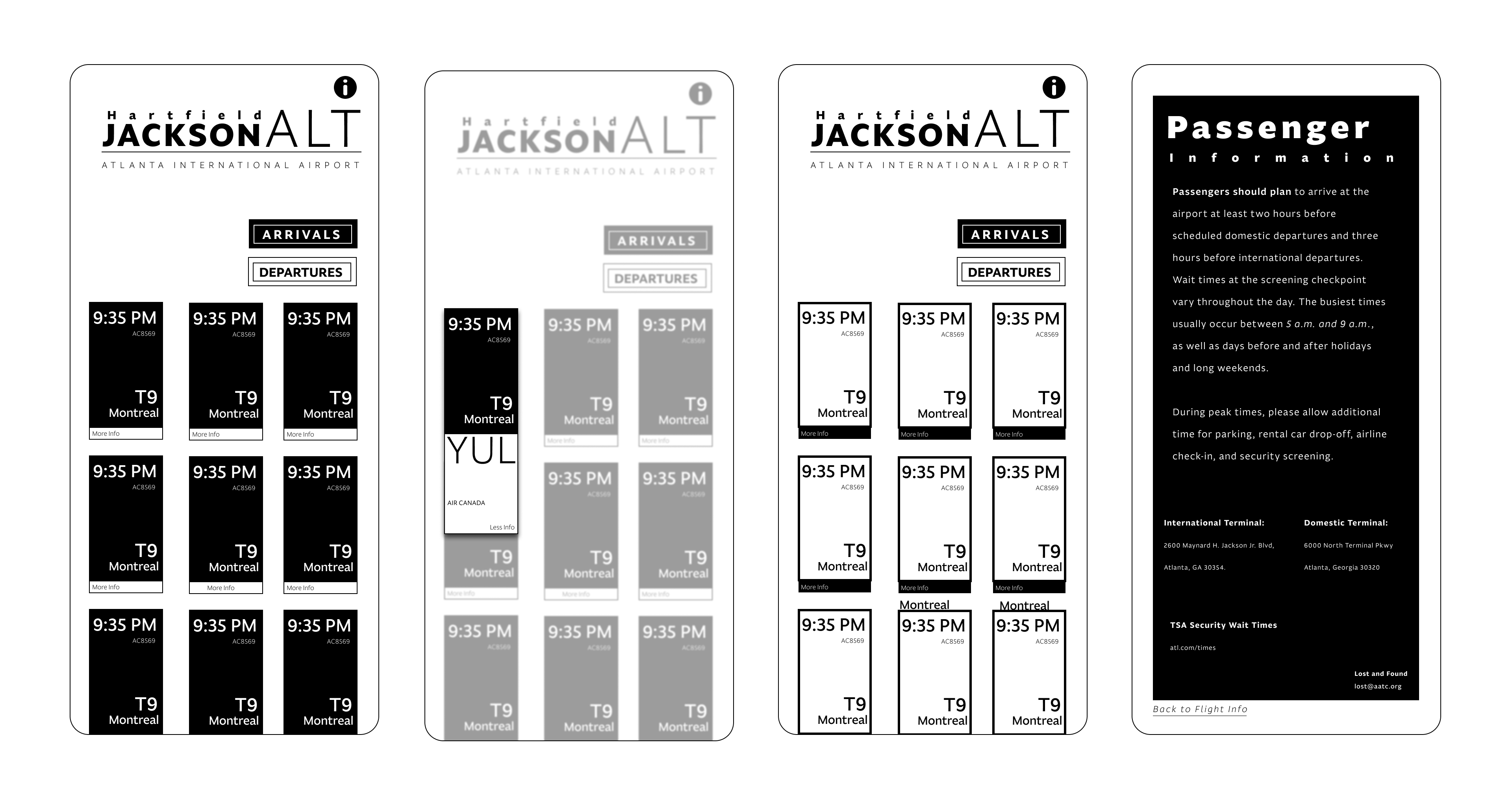
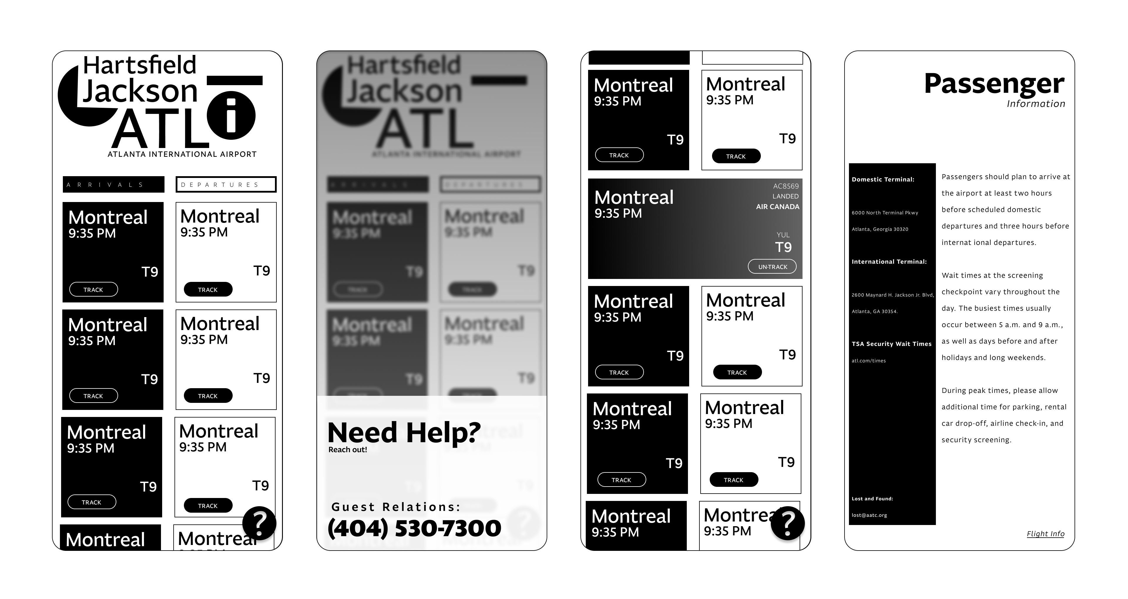
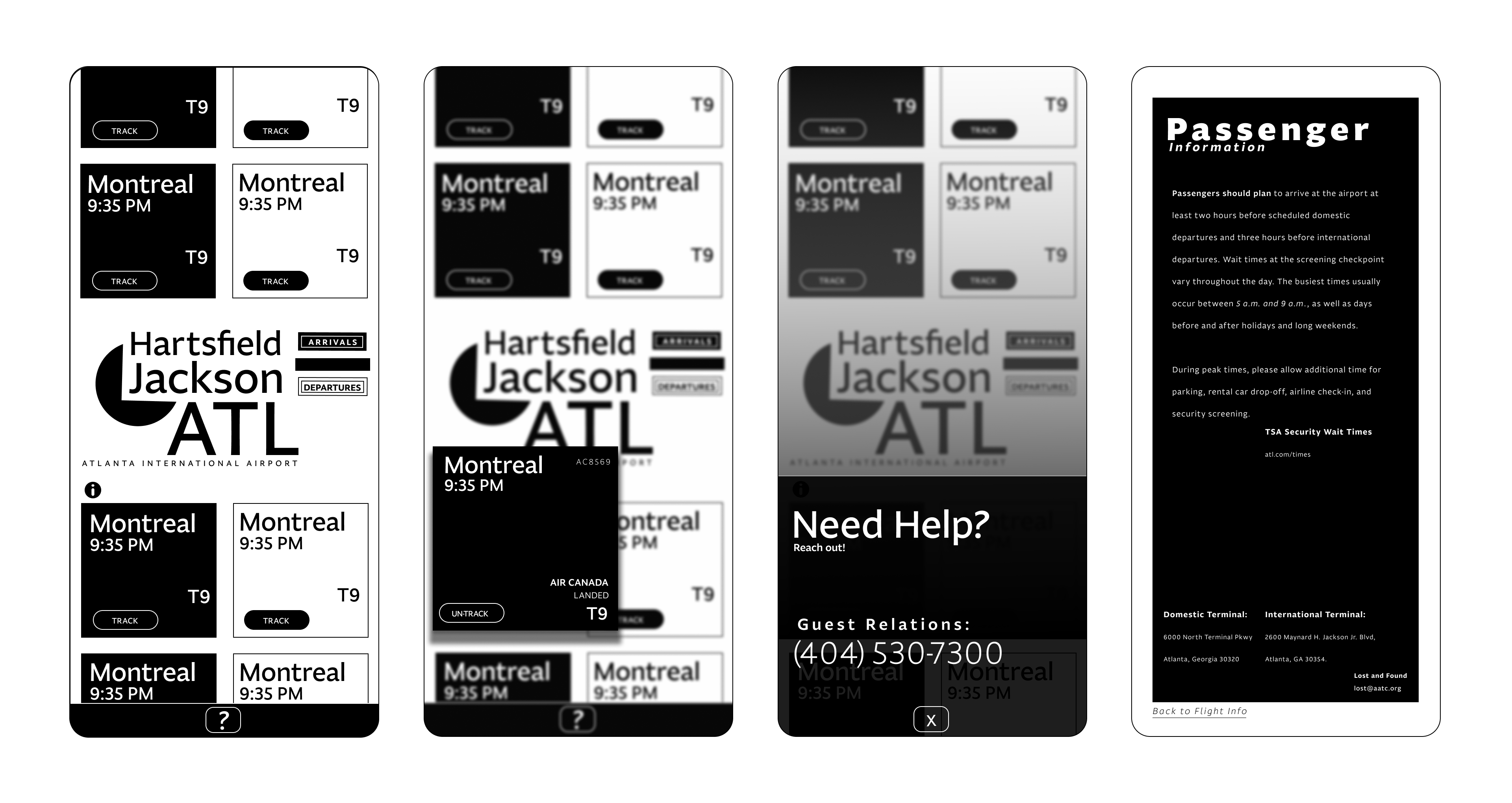
Coming into it digitally, I was still focusing at this point on experimenting but starting to rein it in.
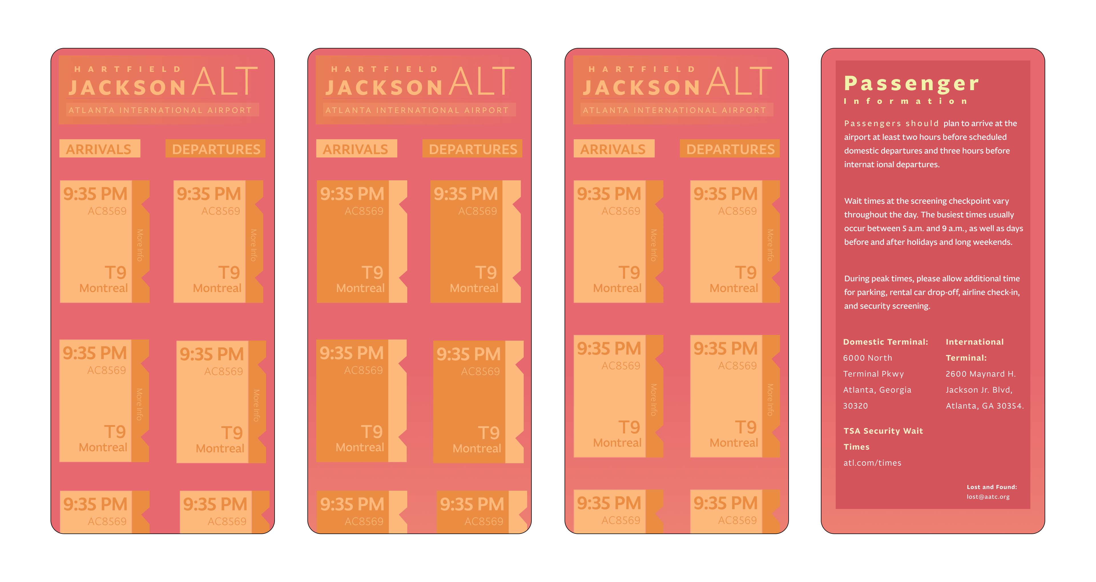
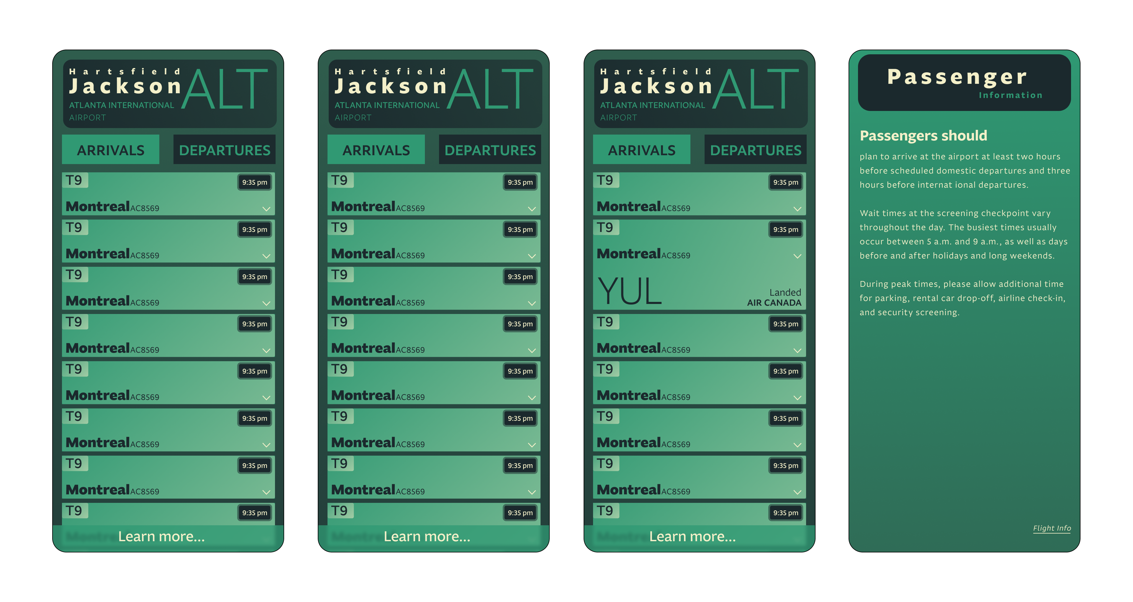
Bringing color into it, I tried a couple of different ones. I want to go with calmer colors to contrast how high-stress an airport can be.
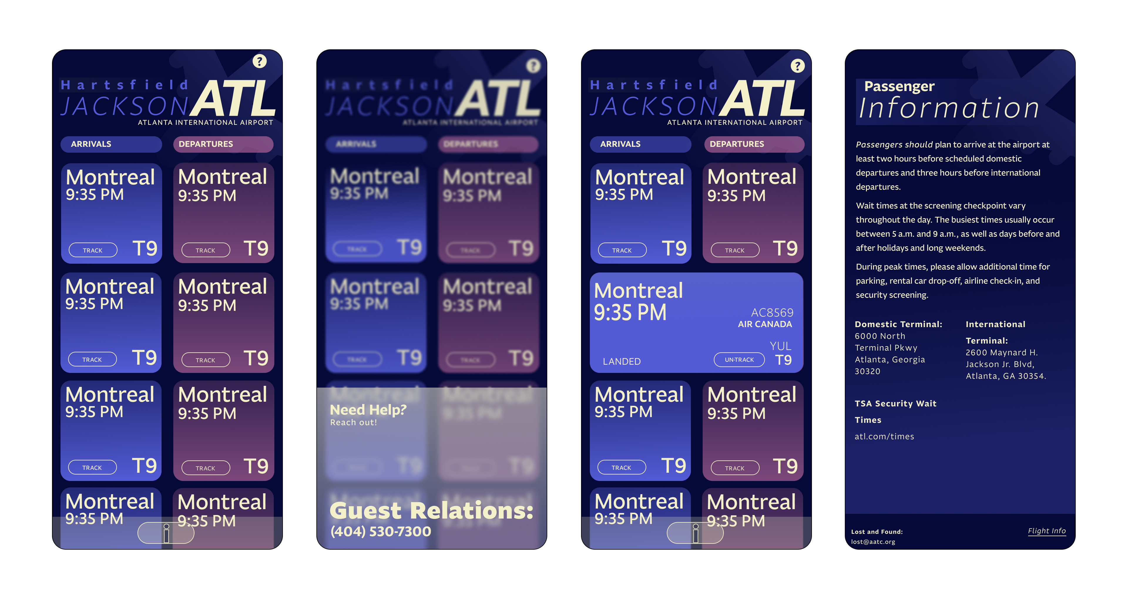
Refinement
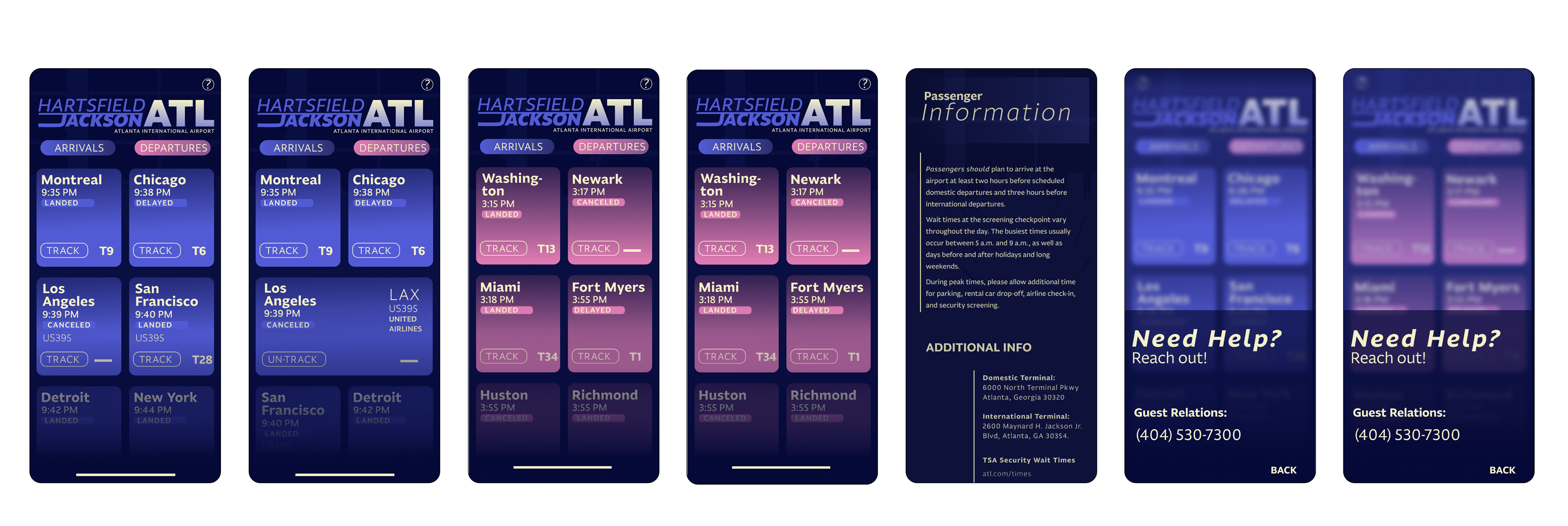
Leading into refining, I focused on touching up the logo and strengthening the hierarchy with the type.
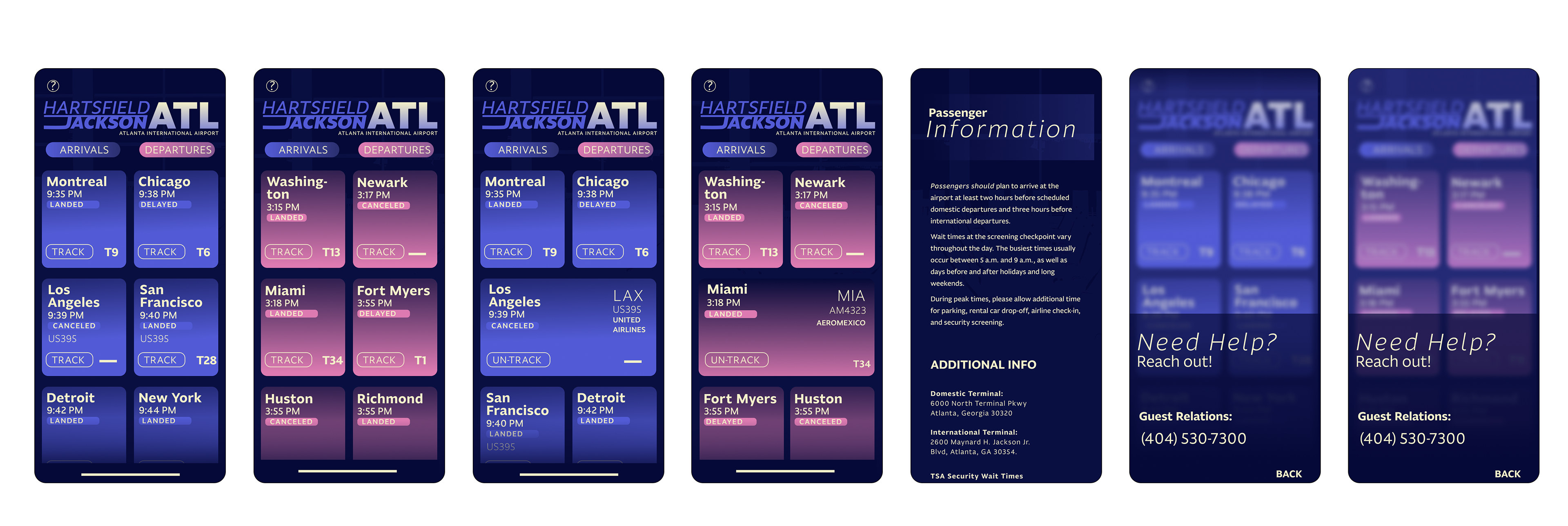
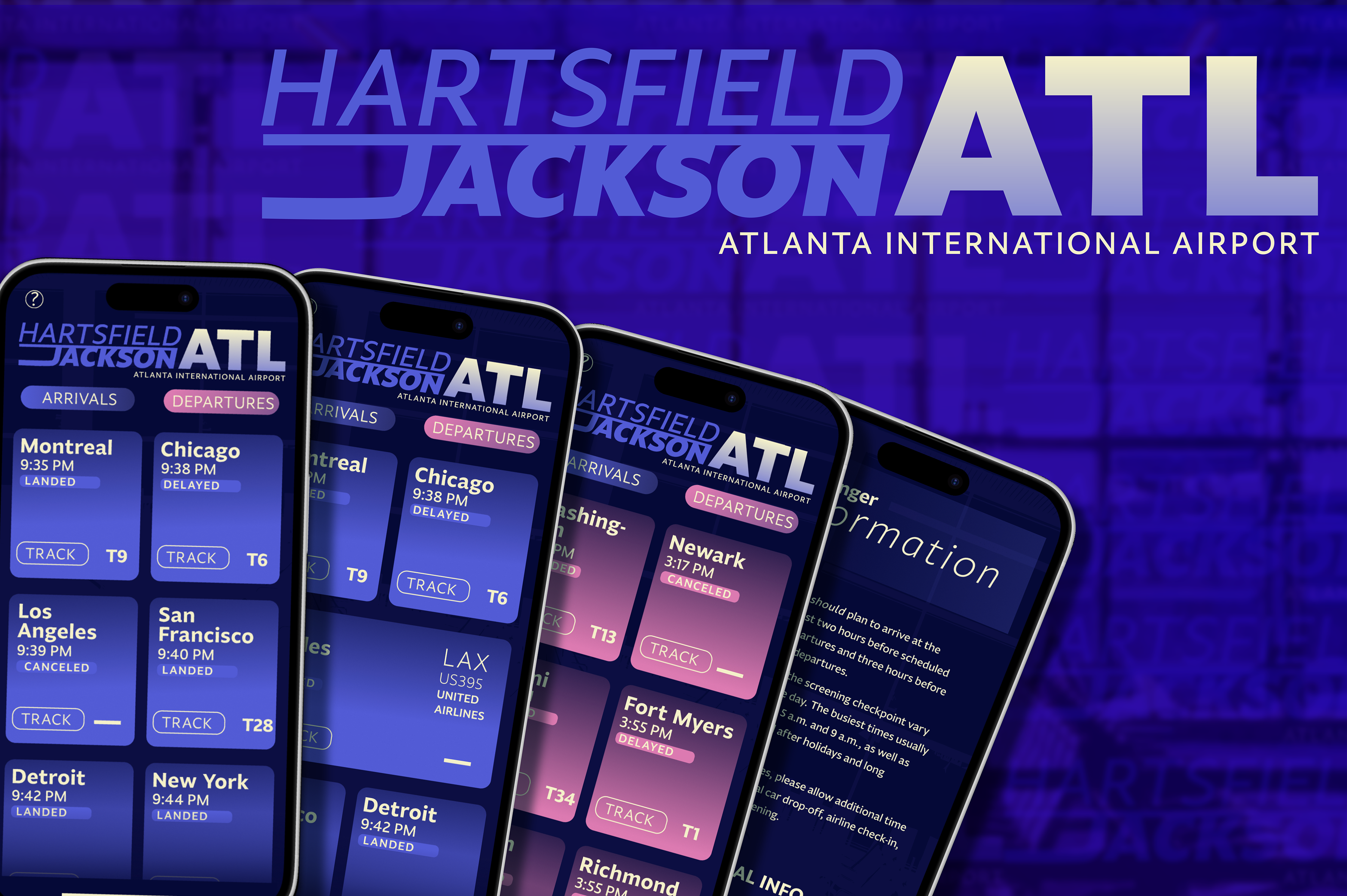
final